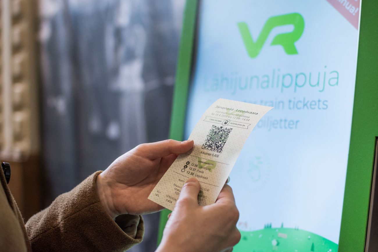
VR’s ticket vending machine concept marries business needs with user expectations
The fundamental purpose of Qvik's service design is to generate real added value, both to our client and the end customer. This was also the design principle for VR's new ticket vending machine.
We spent just under four weeks sketching out VR’s new ticket vending machine concept, and the first machines were busy selling tickets by the end of the four-month design and development period. By listening to the company’s experts and customers, analyzing data, performing tests with users and going through constant iterations, we quickly found the true challenges. We needed to make the ticket vending machine the fastest and easiest possible channel for last-minute purchases without compromising on business needs.
How does Qvik make sure that business needs meet the wishes of users? How do we carry out service design?
Service concepting boils down to five equally important phases. Taking shortcuts at any of the phases can lead the service onto the wrong track and result in an inferior end product.
1. Listen to the experts and demolish silos
Familiarity with the industry makes it quicker for experts to find the right challenges to tackle, but is not an absolute requirement. Every project should start with a thorough study of its individual background challenges. This is what we did with the VR ticket vending machine too.
Every company has a unique situation, products and bottom-line customer needs. To identify the right challenges, we usually start by interviewing various experts from the client and holding workshops themed around the challenge. To the workshops, we invite experts from the client organization who might not even work together in their day jobs. This is an effective way of giving the designers a broad understanding of the background, needs and business-critical elements of the company and project.
In the ticket vending machine case, our designers were already familiar with the problems of buying trips. However, the client’s experts helped us to quickly gain an understanding of, for example, VR’s product design, pricing, customer insights and bonus program, along with the perspectives and needs of conductors and customer service employees with regard to the machine. Being business-oriented means more than just staring at the sales figures: in order to design the best possible service, we have to identify the solutions’ overall impact on the company.
The siloing of information is a typical problem for large companies. As a designer, my first task is to compile the know-how accumulated by the company’s experts in different fields.
2. Study the figures
I like to solve things through the data, especially in the concepting phase, because a data analysis will often reveal things that I would not have fully appreciated otherwise. On the other hand, the data can also support design by confirming your assumptions.
In the preliminary planning phase for VR’s ticket vending machine, we studied how the existing ticket vending machines at railway stations and platforms were actually used: what product users buy at these machines, what more did they want from the process, were there any points at which the purchase path could break and, on the other hand, what was good and worth keeping about the existing service. Even if you’re not updating an existing product or service, the reference data for creating the right concept is most often there, you just have to know where to look.
We reviewed the machines’ sales data concerning the departure and arrival station, customer types, ticket types and purchase times and locations, and compared the data with the company’s other sales channels where necessary. The comparisons revealed which products were worth selling with ticket vending machines, which services vending machine customers hardly used at all, and how the purchase experience should be personalized. For example, customers who buy their tickets from a vending machine a couple of minutes before they get on the train don’t want cancellation cover in case of a change of heart, which the old machine used to offer even for immediate departures. We also realized that we should focus precisely on selling tickets for the next trains and make comparing options as quick as possible.

You don’t have to make decisions based on just gut feeling anymore. Data is one of the most important tools of today’s designers.
3. Don’t just study the figures – get to know the customer too
Understanding the needs of the customer needs more than punching the sales figures into Excel. The data will tell you what happened, but not always why. You have to ask the reasons for the behaviors found in the figures from the customers themselves.
By analyzing the sales data, we formulated hypotheses that we then set out to test with an open mind. We observed and interviewed the actual users of ticket vending machines and reviewed years of verbal customer feedback on the machines. We understood what the users liked and what they felt was missing. We found that certain products were not bought simply because they were not relevant for ticket vending machine customers, while some products were difficult to find in the old machine, even though there was demand for them.
If we had just looked at the figures, we might have imagined that ticket vending machine customers were not interested in the Extra class for business travelers, for example. However, a user survey at the ticket vending machines of Helsinki Central Railway Station quickly revealed the hard truth: the problem was not lack of demand, it was that customers did not know how to buy the product with the old machine’s user interface.
4. Test and iterate
Regardless of the amount of groundwork done, no plan is created perfect. You always need testing and genuine customer feedback to validate your ideas. Prototypes are a great tool for this purpose, since a rough functional prototype can verify what still needs polish and what should be kept in just a few days.
In qualitative user testing, the relevant feedback is often read between the lines and can only partly be obtained through repetition. The most important thing is to listen and observe with your ear to the ground, without judging mistakes or misunderstandings.
In the VR ticket vending machine case, we gave users tasks to carry out with the functional digital prototype. The testers worked independently and commented aloud on their actions. We tested two different purchase path structures and asked further questions from the testers after the tasks had been performed. If I saw a tester fumble or be confused about a button or product selection, the qualitative interview after the test revealed the reason. It usually only takes about a dozen customer tests to identify the stumbling blocks that need ironing out. By talking with the users, we can also get information on how the service could be made even more useful and interesting for this individual. Nearly every round of testing reveals fascinating observations and insights that make the end product better.
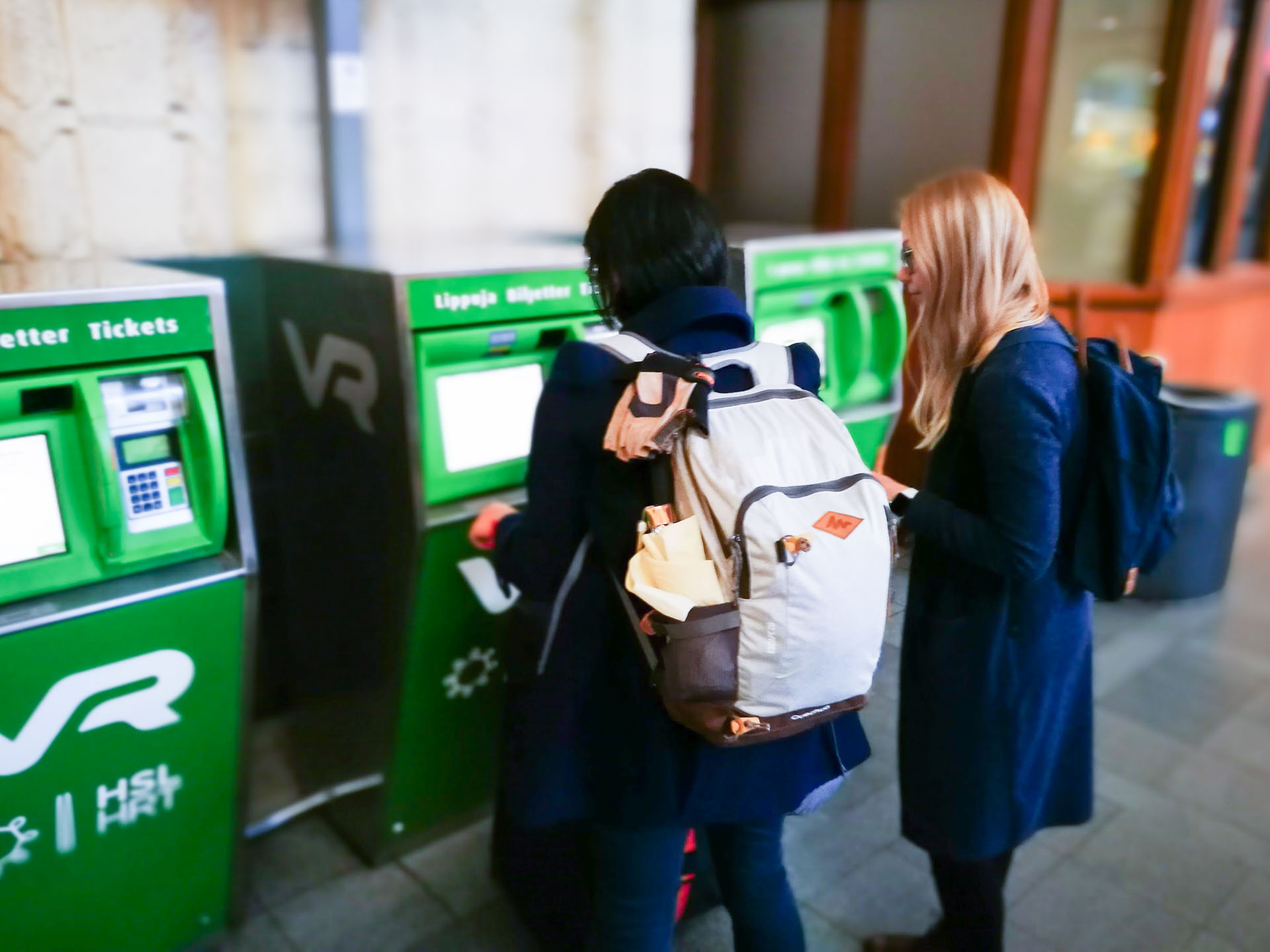
The users are always right. Especially when they don’t understand how something works. There is no point in explaining things in the testing situation. After all, there won’t be anyone to hold the customer’s hand at the ticket vending machine.
5. Keep developing and listening to the user
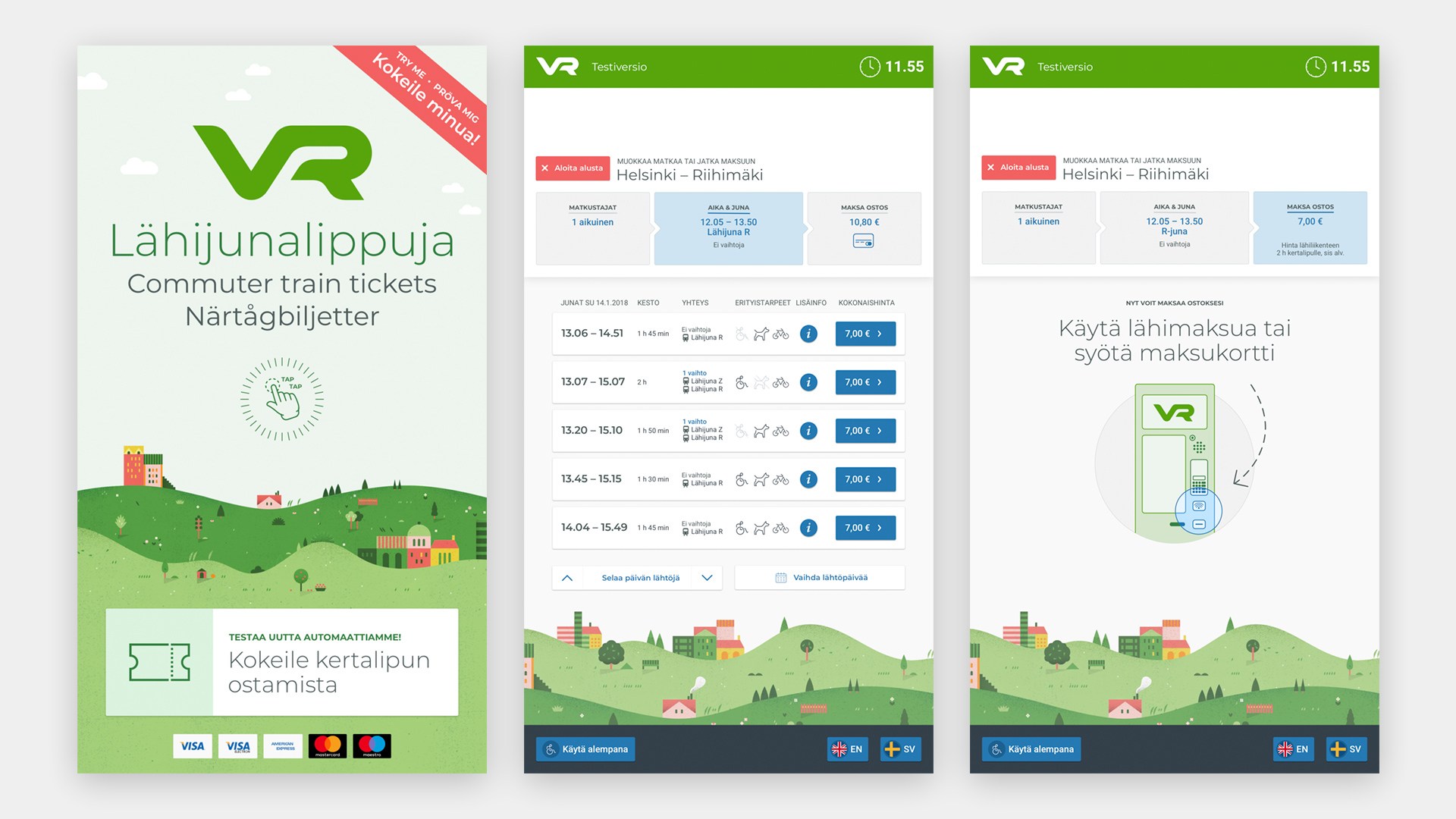
After the iteration rounds, new prototype versions and testing, we had a viable concept for VR’s new ticket vending machine. The thread of the design is a lightning-fast, simple and direct purchase path that avoids unnecessary choices and can go to payment in just three taps of the screen. As a major change from the previous machine, the order of choices in the purchase path has been built from the perspective of the customer, not the products. Now the customer doesn’t have to know the organization behind the products to find the ticket they want. Instead, passengers in a hurry can concentrate on making choices relevant to them: where are they going, how soon do they need to get there, can they make it to the platform in time, and can they bring their pet or bicycle.
The concepting process with its background surveys and iteration rounds only took less than a month. After another three months of visual design and technical development, the first next-generation pilot machines were vending real tickets to customers at Helsinki Central Railway Station and Järvenpää railway station. The development work for the new machine, inclusion of new features and products and, naturally, user testing and learning from the data are ongoing. However, the ratings given by customers who have used the new machines already indicate that the concept and design have succeeded in something: 4/5.
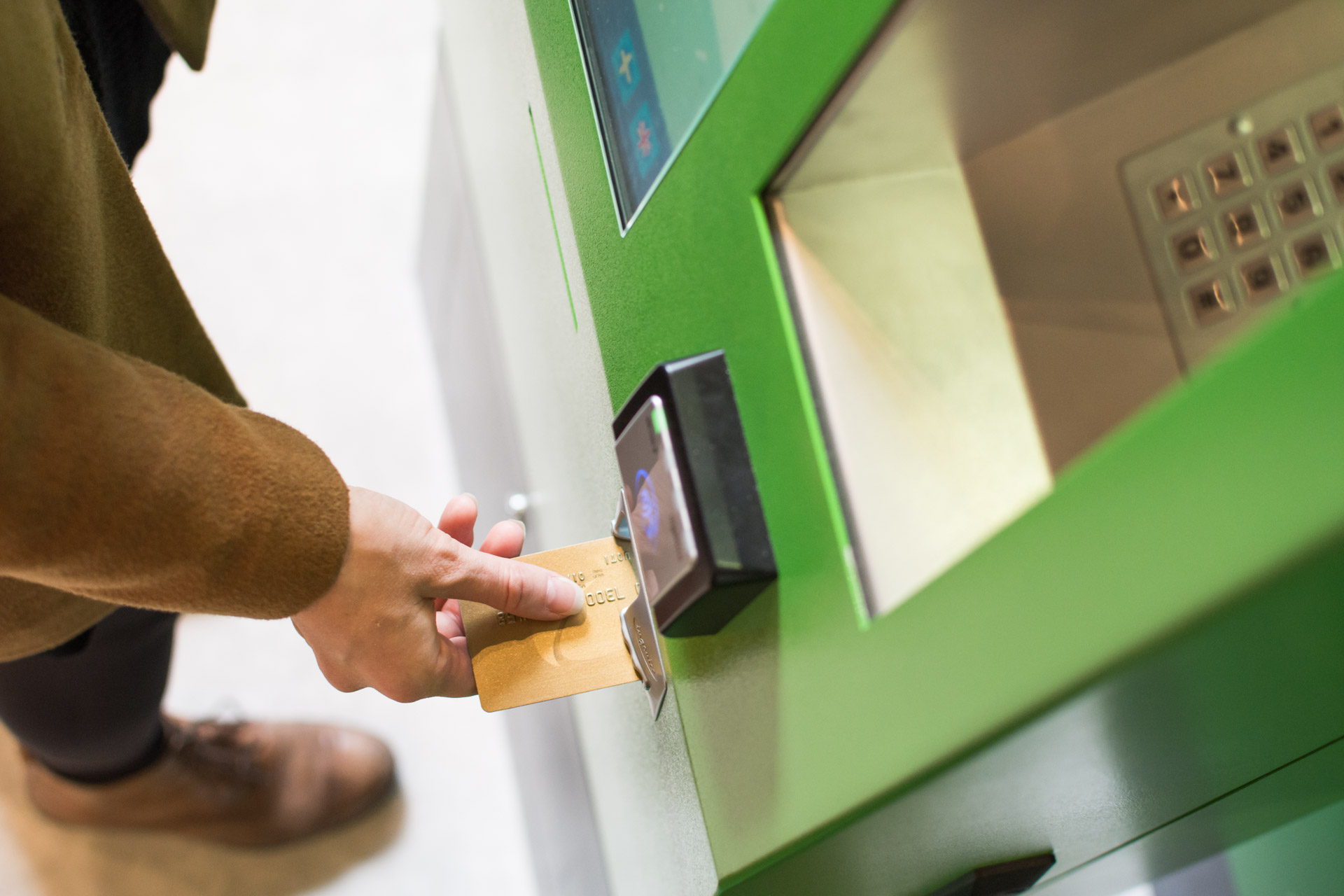
Qvik and VR’s experts collaborated on the concept and UI and UX design of the ticket vending machine. For the machine’s technical application development, the thanks go to our friends at Futurice and Valuemotive. Swiss hardware manufacturer Conduent built the interfaces that control the device’s components.

