Notifications are better than ever. But don’t push it.
Notifications are great for engaging the users and reminding them that your app still exists. But their main purpose is to make the app even more useful.
A couple of years back, more than half of users considered notifications useless and annoying. It seems something has been done right since then: in this year’s push notification survey from Localytics, 52% of respondents thought that notifications are now better.
App makers are no longer sending out blast messages. Instead, users can enjoy notifications tailored just for them. In 2017, the majority of notifications were personalized to match the users’ preferences. Thanks to the more relevant messaging, users no longer disable the notifications or delete the whole app as often as before.
Those users who accept notifications are indeed happier, but the amount of people who still choose to opt out remains the same – almost half refuse to enable notifications on their phone. Underwhelming numbers have made both Apple and Android improve their OS level notification settings. The reasons for “push-less” life vary, but some of them are due to bad user experiences. The user could be getting too many notifications, getting them at a bad time or having difficulties managing them, or maybe there just never was a good reason to enable them in the first place.
Here are some tips on how to design and improve your app’s notifications.
User feedback and analytics – do I still need to mention them?
Designing a great notification starts with the user. Keep notifications rare in the beginning, collect feedback and look closely at the analytics to catch any worrying behavior by the users. Don’t forget the people who don’t want notifications: make sure they, too, get the best experience.
Sell your notifications and sell them well
It’s easy to say no to notifications. Be clear so the user understands the benefits they get by enabling pushes. Also, you can’t just ask for the permission whenever – read through these excellent tips before onboarding your user.

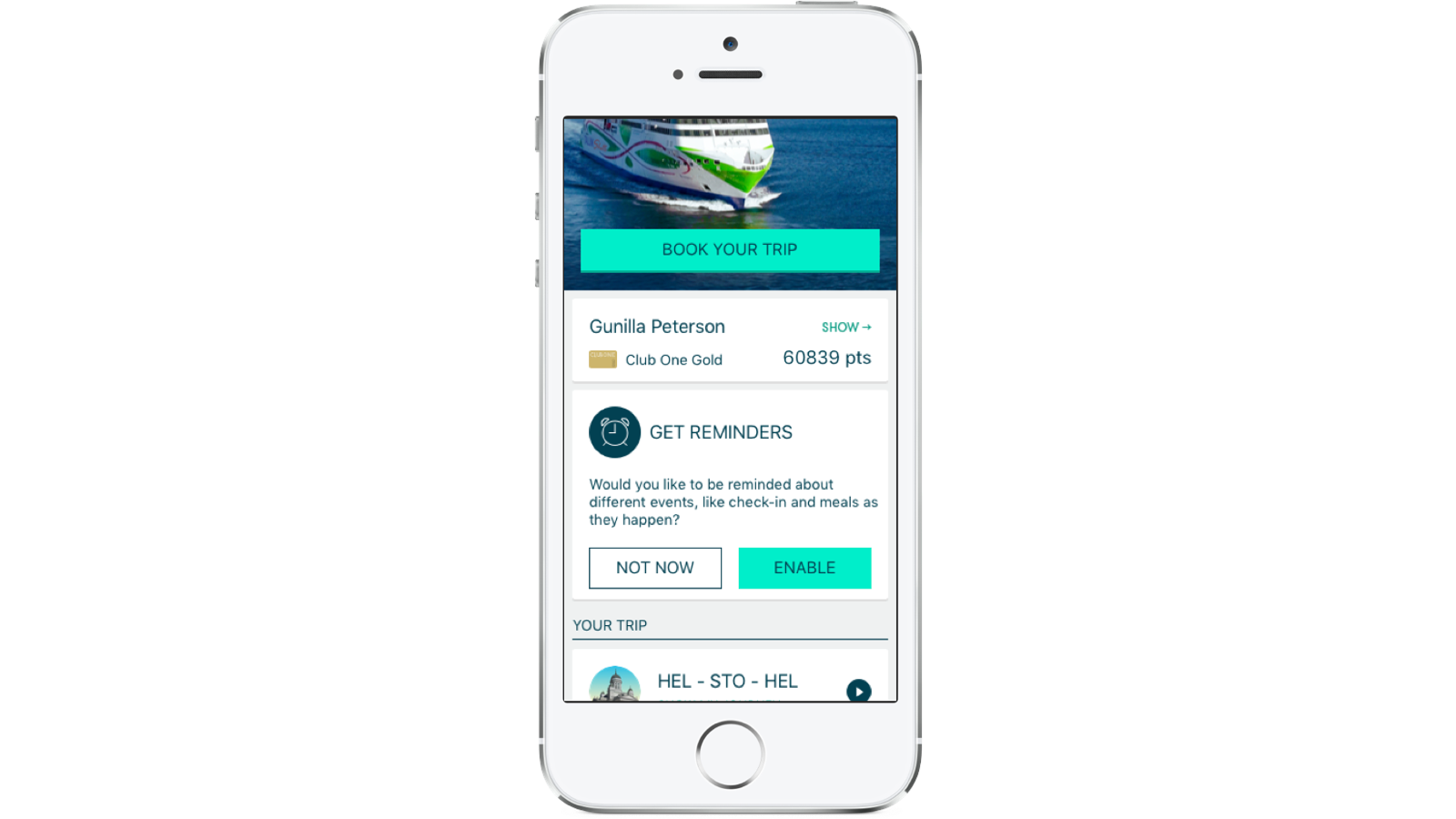
The Tallink Silja app introduces the benefits clearly and in the right context. The OS permission dialogue is shown only after the user has indicated their interest.
First time you heard of personalized notifications? Look into it.
The notifications are an important part of your complete app experience. Everything you know about your user can be utilized to create more personal notifications. The users especially appreciate geo-pushes, so consider using location data.

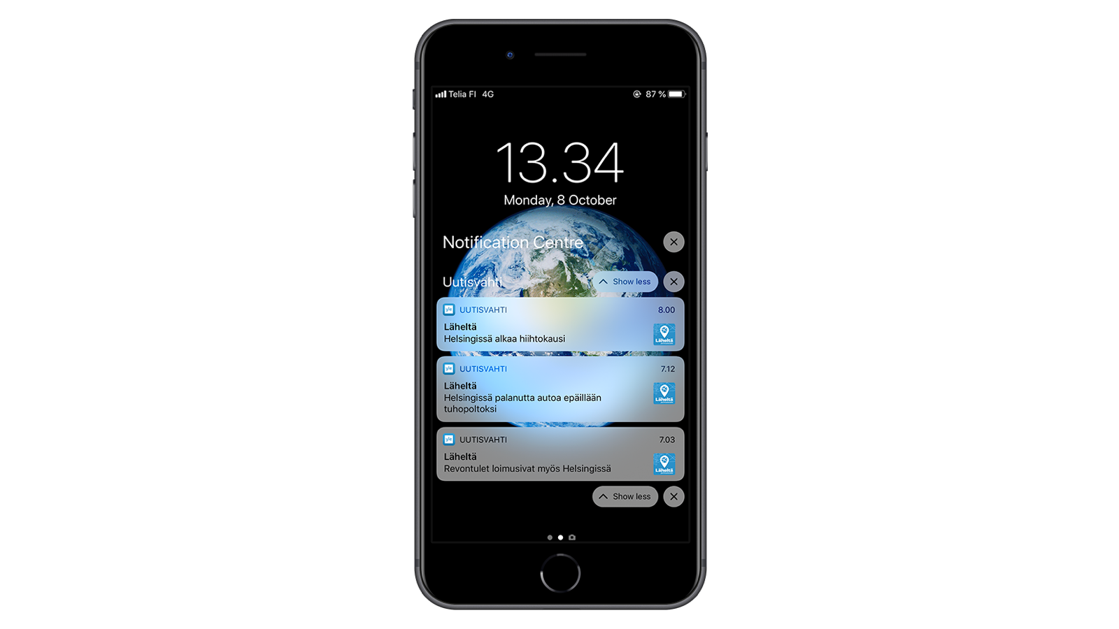
The Yle Uutisvahti news app sends out notifications that are based on the user’s real-time location.
Don’t frustrate the user – changing the notification settings should be a cakewalk
Giving options is the easiest way to please different users. Even if notifications are not your app’s main feature, you don’t want to end up in a situation where the user only has two choices: all in or pass. Don’t hide your notification settings unless you want to make the user really angry and – in the worst case – uninstall your app.

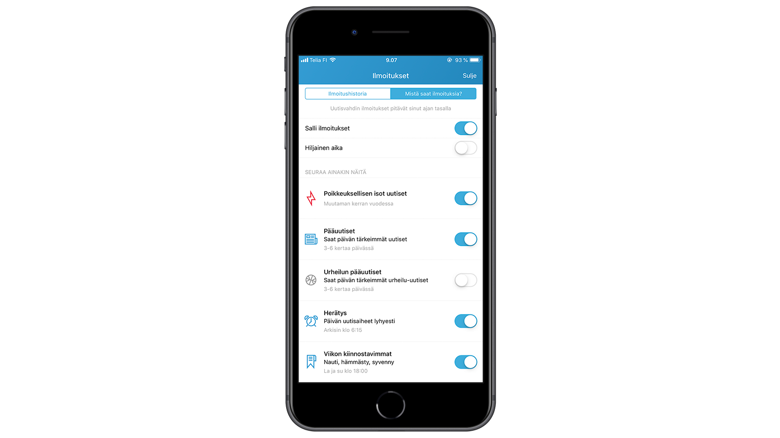
Yle Uutisvahti lets the user decide what kind of notifications they get.
Illustration: Aija Malmioja


