Dark modes are here to stay. To make a good one, you need to understand the context.
Dark mode is all the rage these days. Apple has embraced it as an integral part of their digital ecosystem. Google has brought a system-wide dark mode to Android 10. Microsoft is also doing something for Windows, although thus far the results have been scrappy, as is the way with Windows. Apparently it’s the solution […]

Dark mode is all the rage these days. Apple has embraced it as an integral part of their digital ecosystem. Google has brought a system-wide dark mode to Android 10. Microsoft is also doing something for Windows, although thus far the results have been scrappy, as is the way with Windows.
Apparently it’s the solution to all of our problems from eye strain to battery drain. Some of the effects are more true than others, but many people like the dark side regardless of the inconclusive evidence.
A sight for sore eyes?
Off the bat, I would argue that most of the discussion about the efficacy of dark modes (or negative polarity) misses the point. It’s being compared to light modes (or positive polarity) in the same context, when the real benefits arise in completely different use cases.
When it comes to text legibility, for example, dark text on a light background is easier to read and comprehend than its negative counterpart, according to some studies. But when we want to read something in a dark or low-light environment, many devices have trouble lowering their brightness to a level where it doesn’t blind the user and prevent them from seeing anything. They also often have trouble maintaining proper contrast.
In these cases, it doesn’t matter that relative legibility is better in positive polarity because, in absolute terms, it disrupts the user and their environment.
Context matters
Let’s look at it this way: we wouldn’t use a light theme in an aeroplane’s instrument display, which is often viewed in dim cockpit lighting, because the pilot wouldn’t be able to see outside on their night flight. What about the passenger in that same plane, who would like to read the news but doesn’t want to disturb those sleeping next to them?
Neither would we use a dark theme to display a map that someone’s using to navigate in bright daylight, because the screen will already have trouble competing with the sun’s brightness behind the glare and smudges. Nor would we make someone write a book with a dark themed text editor – although I’m sure there are people who choose to do so.
It’s not enough to study the effects of our designs relative to each other, because it is the overall impact in the surrounding environment that matters.
Personal preferences are another thing, of course, but they are irrelevant to this particular point.
Better for the battery, better for the planet?
Another popular topic is the dark mode’s effect on battery life. OLED screens can turn individual pixels off when displaying black, making the most power-hungry part of the device much more efficient. Google has confirmed that using the YouTube app’s dark mode on an OLED device can decrease the screen’s power consumption by as much as 60%.
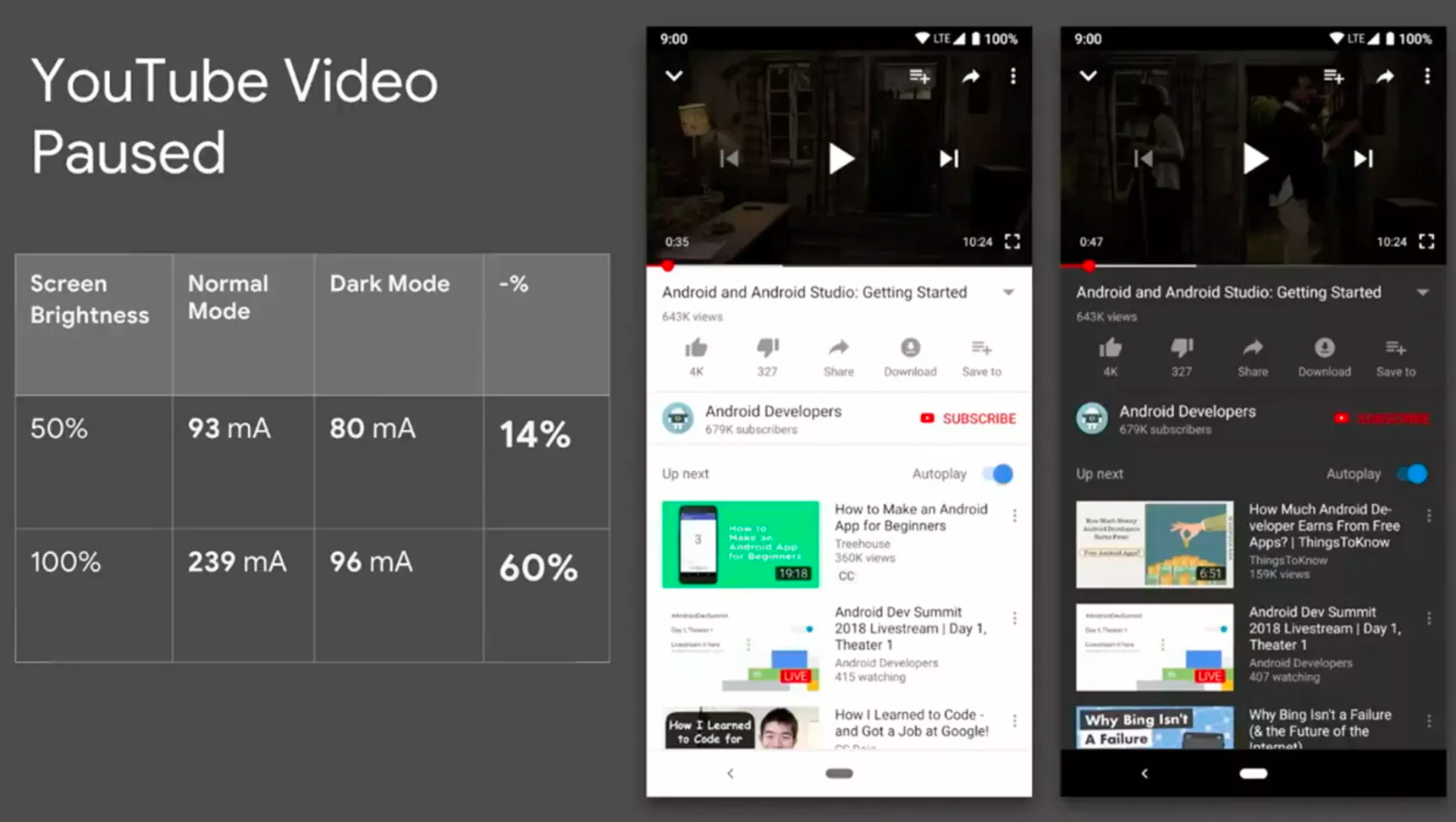
YouTube’s dark mode can save a considerable amount of power on an OLED screen.
This, combined with the fact that OLED screens are continually gaining market share from LCD technology, means that the amount of global energy savings is certainly not insignificant.

According to the Global Smartphone and Tablet Tracker, the market share of OLED screens was over 30 % already in 2018.
In 2018, The market share of OLED screens in the mobile phone segment was over 30% and rising as the technology gets more affordable and reaches the mid and low-tier markets. But as long as LCDs still hold the lion’s share of the market, their limitations should be taken into account.
Keep the 50 shades of grey in mind
What exactly are these limitations? In short, unlike OLEDs, LCDs cannot display true black. So if an app has been designed with a black background and OLED screens in mind, it will look terrible on an LCD because of the leaking backlight.
This is why it may be smart to use a dark gray or a colour of similar luminosity. This way the OLEDs can have some of their energy savings without the app looking terrible on LCDs. Or just enable true black for OLED users, like the Reddit and Wikipedia apps have.
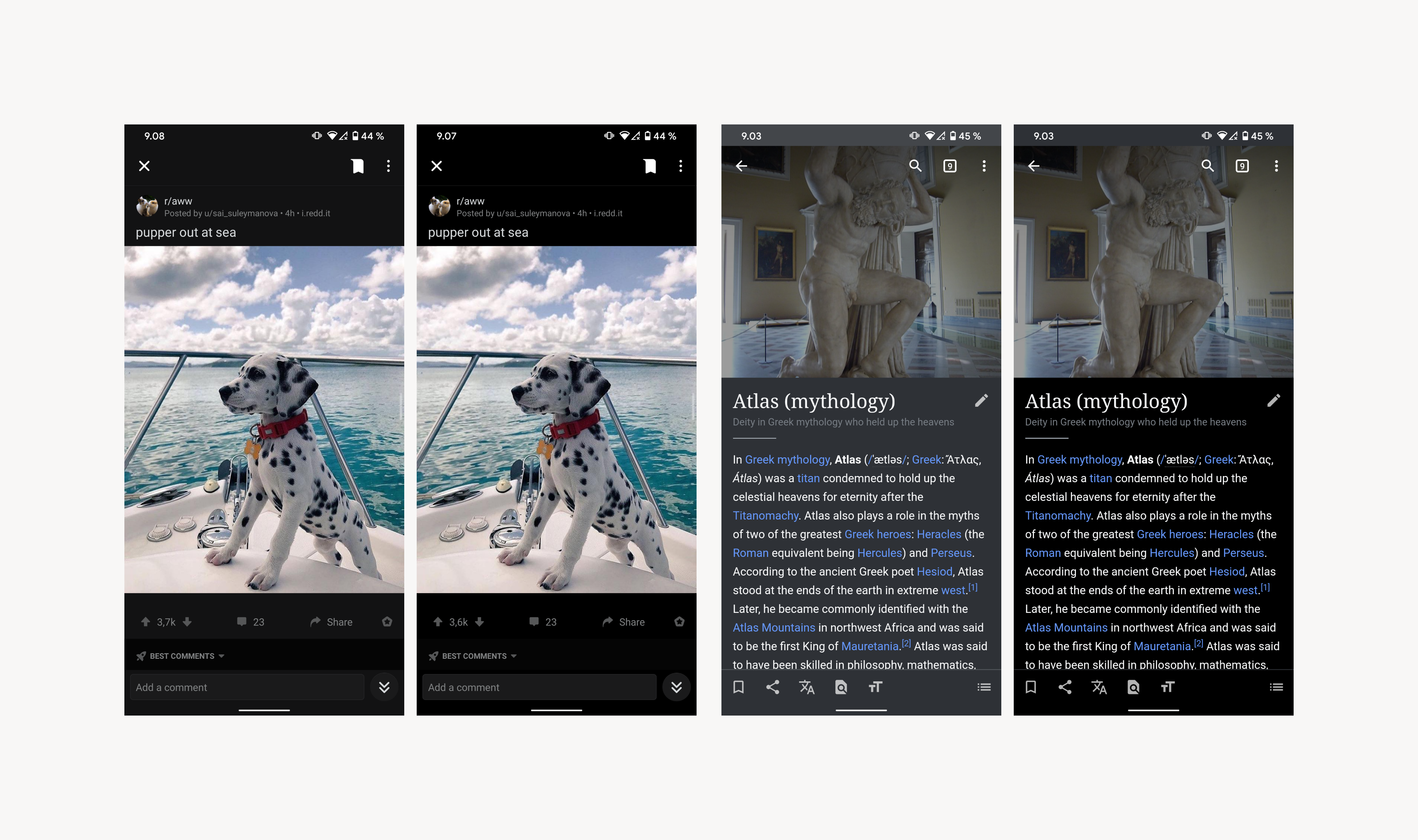
Reddit and Wikipedia provide both dark grey and true black dark theme options.
There are swaths of concrete issues to consider when designing dark modes. The most obvious concern is color. If a UI relies heavily on brand-colored elements, they will have to be adjusted for the dark mode, which is likely to attract the interest of any marketing department we might be working with.
Even if only icons or other interactive elements are colored, they should still be checked. That is because, unlike against a white background, saturated colors tend to vibrate on a dark backdrop, reducing legibility. Simply lowering saturation will often get us where we want. If our application is heavy on imagery, dimming them might be worth considering.
Ignore accessibility and you’re gonna have a bad time
Another important thing to think about, as always, is accessibility. Just like with positive polarity, maintaining enough contrast between the background and content is essential – possibly even more so. The same WCAG 2.1 AA minimum standard of 4.5:1 applies here. The AAA enhanced standard requires a ratio of 7:1.
On the level of implementation, dark mode will instantly show all the poor decisions made in the layout process. A systematic approach to visual design and its implementation is important when juggling two parallel themes.
If color values are hard-coded in the application, making the dark mode will require a juggling act from the developers. If we want to have both light and dark mode available, soft-coding the values is a must.
Google has already published its guideline for dark theme design, and it is very thorough. Apple’s, on the other hand, is very broad.
Tricky questions
We’ve already seen a glimpse of what we’re moving towards with macOS Mojave, iOS 13, and Android 10. A system-wide dark mode and apps that choose to either listen to or ignore that setting. I think this will take us half way.
In my opinion, the ultimate goal is a mode that could change automatically according to momentary lighting conditions, not just the time of day. If you go from a lit hallway to a dark garage, the theme should switch dynamically between dark and light modes.
The same goes for a car entering a tunnel from glaring sunlight. Google Maps already does this while navigating, though it seems to be using location rather than ambient light readings.
The problems we face are thus:
1. How to make the transition from one mode to another without interrupting what the user is doing?
2. How to make sure that we can accurately distinguish between situations in which the dark mode is a real benefit and situations in which it will be a hindrance?
I suppose that the solution will be something similar to what Android has done with the screen brightness adjustment, employing an algorithm to consider a myriad of variables in addition to the light meter reading to make an educated guess about the appropriate level of brightness. The challenge is to find a balance between a fast and responsive switch while avoiding annoying “flickering” between states.
We could see dynamic dark modes like this become a feature soon.
But these are bridges we should cross once we get there.
Diagnosing a dark mode deficiency
So, like any other issue, it’s complicated. To make informed decisions about dark modes we have to:
1. Understand the environments that the user might encounter while using a service
- Is the service going to be used in dark conditions? Will our service be the one that people open when they can’t sleep at night?
2. Consider the type of content being displayed.
- Could the user interface’s dark theme have a negative effect on understandability?
- If it does, will the benefits outweigh the negatives?
3. Recognize opportunities to extend the user’s battery life specifically and improve the efficiency of our electronic devices generally?
- Does our service require lots of screen-on time?
- What impact can we have on energy consumption with the size of our user base?
Many services may not need a dark mode at all. But there is an element of platform conformity to be considered in addition to the actual needs of the user: if a user has explicitly decided to use a dark system mode on their phone, how certain are we that we want to deny them the privilege in our application?
Enabling a negative polarity theme can certainly be a large investment, but services are being pressured to conform to emerging standards all the time. Maybe a dark mode is no different than any other platform guideline.
So I guess there’s one more point to add to our list:
4. Consider what implementing or not implementing a dark mode will communicate to the user about your brand.
- Despite the lack of an identified use case for a dark mode, should we still acknowledge and respect the user’s preferences?
- If we implement a dark mode for an app that absolutely does not benefit from it, will we imply that we are doing it just to be part of a cool new fad?
Säästöpankki’s dark mode is a great example from the Finnish market
Discuss with your team and stakeholders to find out if dark mode is right for you. For instance, our client Säästöpankki decided to start providing dark mode for their customers. After few months of work, the dark mode version was out and the end result looks like this.