AI art and the slippery slope to Uncanny Valley: Guinea pigs and something almost NSFW
We decided to start using AI art for our blog covers. While drawing up the guidelines for the kind of images we should use, we did a lot of testing and witnessed horrible things.
I’ll be honest here – and this is not Qvik’s official opinion. I HATE AI ART! The most meaningful thing in art is that it is supposed to capture, express and communicate feelings, emotions and thoughts about the world. As AI just mixes semi-random things semi-random people have produced, I think it’s somewhat preposterous to even call it art.
Then again, work produced by AI algorithms can make you feel things and inspire you. And these pieces are a part of today’s art scene, whether I like it or not. Also, the algorithms are getting so good that it can already be difficult to tell the difference between human and AI-made art – and proper AI art is often a combination of the two.
But I hate AI art. Sometimes because it looks awful and sometimes because it looks annoyingly good.
Our senior product designer Samuli Saarikoski is Qvik’s best expert on the AI art scene and also produces his own art with the help of AI. You can follow his work on his Instagram account, @samulisaarikoski, among other places.
We started to define Qvik’s AI illustration guidelines with him, our product designer and brand guard Jukka Forsten and our software engineer Ossi Hanhinen.
Get ready for some spooky guinea pigs
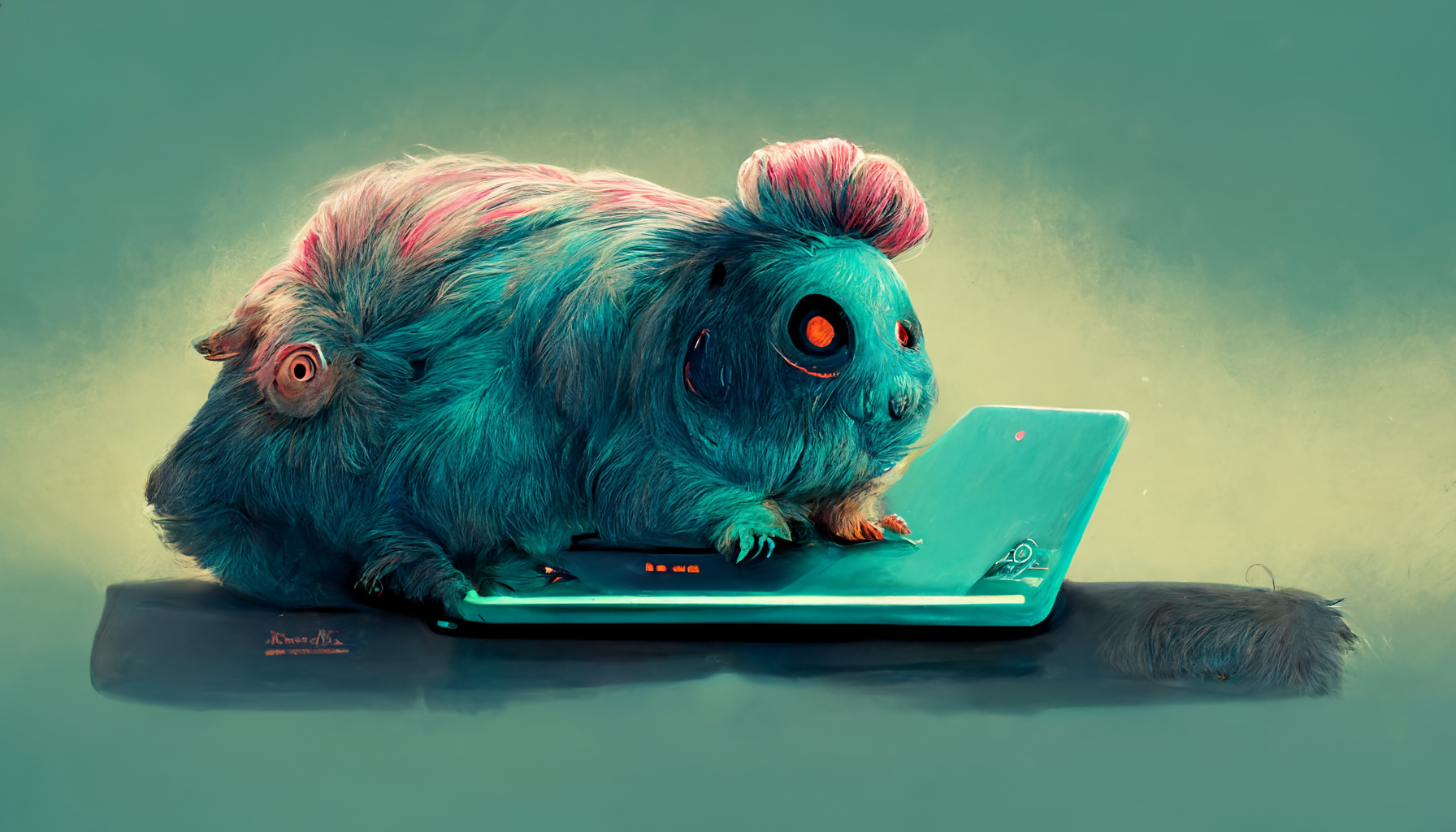
As we started drawing up the guidelines on Midjourney, Saarikoski did a simple test. He wrote turquoise guinea pig using a laptop on a table, pastel color palette, character illustration art, digital art, concept art.
It took about 30 seconds, and this is what we got at first.
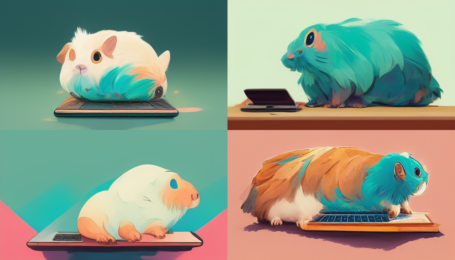
“Usually, the first versions you get don’t make a lot of sense, and you often have to flounder through a bunch of horrible versions before getting something good out of it”, Saarikoski says.
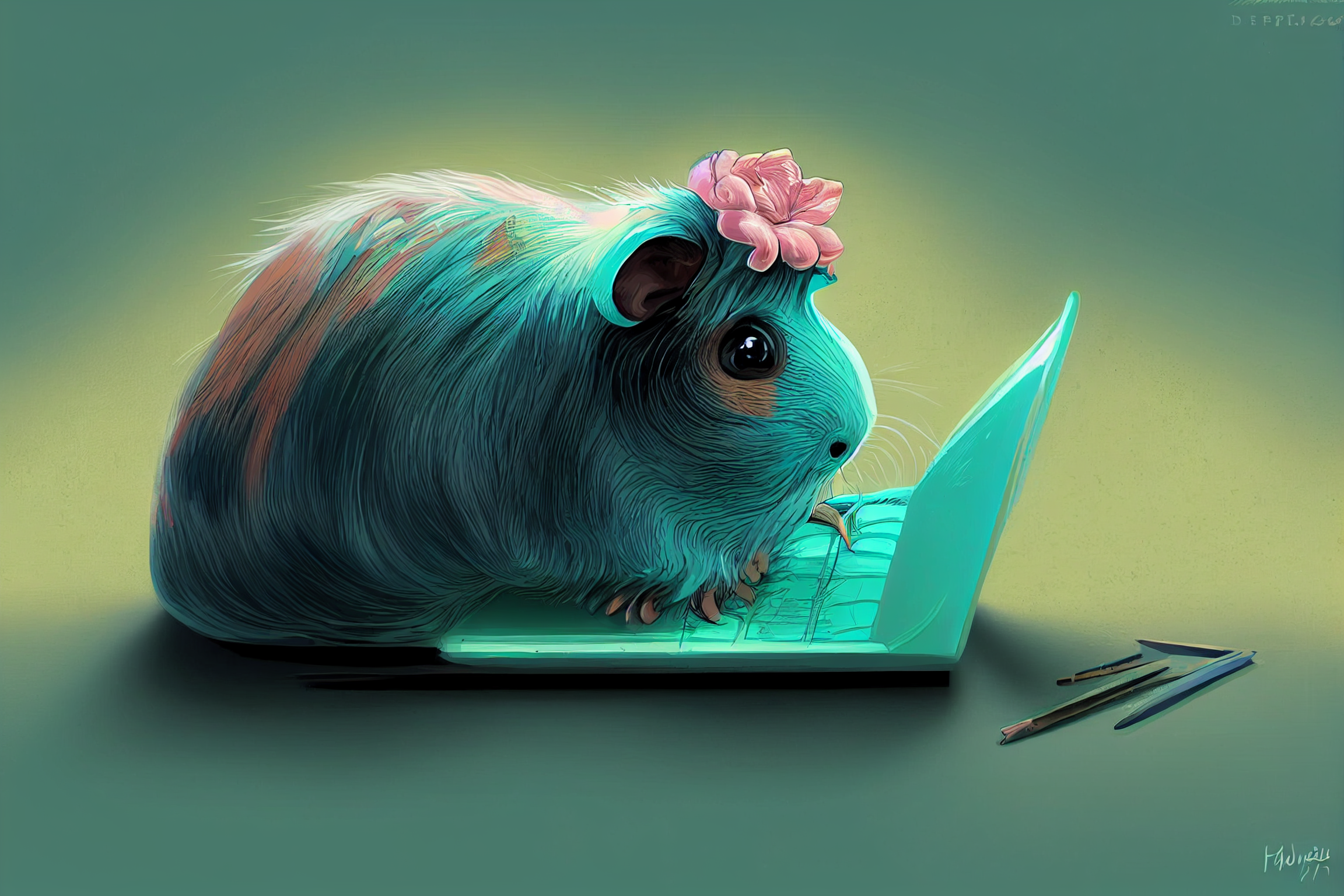
“My favourite thing in Midjourney is the current remaster feature. It does the best AI magic and has the potential to save you from the horrors.”
Here’s what we ended up with after the remaster tricks and Samuli’s magic.
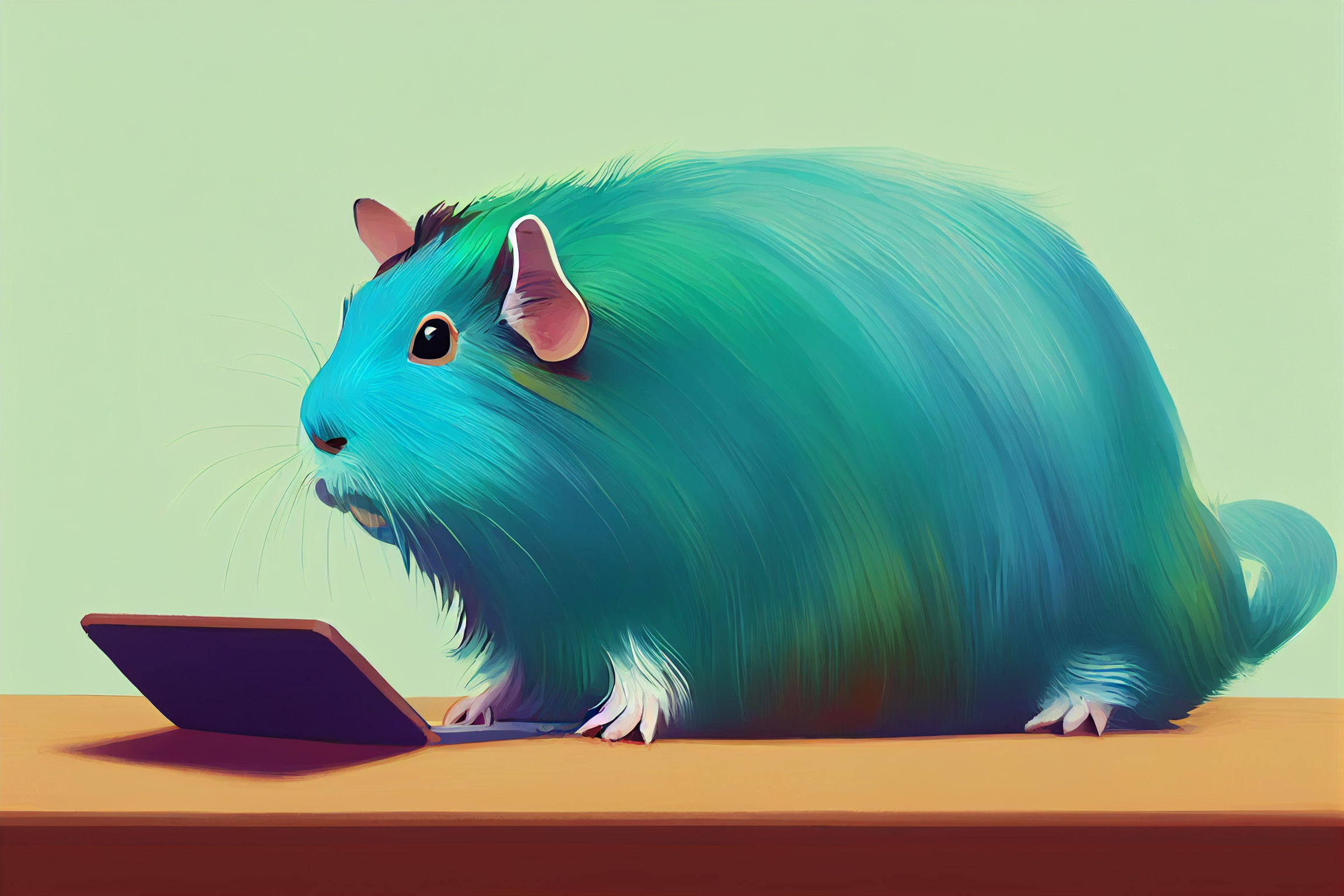
We have a thing for guinea pigs at Qvik, since one of our office mascots is a turquoise guinea pig. Even though our guinea pig got lost in our office renovation and only lives in our memories now, it made sense to continue testing the algorithm with guinea pig stuff.
Here’s tiny cute and adorable turquoise guinea pig adventurer dressed in a warm overcoat on a winter’s day, jean-baptiste monge, anthropomorphic.
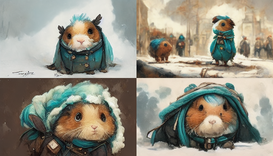
After a decent amount of variations, remasters and other magic, this is what Saarikoski was able to get out of it.
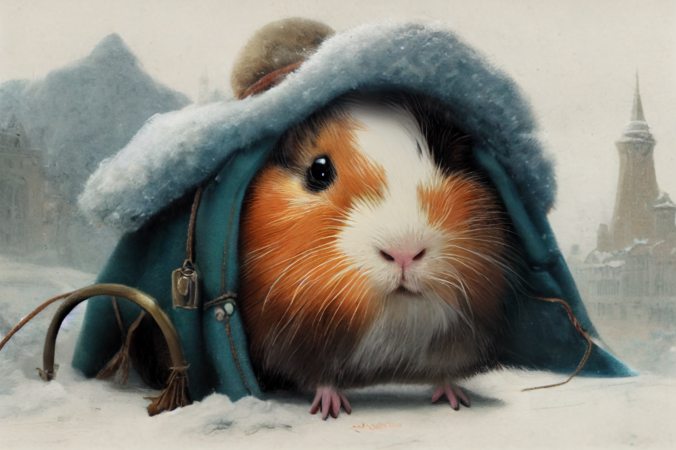
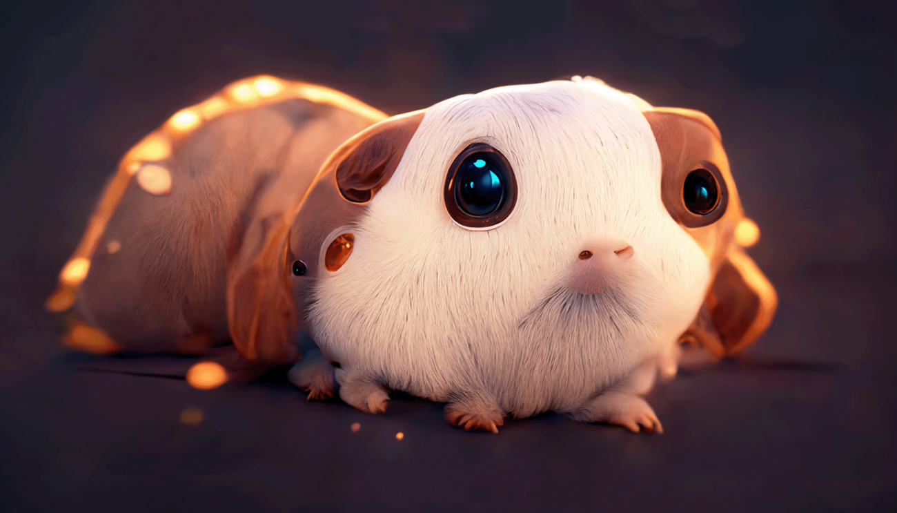
Saarikoski explained that, because of the lack of “training”, AI often produces extra-horrible things when creating animals. It’s also better at creating more common animals like cats or dogs but seems to struggle more when it comes to guinea pigs.
If you are spooked by what you just saw, it’s because we’re in Uncanny Valley
The ‘uncanny valley’ is a phenomenon that makes some people experience discomfort when seeing something that resembles a human but is not quite human, such as human-like androids, robots, or even clowns. I believe – and studies have shown – that it also applies to seeing animal-like things that are more or less off.
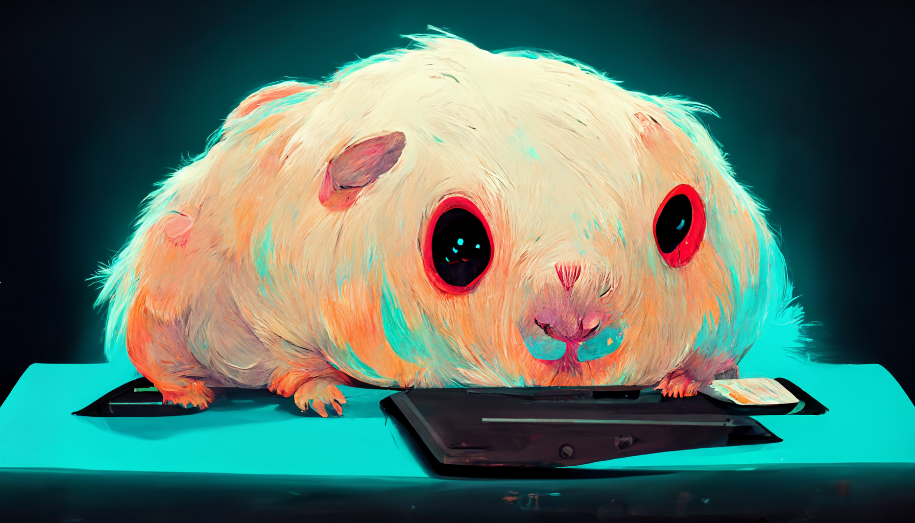
We were talking about this with Forsten and Saarikoski, and Forsten requested a set of AI guinea pigs with the word “horror” in the description.
So here’s turquoise horror guinea pig using a laptop on a table, pastel color palette, horror dark art, character illustration art, digital art, concept art.
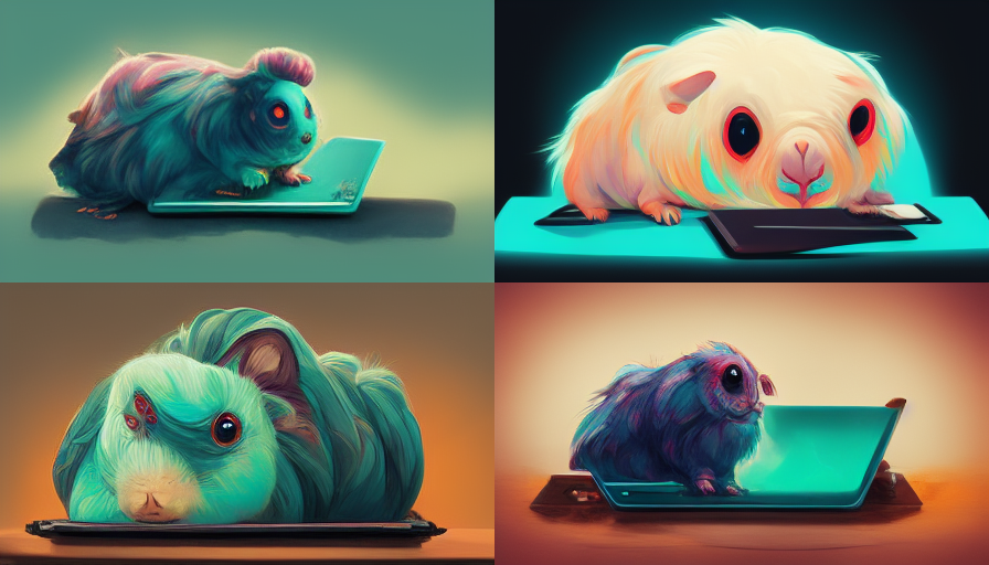
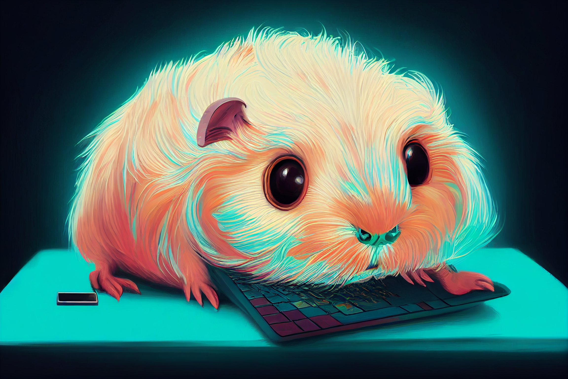
Interestingly, when Saarikoski started remastering these images, the algorithms replaced the horror with cuteness.
The AI was like “Sorry about that – here’s a flower, pencils and my signature to make it better. Don’t worry about the fact that the cute guinea pig is also a bit like a centipede.”
It happened twice, so go figure. Maybe the first ones were too much even for the AI.
Here, the AI was like: “Maybe you’d prefer this stretching creature with a funky keyboard and tiny smartphone.”
DALL·E vs. Midjouney
You’ve read this far, so here comes the NSFW thing.
Before inviting Saarikoski and Forsten to the discussion, Ossi Hanhinen was playing with the idea of illustrating his article with AI illustrations provided by DALL·E. DALL·E is an open AI system that, like Midjourney, produces images and art from natural-language descriptions.
He wrote Van Gogh style countryside with a group of developers discussing around a laptop and this is what we got.
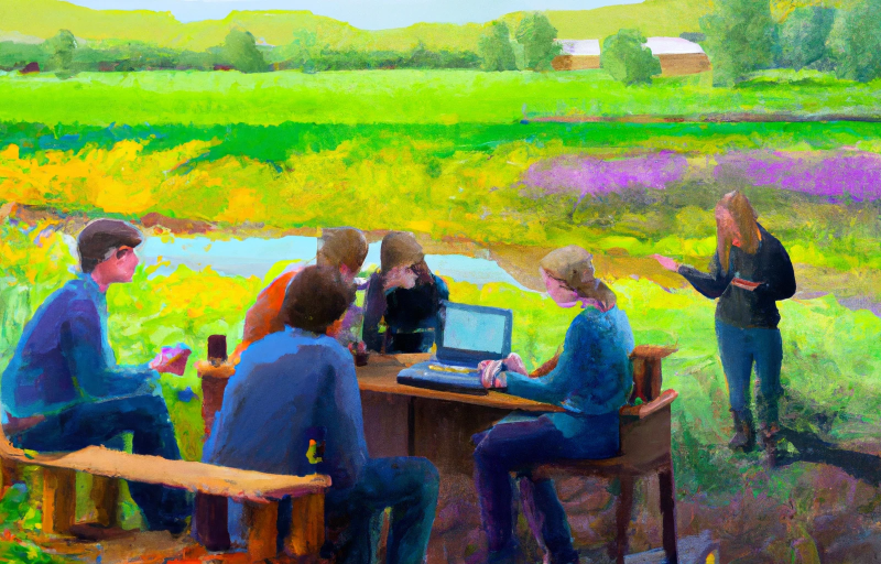
So yes, we’re all familiar with the field meeting. Some are standing with a hotdog hand and explaining things, others are facepalming or drinking coffee, etc. But what is that person sitting on the right holding in their hand?
I know I’m not the only one seeing this. But, apparently, not everyone can – good for you and never mind.
“One of many differences between Midjourney and DALL·E is that Midjourney’s images are based on its own deep pool of curated images, while DALL·E browses the internet more freely”, Saarikoski says.
“So when you use Midjourney, you basically get less penises.”
This is just one nice example of the unintended, yet quite problematic, issues you might encounter when dealing with AI art.
Guidelines for AI art in Qvik’s blog and marketing
When writing instructions for AI algorithms, many also mention artists or styles they like – for instance Studio Ghibli or prases like art by artgerm and greg rutkowski and alphonse mucha.
“This is a bit sketchy, and I think that it’s important that Qvik doesn’t start mimicking specific artists and their unique styles in our material”, Saarikoski says.
So that’s rule number one. These are the other guidelines we’re going to start testing:
- Don’t mimic other artists.
- Keep it simple, no need to create whole worlds. Pick a few keywords from the blog and choose a theme that would fit.
- Illustrations should have a few key “eye-catchers” and their placement should be clear (golden rule, rule of thirds, in the middle, etc).
- It’s okay to use patterns that fill the whole space, but they should be as seamless as possible.
- Steer away from realism, AI is not quite there yet. So no humans, animals or environments with realism in mind, as that usually stray into uncanny valley territory. Take a stylized approach instead.
- The color palette should be aligned with Qvik’s brand. We are not that strict about blog post illustrations, but the main colors should come from Qvik’s brand highlight colors. A black-and-white palette can also work.
- No raw images, all images should be edited in Photoshop to some degree. AI usually “prints out muddy colors”, so it’s a good idea to set at least the brightness, contrast and saturation in Photoshop.
- We use 16:9 ratio images in our blog.
- Obviously no NSFW material or any pictures straight out of uncanny valley.
Even with these instructions, it’s not going to be simple and polished out of the box. We agreed that Forsten and Saarikoski will help check and fix the images we produce with Midjourney, and the images will also get a round of Photoshop before use.
Our first blog post with AI cover was published this Monday. It’s Ossi Hanhinen’s What is automated UI testing and why should you do it?, and I hate to admit that to me the cover looks kinda nice.
I will now use an AI text generator to conclude this post
What better way to end a story about AI art than to let Copymatic.ai do it? The algorithm wrote four conclusions to choose from, and three of them said that we’re never going to use AI images again. That is not true, but I liked this one best.
“As we were crafting the guidelines to what kind of images we should use for our AI art blog cover images, we witnessed some horrible things. The AI generated some truly disturbing and graphic images that no one should ever have to see. We quickly decided that we would never use AI generated art for our cover images again. We hope that our experience can serve as a warning to others who might be considering using AI generated art for their own purposes.”
Copymatic.ai

