
SwiftUI is promising but still raw. Here’s our first impressions.
With iOS 14 coming out and the technology having had a year to mature, puting SwiftUI to production use is beginning to sound like a reasonable proposition.

With iOS 14 coming out and the technology having had a year to mature, putting SwiftUI to production use is beginning to sound like a reasonable proposition. To test it out, we set out to build a very simple application for the internal tracking of test devices.
Before getting my hands dirty, I spent some time reading about SwiftUI and going through Apple’s tutorials. One of the better reads I came across was this blogpost from Alex Grebenyuk. It’s a solid tutorial to basic SwiftUI use, but what I really want to highlight are the opposite approaches taken by Auto Layout and SwiftUI.
Auto Layout is a powerful layout engine that Apple adapted to their use case, while SwiftUI is built from the ground up to make common iOS UI patterns simple. It also fails gracefully, unlike Auto Layout where a tiny bug could have drastic effects elsewhere.
These two paradigms have the expected tradeoffs. You can very easily put together straightforward layouts in the default iOS style with SwiftUI, but it is much harder to fine-tune the elements to your liking. To illustrate, I’m going to devote most of this post to a walk-through of how I put a screen together with SwiftUI.
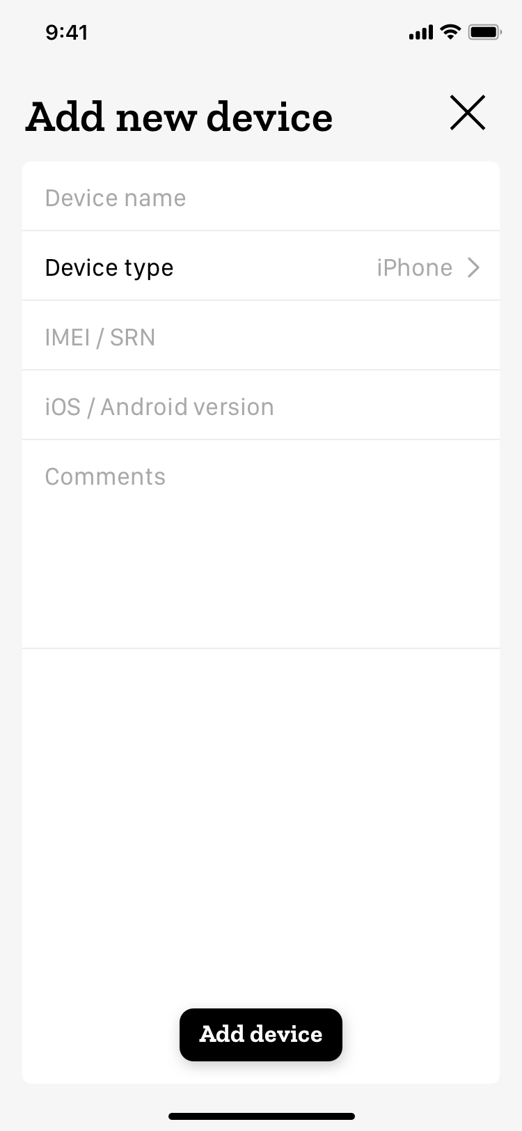
Building a simple form with SwiftUI
The first task I set out to do was building a simple form for adding a new device or editing an existing one’s properties.
SwiftUI layouts are defined through Swift code, with Xcode providing you with a live preview. At its best, this gives you the best of both worlds between doing a traditional layout in code — nice for creating simple things but a pain to read — and Interface Builder documents, which are nice to work with but lack flexibility with dynamic content and make it harder to see exactly which properties have had their values changed from defaults.
Laying out the core components was easy in SwiftUI. Its layout logic is built around Stacks, and this view would consist of ZStack to put the Add device button on top of the rest of the content, HStack for the title and the close button, VStack to place the table below them, and finally a List, SwiftUI’s counterpart to UITableView, for the main content.
We have Text, Image, Button, TextField and TextEditor for the components themselves, wrapping UILabel, UIImageView, UIButton, UITextField and UITextView. Additionally, the device type row should reveal a Picker, which has UIPickerView and UISegmentedControl covered under its various styles.
SwiftUI’s powerful new tools
The nicest part of working with SwiftUI were the data bindings. SwiftUI adds a handful of new property wrappers, the most straightforward one — at least in terms of usage — being @State, which sets the view to respond to changes in the value.
In this case, we would declare a String variable as @State and pass it to the TextField initializer with a $ prefix operator. SwiftUI can then take care of the details of synchronizing the variable and the view state, and we can simply think of the variable as synchronized with the TextField’s contents, without having to worry about delegates or observers.
SwiftUI’s view modifiers felt good too. When you declare any view component in SwiftUI, you can tack on as many modifiers as you like, either from the huge list provided by SwiftUI or ones you’ve defined yourself.
These are surprisingly flexible. For example, in the earlier view, tapping the second row would bring up a picker view below it, and getting the arrow on the right to animate for the transition was simply a matter of adding a modifier .rotationEffect(.degrees(showPicker ? 90 : 0)) to the Image, where showPicker is the Bool variable that represents the picker element’s current state, tagged with the @Binding property wrapper.
SwiftUI again does all the state handling for you, synchronizing the image’s rotation with the picker sliding in and out. Some of the commonly used view modifiers also have hidden context-aware behavior, such as .padding() prompting iOS to figure out the exact values for you when called without parameters.
Less pleasant aspects
As the views grew larger, I started to have a bit of trouble managing them. With Interface Builder, you can stick a lot of complexity into a specific component and it will stay out of your way, folded into the view hierarchy. With a big chunk of SwiftUI code, the tools for navigating it are more limited.
I expect this to be less of an issue once I get a better feel for structuring SwiftUI code into separate elements, and perhaps code folding will turn out to be more useful here than it initially felt like. Still, I was surprised by how quickly the size of the code started to feel overwhelming.
Another issue is that the visual preview has been quite finicky about when it deigns to work at all. Xcode 12.0, which released mid-September, appears to have fixed my biggest annoyance: errors anywhere in your project causing you to lose the preview. But the error messages are still as opaque as ever. For example, if you forget to set an EnvironmentObject in your preview object, the preview will not work and the most informative part of the error diagnostics is “BSServiceConnectionErrorDomain error 3.”
Running into issues
Getting back to our view, the first thing I noticed after getting the basic structure in place and trying it out in a live app — aside from all the functionality being there right out of the box — was that the TextFields would only respond to taps within the precise height of the text.
This is unacceptable. If the user taps two pixels above the text, within the area of the element, we obviously know what their intentions are, and the application should respond accordingly.
Since SwiftUI’s layout paradigm is that individual views are responsible for themselves and shall not cause errors elsewhere if they misbehave, it isn’t too surprising that things get tricky when you do want to add dependencies to other views. It is done by using GeometryReader to access a specific view’s geometry, which you can then use to set the frames of its child views.
This works, but is nowhere as elegant as just being able to set two elements’ heights as equal like you could have done with a single constraint under Auto Layout. The GeometryReader object isn’t perfectly inert either, and inserting one into a view structure can cause it to be rendered differently.
I did eventually figure out a satisfactory way to set the TextFields’ heights… and found out that it did not actually solve the problem. The responsive area of the view remains the same regardless of its dimensions.
Falling back to UIKit
If you’re really set on working around this, I did find a solution that involved not only an invisible Button around the TextField, but also using a library that performs some tricks to give you a reference to the underlying UIKit view. At this point, I feel you could just as well ditch TextField entirely and create a wrapper for UITextField instead. To SwiftUI’s credit, writing such wrappers is at least as straightforward as can reasonably be expected.
You’ll most likely need UITextView for the comments field too. TextEditor does improve on UITextView, giving you automatic scaling to content size right out of the box, but it’s only available in iOS 14. For the most part, it behaves like its underlying UIKit counterpart, still lacking placeholder text and not matching TextField insets. If you wish to maintain a unified style with TextFields, it’s still all on you.
You can choose to use components introduced later in supported iOS versions with accompanying fallback implementations. To Apple’s credit, the way SwiftUI layouts are constructed lets you insert availability conditions as easily as to any other piece of code.
Wrapping up
I talked about the issues with the text input views at length not because I feel the viability of SwiftUI as a whole hinges on them, but because I feel they are representative of the difference between a basic layout and a polished user experience.
Keeping with this same view, displaying a Picker with proper padding and alignment also proved to be a challenge. Others who worked on our little test project echoed these sentiments. If you try anything fancier with SwiftUI, I’m sure you’ll find more examples of your own. Unless you settle for mostly good enough, this is what you’ll have to deal with.
Our test project did ultimately end up in an app we were happy enough with. It’s hard to be too impressed though, given that it was the ideal use case for SwiftUI, consisting of simple views and largely settling for iOS default styles. I could certainly recommend SwiftUI for projects with a similar level of ambition, but I’m skeptical of its suitability for anything larger.
Still, SwiftUI struggled with more precise tasks even in our little test project. If I were to implement more complex custom designs, I fear that any productivity gains from SwiftUI’s more advanced features would be counteracted by the work required to get your views to look and behave exactly the way you want, instead of just almost so.
That said, SwiftUI is still young and certainly has potential, even if it’s hard to imagine it in serious production use in its current state.
Want to read more about SwiftUI? We recently published articles you might like:
Adapting to SwiftUI View Lifecycle
Basics of SwiftUI Animation
Illustration: Joel Pöllänen