Evaluating native app accessibility – see how 15 popular Finnish apps did.
Qvik evaluated the accessibility of 15 popular Finnish apps to gain insight into accessibility in high-volume apps. None of the applications were yet compliant with the standards of 2021.
Qvik evaluated the accessibility of 15 popular Finnish apps to gain insight into accessibility in high-volume apps. None of the applications were yet compliant with the standards of 2021.
Accessibility testing is conducted using some criteria. The statutory standards are a poor fit for evaluating app accessibility. To guarantee the reliability of testing, Qvik developed its own evaluation method, the Qvik Mobile Application Audit. The method is fully compliant with the requirements of the European standard.
Qvik’s proprietary method defines how applications should work with various assistive technology solutions. The test ensures that the application is compliant with requirements and accessible to people using for instance, screen readers, keyboards or switch access devices.
We chose the Qvik Mobile Accessibility Audit method’s most critical and telling tests for our accessibility test for Finnish applications.
Assessing app accessibility can be a challenge
Automatic testing, manual testing and user surveys can all be used to evaluate accessibility. The same principles can be applied to web sites, apps or stand-alone kiosk devices
Even though the tools are there, evaluating the accessibility of native apps still means a lot of work: automatic testing doesn’t cover everything, manual testing takes considerable effort, and a user survey is still needed to ultimately confirm the service’s accessibility.
The most cost-effective option is to combine extensive manual testing by experts complemented by a user study.
How we evaluated the accessibility of Finland’s top apps
We charted the current state of app accessibility by testing 15 applications in both iOS and Android versions, i.e. 30 software products in total. We only picked free applications available in both app stores.
The sample included banking, telecommunications, health care, media and food industry apps. At least two applications were chosen from each sector. The apps were picked from the national Top50 lists and had at least 100,000 downloads in the Play store for inclusion.
We ruled out applications that cater exclusively to sighted users, like video streaming services.
We performed a light accessibility test for each application with a single up-to-date device running iOS 14 (iPhone) or Android 10 (Samsung) operating systems. The test looked at the following factors:
- Overall usability with a screen reader
- Keyboard use
- Control labeling
- View structuring
- Navigability
- Authentication
- Font enlargement
- Horizontal use
The tests were performed by executing a typical use case and examining the app’s first-time user experience and menu structure. The test didn’t address multi-step purchasing or registration functionalities. The applications were graded on a scale of 0–5 (fail, poor, passable, satisfactory, good and excellent) for each criterion.
With this approach, we were quickly able to find major accessibility issues affecting the user experience. More extensive user testing or a Qvik Mobile Accessibility Audit would probably reveal many more issues, but that was not the objective of this test.
Based on these criteria, it is safe to say that if an app did not pass this test, neither would it pass a more rigorous audit.
Results: everyone failed, but in varying degrees
None of the applications passed all the test criteria and would thus need changes to comply with the new legislation.
But if we look at the results in terms of the accessibility potential of these applications, the situation shows some promise. Nearly all of the apps already have accessibility-promoting features, but still need a lot of work to achieve a good accessibility grade.
In short, it’s not all doom and gloom.
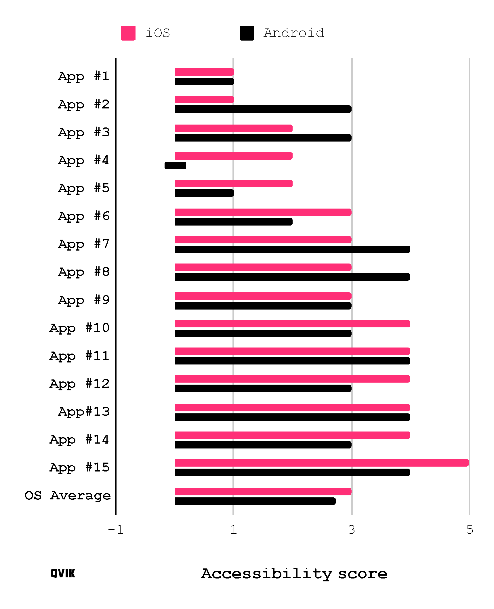
The most common grade achieved by iOS applications was “good” and that of Android apps “satisfactory”, but the gap between the operating systems was surprisingly narrow, as you can see from Figure 1. The Android version of some applications even beat the iPhone.

Figure 1. The accessibility scores received by each of fifteen apps. iOS and Android versions illustrated in parallel as well the operating systems average.
The iOS version of Koronavilkku had the best accessibility and was closest to the level of compliance. In this video you can see how the iOS version of the app works with a screen reader. Congratulations to the Finnish Institute for Health and Welfare for a great acquisition!
There were poor apps in all business domains. One Android application failed the test completely due to a total lack of support for assistive technologies.
Typical shortcomings in app accessibility
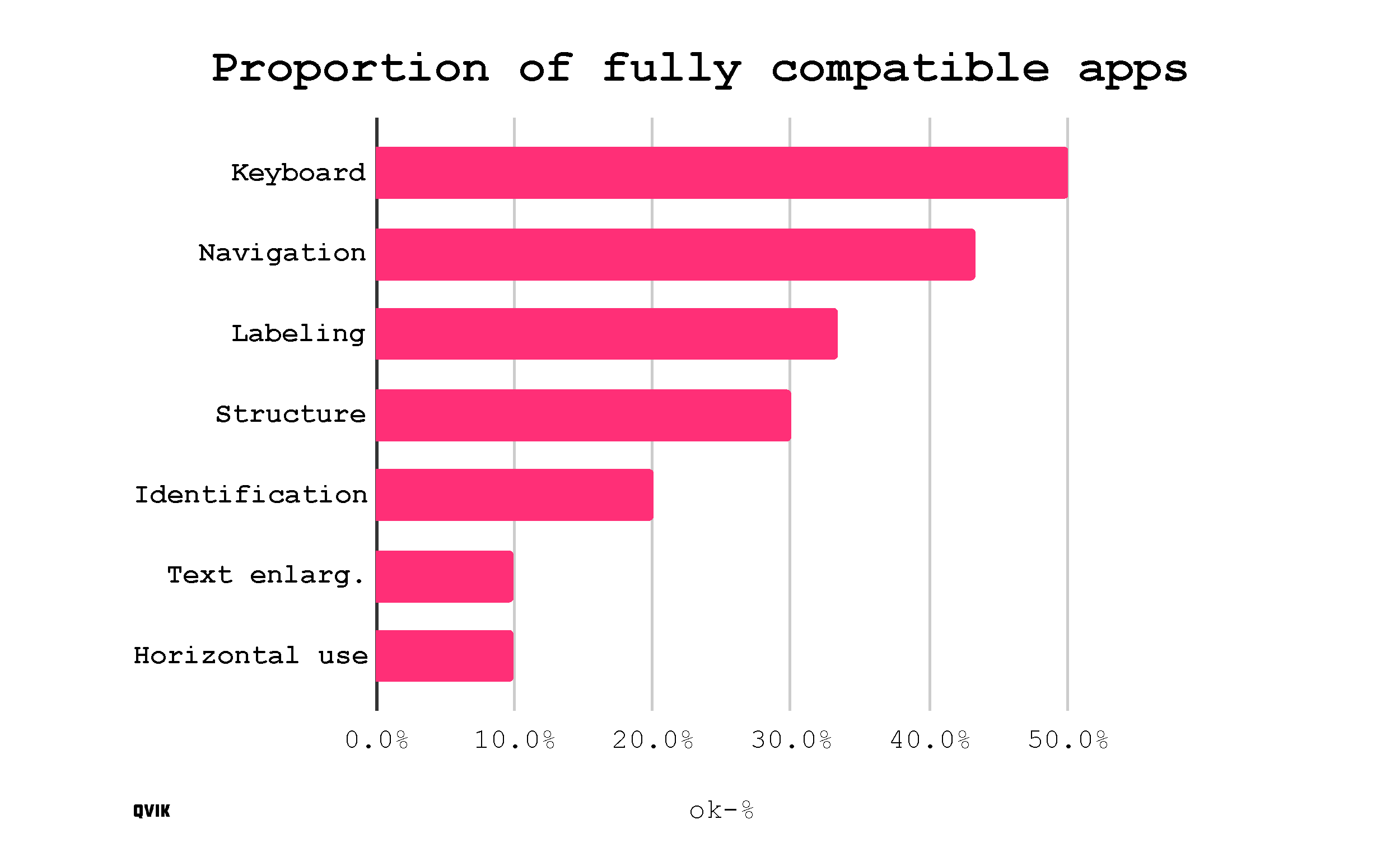
The test revealed a lot of shortcomings in the apps, so nominating the biggest issue is no easy task . Font size scaling was one of the most common issues and was missing completely from as many as 60 percent of the apps and fully functional only in 10%. From the technical point of view, the problem is caused by a fixed definition of font size instead of a scaling one.
My hunch was that the most serious problems would involve horizontal use, but this feature was completely absent from only one in three applications.

Figure 2. The proportion of apps which fully satisfy each of our seven criteria used in this test. Partially compliant ones were not counted.
Deficiencies in labeling, i.e. the additional information picked from the app by assistive technologies, were almost as common. These problems concern screen reader users, since having the screen reader say “button” really doesn’t tell you much about what will happen if you press it.
To recap, the biggest issues were:
- Font scaling
- Horizontal use
- Incomplete labeling
In addition to typical problems, critical issues are another interesting metric. Critical issues include “traps” in otherwise well-behaving applications that can leave user “stuck” in a view with no way back. This could be something like opening a full-screen window that you can’t close any more. These types of issues were found in regrettably many apps.
Perhaps the saddest example was a sliding toggle used to confirm a critical function in one of the apps. Unfortunately, there was no way to use the slider without physically swiping the screen with your finger. With a screen reader, you could make the slider stutter towards the apex of the swiping movement one step at a time, but that was it. Offering an alternative control method to gestures is a basic requirement in the WCAG 2.1 criteria.
Application accessibility 2021 – now’s the time to get your act together
The Act on the Provision of Digital Services entered into force in 2019, and its scope will be extended from online services to applications on 23 June 2021. In the first phase, this will only apply to the applications of public officials and certain sectors specified in the Act. But this category covers many important services, like government services, insurance and utility companies, and a variety of other public services.
The purpose of the legislation is to promote equal access to digital services, which are often the most convenient way to take care of your everyday affairs.
The accessibility of applications is an essential driver of equality in the modern information society. For example, strong digital authentication will be much more prevalent after the entry into force of PSD2, and mobile applications are the primary channel for strong authentication.
In Finland, compliance with the Act is monitored by the State Regional Administrative Agency (AVI) for Southern Finland. AVI Southern Finland has announced that it will audit the accessibility of at least four applications in 2021. The Agency can oblige the applications’ publishers to correct defects, and can even impose conditional fines based on reports of non-compliance.
Illustration: Joel Pöllänen


