
Case Whim: Streamlining an app’s design language
What’s the best way to ensure that the quality of your digital product stays consistent? The key is to have a proper style guide and carefully maintained component library. They also improve the communication between designers and developers. Here’s how I helped Whim streamline their app’s design language and improve its component library. A style […]

What’s the best way to ensure that the quality of your digital product stays consistent? The key is to have a proper style guide and carefully maintained component library. They also improve the communication between designers and developers. Here’s how I helped Whim streamline their app’s design language and improve its component library.
A style guide is a set of guidelines that make sure a digital product’s look and feel stay consistent. It can contain rules on anything from typography and colors to defining how specific components should behave or the tone of the product’s marketing.
When products are developed further and teams get bigger, the style guide keeps everyone on the same page. Without documentation on how things should look and work, the cohesion of the product will suffer. In the worst case, this can lead to confusion and frustration among team members as well as end-users.
A style guide can be a website, blog post, Google document, Sketch file, or whatever works best for any given team. As long as the guide is visible and accessible to everyone and also frequently and effortlessly updated, any copy-pastable form will suffice. If the style guide is in the hands of the designers alone and half-hidden from everyone else, it’s guaranteed to be forgotten.
The essentials of Whim’s style guide
In Whim’s case, I created a separate style guide page inside the app’s Sketch library – that way, the styles could be directly applied to the components. With the help of Abstract, a version control tool for Sketch files, the guide was made accessible to the whole app team. Whim’s style guide includes these essentials:
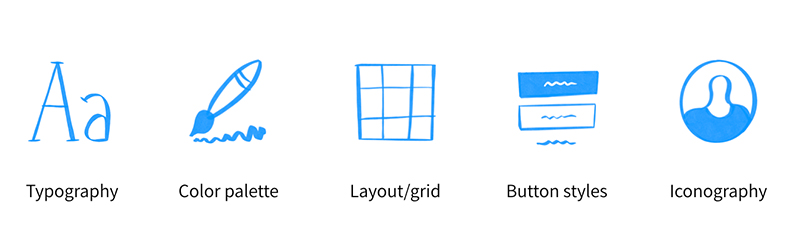
Style guide essentials.
Typography
Typography contains all the typefaces used in a product and the instructions for using them. Limiting the number of text styles and naming them consistently in design and code makes communication easier. For example, naming a text style according to its use (eg. Body, Caption, Button) is a good convention.
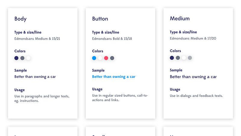
An example of defined text styles for the Whim app.
Color palette
The same kind of definitions can be applied to colors. Again, it’s probably a good idea to limit the palette – no one really needs those 50 shades of gray – and make sure the use of color always follows the same logic.
If, for example, bright red is used as an alert color, its use should be limited to that. Using too many colors incohesively will create confusion.
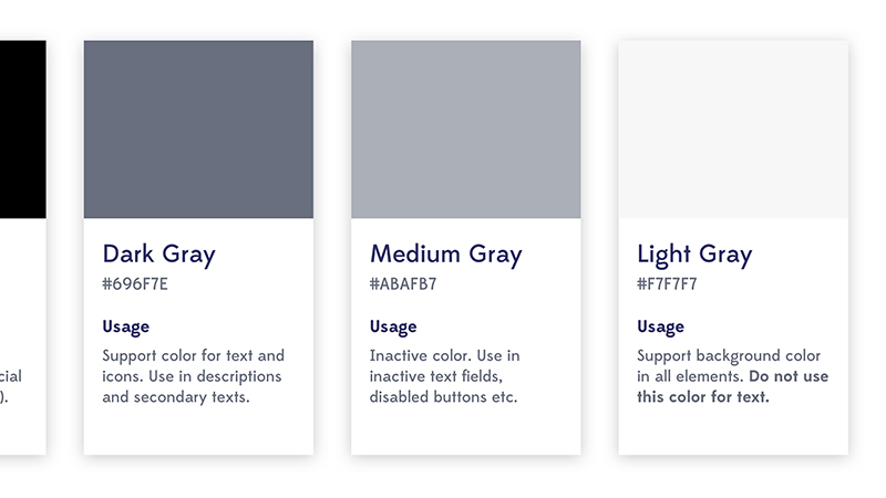
Whim and only 3 shades of gray.
Layout/grid
With responsive digital products, it’s critical to make sure the design looks good on all screens. You don’t usually need a drawn grid for every possible view, but it’s good to have some kind of logic behind the sizes and spacing of components. This logic can actually be built inside the components, saving the team from defining each component individually.
Button styles
Buttons have different states, styles and sizes depending on where they’re used. Listing all the button types with their correct colors, text styles and behaviors in the same place and following clear naming conventions will avoid a messy button hell.
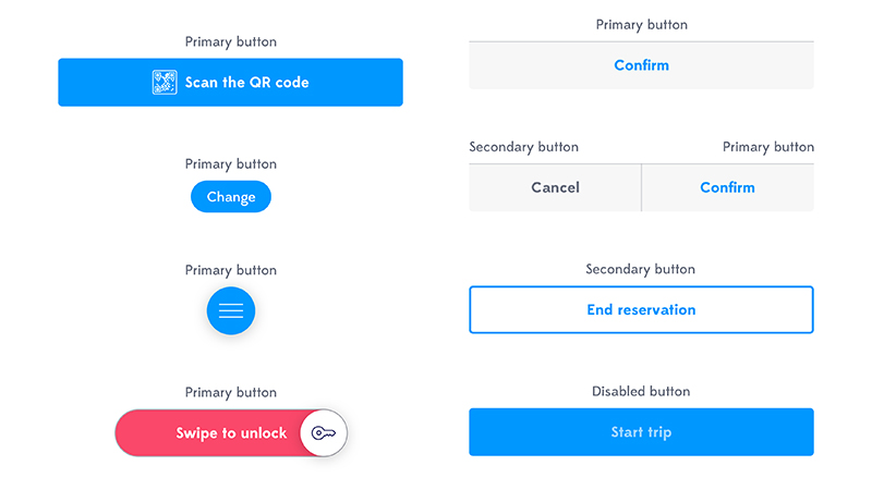
Whim buttons.
Iconography
Icons can have a significant effect on a product’s look and feel. If you draw your icons yourself ( to you, by the way), be consistent and make sure they all look like they belong to the same set.
If an icon has too many details or thin lines, it starts to look a bit wonky when scaled down. Test your icons in a few different sizes to make sure they remain recognizable.
If you prefer using icon libraries, such as Google’s Material Icons, don’t go overboard. Again, keeping things nice and simple will really make everyone’s life easier.
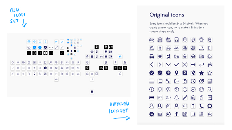
Streamlining the Whim icon library. All the icons have the same dimensions so they are interchangeable in the components.
TL;DR: Style guide
- Defines the styles used in your product, such as text styles, colors, icons, and buttons
- Makes design decisions visible to all team members
- Is especially helpful if and when there are new team members in need of onboarding
- Is not only for designers, as the whole team benefits from having visible guidelines
If you don’t yet have a component library, start building one
Every product – no matter how small – benefits from having a component library. Even the simplest applications have parts that appear in multiple views (e.g. menus, buttons and input fields). Keeping those building blocks in the same place, visible and accessible to everyone in the team will make creating new views and features easier, saving money and time.
“In essence, Component Based Design is the practice of splitting UI into smaller, more manageable parts with clear names.”
–How we’re using Component Based Design by Heavyweight
Most design software supports libraries (see also Ville’s post on design tools if you want to see some comparison). In Whim, the components are stored in a single library file in Sketch, and they all use styles defined in the style guide.
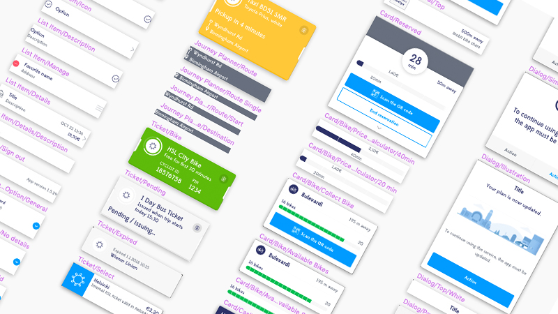
Whim components.
Recycle and simplify
Design should start inside the component library. Seeing all components in one place helps identify when a small update to an existing component will do the job, avoiding the creation of unnecessary, non-reusable elements.
A limited selection of components also drives the design towards simplicity, which can lead to significantly faster and easier decision-making. In Whim, this meant going through the library, merging similar components together and removing ones that were no longer in use.
Test to avoid surprises
Designed components should resemble their coded counterparts as closely as possible. Utilizing the design suite’s features – such as constraints – makes it possible to test how components behave when scaled. This way, the same components can be used when creating views for smaller or bigger screen sizes.
The components should also support varying contents, especially if the product is localized into different languages. Testing these scenarios in the design phase prevents surprises before things move forward to implementation.
For Whim, I used the Anima Toolkit plugin for Sketch to make sure every component supports scaling.
TL;DR: Component library
- Makes dev/design collaboration faster, better and stronger
- Improves visibility to what’s already been designed and what parts of the design can be reused
- Is just a really good general practice to follow in every digital project
Sources
https://www.toptal.com/designers/ui/ui-styleguide-better-ux
https://medium.com/@wereheavyweight/how-were-using-component-based-design-5f9e3176babb
https://www.toptal.com/designers/ux/why-startups-need-a-styleguide
Illustration: Aija Malmioja