Basics of SwiftUI Animation
Animating is quite different in SwiftUI than with UIKit.. While I consider myself quite fluent in UIKit animations, I still had to relearn almost every kind of animation with SwiftUI. The syntax is mostly easy to understand, but the logic is so different that it takes time (and nerves) to master.
Animating is quite different in SwiftUI than with UIKit. While I consider myself quite fluent in UIKit animations, I still had to relearn almost every kind of animation with SwiftUI. The syntax is mostly easy to understand, but the logic is so different that it takes time (and nerves) to master.
When I first started to learn SwiftUI with tutorials and such, I missed the customization possibilities of UIKit animations and felt like I was stuck with the few default animation types. But after studying SwiftUI, I have realized how different the logic is and learned to create more complex animations. Happily the most used animations are quick to implement and SwiftUI even creates some nice transitions for free.
Since SwiftUI views are state-driven, it makes sense that view transitions between different states are the most used animations. The most commonly animated parameters, such as opacity, scale, rotation, color and position are fortunately really easy to animate in SwiftUI.
For a state-driven animation, it usually means that the animatable parameter is changed from the old value to a new one. This also means that some extra logic is required if we want to animate it back to the original value, such as changing the state back after a delay with DispatchQueue.main.asyncAfter().
Two types of SwiftUI animations

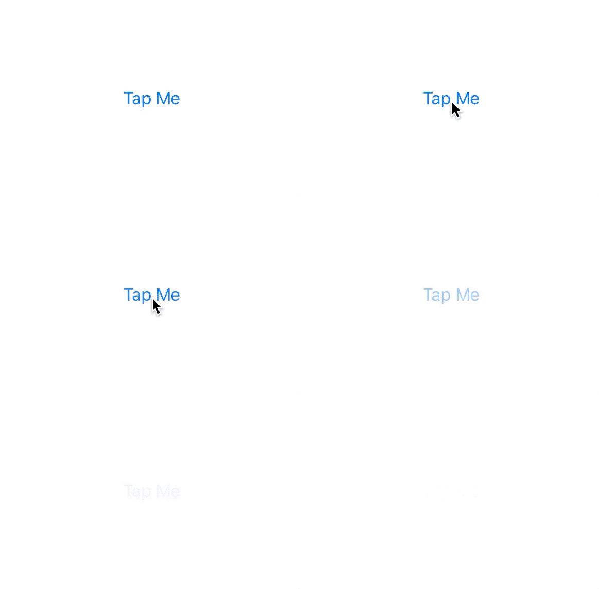
In the following example, a simple button is hidden by changing the opacity from 1 to 0 with a .easeInOut animation lasting two seconds. The hidden state variable defines the button’s opacity and the .animation() modifier specifies which kind of animation is used for the change.
struct ContentView: View {
    @State private var hidden = false

        var body: some View {
            Button("Tap Me") {
                self.hidden = true
            }
            .opacity(hidden ? 0 : 1)
            .animation(.easeInOut(duration: 2))
       }
    }
}
This is called an implicit animation. It’s the simplest kind of animation in SwiftUI and the modifier is used for any changes that happen within the view.
As the animation() modifier only animates the changes above it in the modifier stack, you can control the animation separately for each state change and create complex animations with multiple kinds of effects by using multiple of them. You can also disable animations for the changes with .animation(nil).
 The other type of animation in SwiftUI is called an explicit animation. It is defined with a withAnimation { … } closure, and only the parameter values changed inside the braces will be animated. This is useful if you want a state change to have a particular animation that is not defined in the affected views, like this spring animation to change the offset:
struct ContentView: View {
    @State private var hasOffset = false

    var body: some View {
        Button("Tap Me") {
            withAnimation(.interpolatingSpring(
                mass: 1,
                stiffness: 80,
                damping: 4,
                initialVelocity: 0)) {
                    self.hasOffset.toggle()
                }
        }
        .offset(y: hasOffset ? 40 : 0)
    }
}
The protocols behind all SwiftUI animations
All SwiftUI animations work as they do because of a protocol named Animatable. This protocol tells the framework how the value should interpolate from start to finish. It has a computed property named animatableData that has to be of a type that conforms to a protocol named VectorArithmetic.
This might feel a bit overwhelming and, for simple transitions and state change animations, you don’t usually have to care what happens in the background, since SwiftUI handles most modifier animations for you. Just keep in mind the type of the value that is changed:
- Types that conform to Animatable: Angle, CGPoint, CGRect, CGSize, EdgeInsets, StrokeStyle and UnitPoint.
- Types that conform to VectorArithmetic: AnimatablePair, CGFloat, Double, EmptyAnimatableData and Float.
If you animate something more complex such as a shape, transform matrices or colors in a gradient, SwiftUI does not know what to do so no animation is shown. In a case like this, you have to create your own animatableData implementation to describe how SwiftUI should render the frames in between. With a bit of extra work like this, you can animate nearly anything you can imagine.
AnimatableModifier is a powerful protocol that conforms to Animatable. It is used as a view modifier and can therefore create even more complex animations using multiple view types.
For animating transform matrices, you have to use a protocol named GeometryEffect that conforms to Animatable and ViewModifier. You can animate any kind of complicated geometry transformations and combine as many of them as you want with this protocol.
Synchronizing views with MatchedGeometryEffect
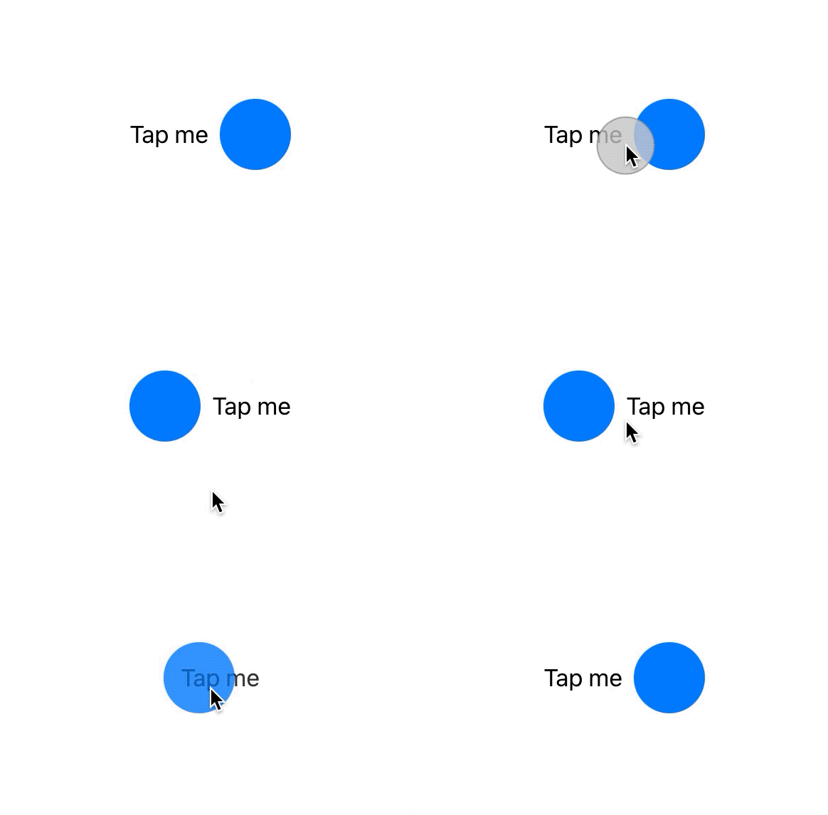
The new iOS 14 added a cool new matchedGeometryEffect() modifier to SwiftUI. This is useful if you want to animate a view’s transition to a different part of the same view hierarchy.
Before iOS 14, it would’ve been very hard to animate views with an effect that makes them appear to be the same, but the new modifier makes it easy. You only have to add the modifier to the views with a matching identifier to synchronize them and add a @Namespace property wrapper to create a global namespace for all the views:
struct ContentView: View {
    @Namespace private var animation
    @State private var isFlipped = false

    var body: some View {
        HStack {
            if isFlipped {
                Circle()
                .fill(Color.blue)
                .frame(width: 50, height: 50)
                .matchedGeometryEffect(id: "Shape", in: animation)
                Text("Tap me")
                .matchedGeometryEffect(id: "Text", in: animation)
            } else {
                Text("Tap me")
                .matchedGeometryEffect(id: "Text", in: animation)
                Circle()
                .fill(Color.blue)
                .frame(width: 50, height: 50)
                .matchedGeometryEffect(id: "Shape", in: animation)
            }
        }
        .onTapGesture {
            withAnimation {
                self.isFlipped.toggle()
            }
        }
    }
}
 In this example, both the text and shape have their own identifiers to match them with similar views within the if-else statement. IsFlipped state then determines the content of the stack and the changes are animated accordingly.
Another purpose for using the matchedGeometryEffect() modifier is synchronizing frame properties within multiple views that are all simultaneously part of the view hierarchy. For this, you would use the following additional parameters:
- properties for choosing whether synchronized views should match size, position or both;
- anchor to specify the relative location of the matched view; and
- isSource to specify the source view providing the geometry.
Improving rendering performance
SwiftUI uses Core Animation for rendering by default, and its performance is great for most animations. But if you find yourself creating a very complex animation that seems to suffer from lower framerates, you may want to utilize the power of Metal, which is Apple’s framework used for working directly with the GPU.
By adding the .drawingGroup() modifier to your view, you tell SwiftUI to render the contents into a flattened image with Metal before showing it. This happens extremely fast and, while it can be tempting to use often, should still be used sparingly as it can slow down SwiftUI in simple drawing.
Where to start?
If you want to get into SwiftUI, the best way to start is finding some nice tutorials. I highly recommend this extensive collection by Hacking with Swift. It includes a lot of animation tips and tutorials and was the biggest help for me when learning SwiftUI.
After you have gained some understanding of how SwiftUI and its animations work, you should try to create something of your own and try out some of the more complex animation techniques. Here are some additional links I have found helpful:
- Medium – 2 Must-Know Protocols for SwiftUI Animation
- The SwiftUI Lab – Advanced SwiftUI Animations
- The SwiftUI Lab – MatchedGeometryEffect
The amount of SwiftUI support and solutions online is currently very limited (simply because it is so new), so learning and problem-solving can be a significantly slower and, at times, tedious process. Keep this in mind, as it can occasionally be better to just rethink your design or resort to UIKit.
Illustration: Joel Pöllänen


