OTAVAMEDIA
Kaksplus.fi – The most unique media for families in Finland
Kaksplus is the oldest Finnish parenthood-focused consumer brand, which has a long history of providing journalistically high-quality and reliable content. Its website delivers diverse content on all themes helpful to parents, families and the ones dreaming of it. The Kaksplus site engages a user base of millions of parents, parent-figures, and family-minded people. Its business model relies mostly on display advertising.
In autumn 2022 Kaksplus media faced a challenge: visual identity had become old-fashioned and gendered. The brand didn’t really inspire confidence or stand out from its competitors. The ads and redirects on the page disrupted the reading experience, causing readers to lose themselves in the diverse content. Despite playing an important role on the site, the ads mainly irritated readers and impeded the user experience. Readers in different life situations found it challenging to navigate to content that was relevant to them.
Otavamedia wanted to renew its Kaksplus brand completely. The emergence of artificial intelligence and the efforts of Meta and Google to direct less traffic to media sites in the future have raised concerns about reduced traffic. To tackle this, the focus was on strengthening the Kaksplus brand and taking steps to direct an increasing number of people to the site directly. This approach aimed to enhance brand awareness and increase the site’s visibility, ultimately driving more traffic and engagement.
“The site seems credible. Its written with good Finnish. It’s clearly presented when the content is an individual’s opinion and when it is an actual article.”
A quote from a test user
The new Kaksplus website is based on deep customer insight
Together the Kaksplus team and Qvik, designed a total renewal and created a modern, solid, expressive visual brand for Kaksplus. The focus was particularly on targeting the content more effectively and planning the advertising spots to improve the user experience. We set out to respond to these challenges using service design methods. However, the service design project was spiced up with business design methods as it was planned and facilitated by Qvik’s business designer.
In the future, Kaksplus will introduce a new section for logged-in users. This section will feature content and advertising tailored to user profiles identified during this project, aiming to provide the right support for families in various life situations. The identified user profiles will assist in content planning and timely targeting, ensuring that Kaksplus can effectively cater to families in different circumstances. The attractiveness of targeted advertising spots to advertisers will increase even more. This is due to the customization of ads based on specific customer interests that we found out during this project.
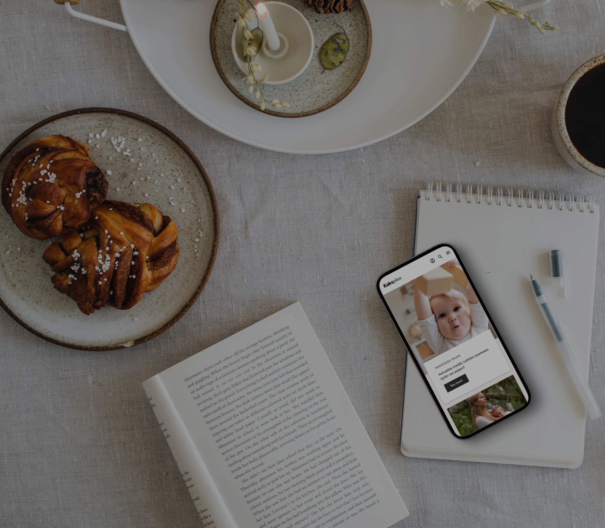
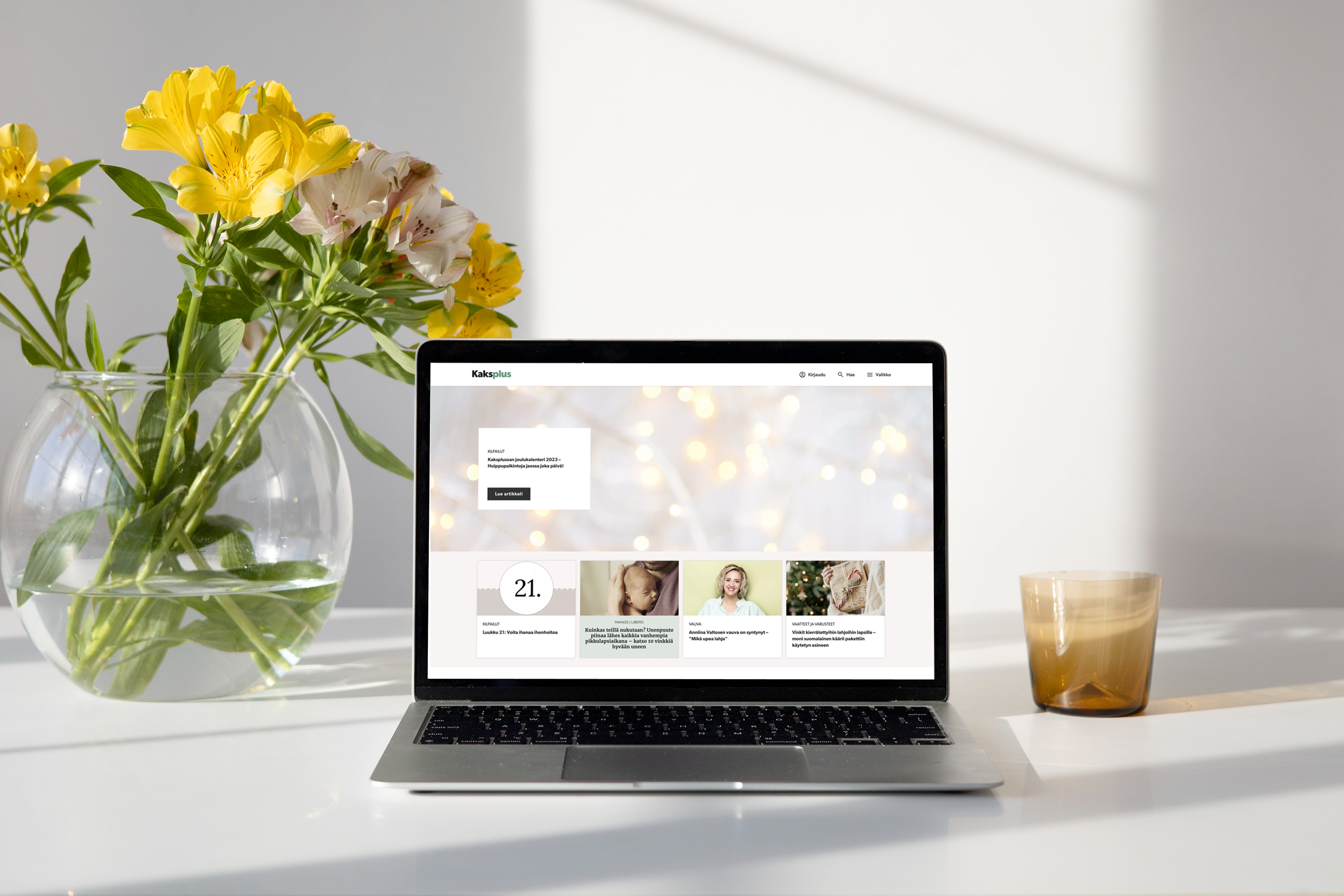
The new Kaksplus site was released in September 2023. The renewal has received good end customer and advertising customer feedback. Customers have received the renewed site as clear and modern. Based on current numbers, it seems inevitable that the investment will yield the desired returns.
Link to the renewed Kaksplus site: https://kaksplus.fi/
Project highlights
- Well-defined project plan and definition of done to enable smooth collaboration
- Applying a business-oriented mindset to a service design project
- Developing new customer segmentation by utilising a need-based approach
- The work done in this project serves also the long term goals
- New value propositions created and business models ideated
- Browsed to the end of the content +30%
- Avg.time spent on site +20%
- growth in newsletter subscribers +20%
- Page bounce rate decreased by 19%
+30%
Browsed to the end
+20%
Avg. time spent on the site
+20%
Newsletter subscribers
19%
Decrease in bounce rate
Strategy
Enabling success
Expectation management regarding the project and collaboration between Kaksplus and Qvik teams were handled with precise project planning and creating a document that defined the “Definition of Done” for each phase of the project. The power of utilizing these essential tools is often underappreciated. These tools enable smooth collaboration between teams, as everyone knows what kind of outcome to expect at each stage.
Project Plan

Definition of done
The definition of done that was created includes in a written format all the outcomes that will be produced in a certain phase, including the number of iteration rounds. Also, restrictions explaining what kind of outcomes are not included in the work.
Example of User testing DoD
- We have tested the concept once(1) with a Figma prototype with five(5) test users
- We test both the usability and the concept itself
- Kaksplus team is responsible for choosing and contacting the test users from their customers and sharing the contact information with Qvik
- Kaksplus is responsible for getting the reward for the test users
- Qvik team schedules the test sessions with the test users
- Qvik team conducts the test sessions online or face-to-face, depending the test users preference
- Qvik team conducts one(1) analysis of the test results
- Analysis will be presented to Kaksplus, and the presentation will be shared with them
Restrictions
- If more than five (5) user tests are requested, it is additional work and will be charged separately
- If Kaksplus wishes to get more than one(1) analysis of the user test results, it is additional work and will be charged separately
The DoD’s were created for each stage of the presented project plan. Our gut feeling is that this significantly affected the success of the project.
Service design project with a business design orientation
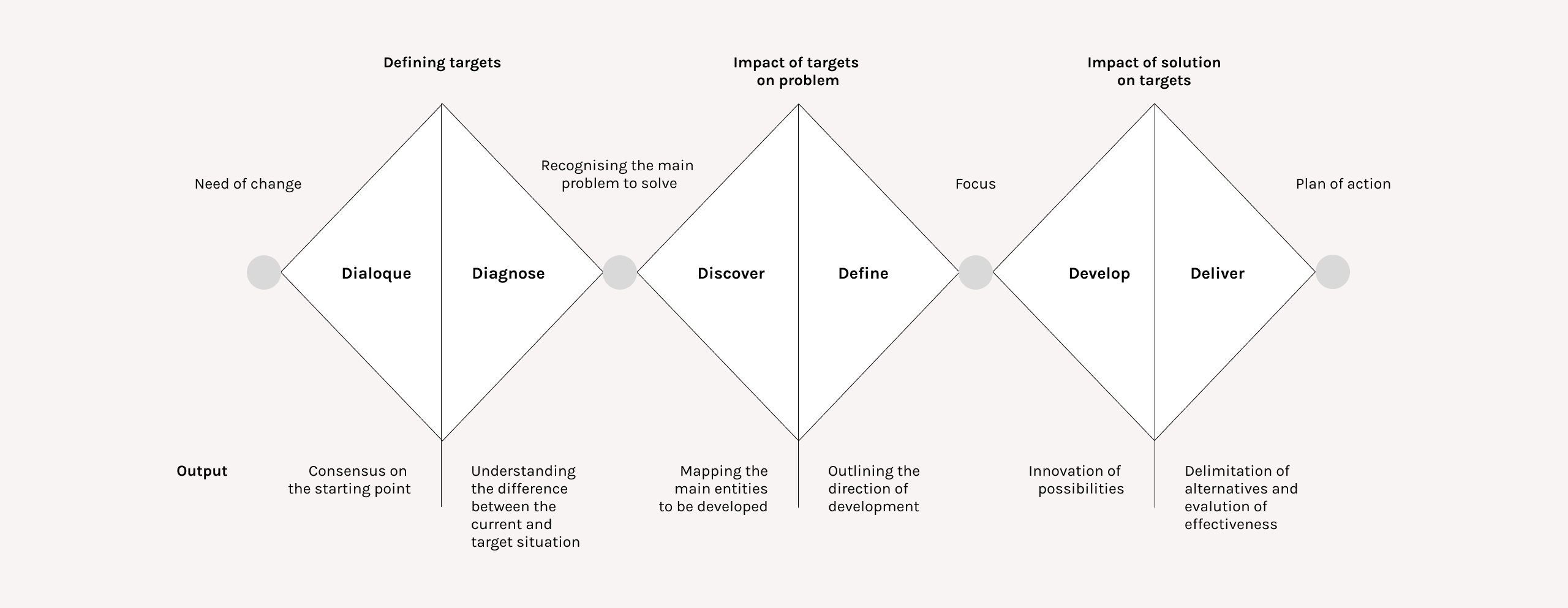
The framework we applied in this project is the Triple Diamond. We chose to use this model as it emphasises the value to the business more than the traditional Double Diamond model.
The Triple Diamond approach is a modified version of the Double Diamond process popularized by the British Design Council in 2005. The added phase includes analysis of the current state, understanding the need for the change, and exploring the problem and the future possibilities.
The business design method we used for clarifying strategic goals and focus operations to meet strategic goals is called Balanced Scorecard. The Balanced Scorecard was originally developed to provide a comprehensive view of organizational performance to enable effective strategic management (1992, Drs. Norton and Kaplan).
We utilised the scorecard at the beginning of the project to understand the need for the change, and the target-level for the future. The idea was to understand the direction of the change, rather than focusing on specific numbers. In our Refined Scorecard, we extended the objectives to both short-term and long-term, and included key objectives, measurement, targets and solutions in the board.
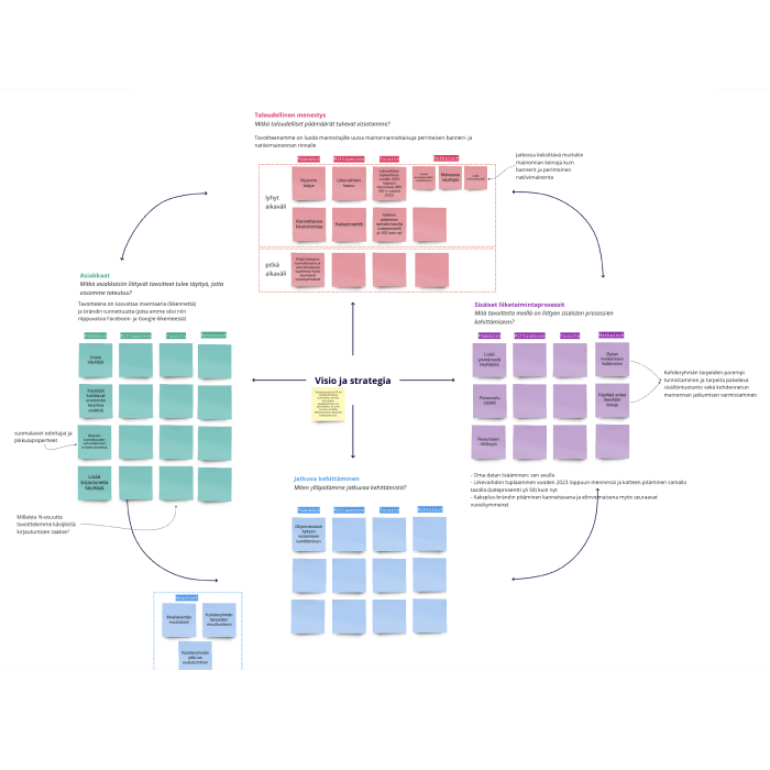
With this tool the Qvik’s team helped Kaksplus to consider their objectives related to
- Customers (end-users and advertising customers)
- Financial measures
- The business processes they should excel at
- Organisational capacity, how to measure the success internally
Survey to fill in the gaps
The project continued with developing customer segments. We analysed current data of customers and created prospective user segments based on their needs, and hypotheses of value proposition for each segment.
The Need-based user groups we found out at this point
- Expecting first child
- Parents of one child
- Parents of multiple children
- Grandparents / bonus parents
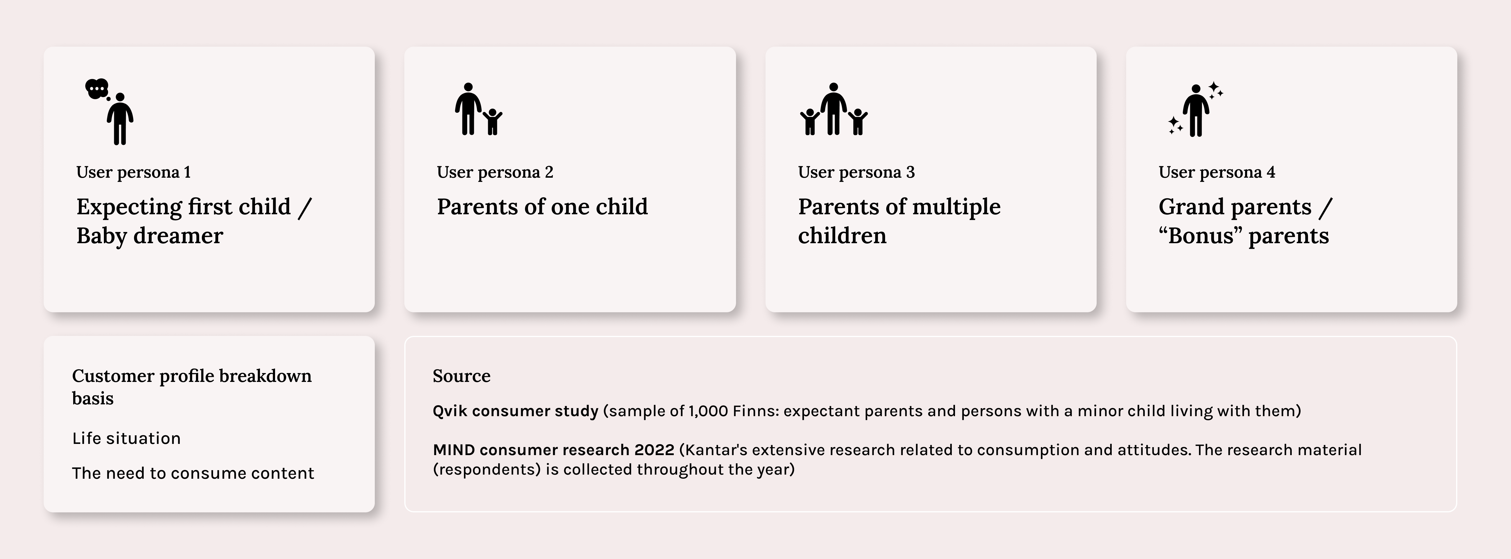
Qvik’s data-driven design ideology matched Kaksplus’ vision to base its new concept on customer insight. The project had a clear foundation in customer research from the beginning, and together with the Kaksplus team, Qvik agreed that it would be beneficial to carry out a large-scale consumer survey to test our hypotheses of customer needs. Together, we workshopped to ensure the correct outcomes from the survey in order to fill-in the gaps we had about Kaksplus customers.
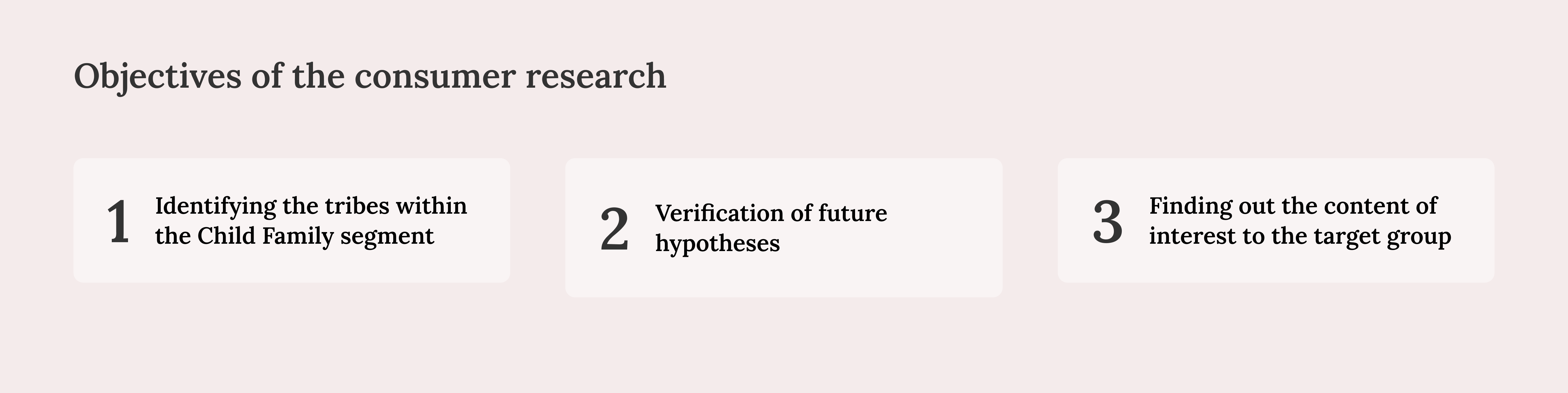
The consumer survey focused on the prospective user segments and was completed in a pool of nationally representative respondents aged 15 to 75, provided by Qvik. The Kaksplus survey raised 1,000 responses in total.
The team conducted analyses for each segment, and the most exciting content categories, channel preferences, and attitudes toward media were explored, among other themes.
The data served as direct input for design work, which aimed to re-imagine how the Kaksplus website could best address customer needs.
A Joint workshop – A strong value proposition and new business models
Next, the team entered the business and concept design phase to establish the final vision and outline for the service. To clarify Kaksplus’ competitive advantage, we further refined the value Kaksplus will be offering in the future, and how to distinguish the media from the competitors.
We did this in a joint workshop where we went through the current state of the Kaksplus media and set goals for the future and the renewed visual appearance.
The goal for the workshop was to find out
- What are the goals for renewing the digital customer experience of the Kaksplus brand?
- How does the redesign best serve users and business customers?
- What strengths are emphasized, what challenges need to be solved?
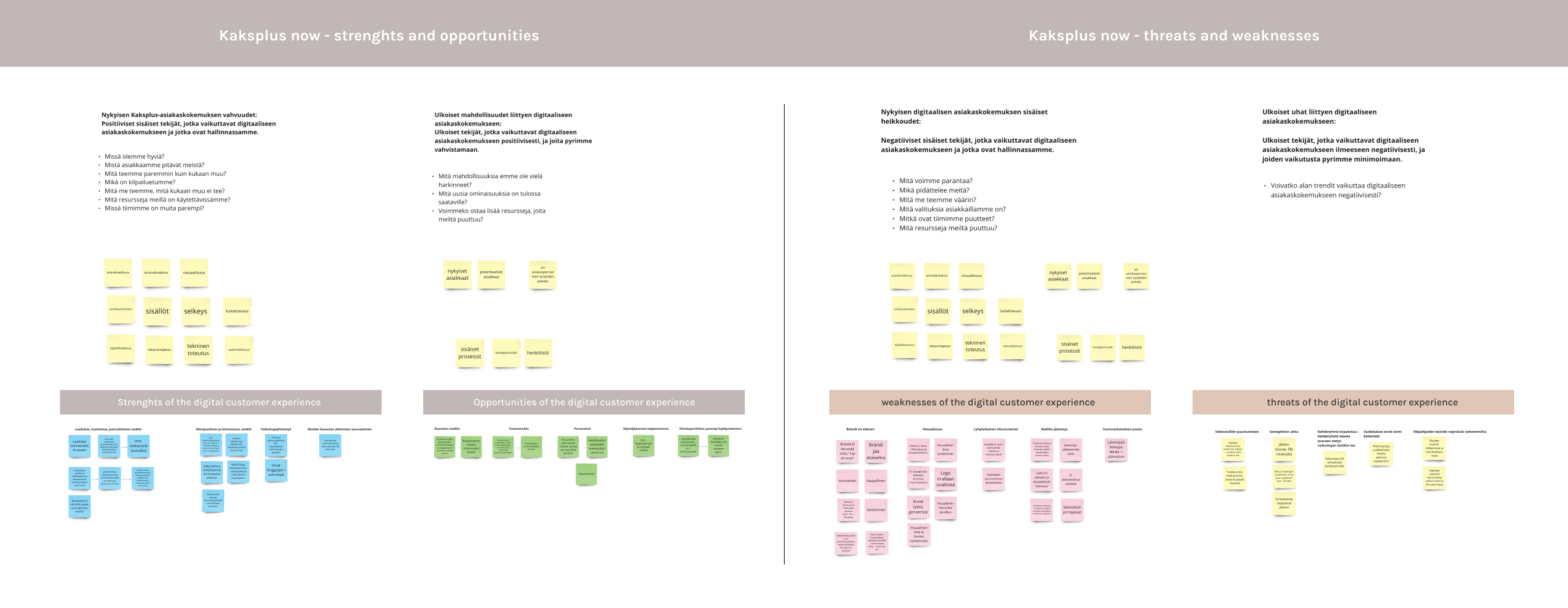
For informed decision-making and strategic planning, we utilised a strategic management technique called SWOT analysis to identify the current internal strengths and weaknesses of Kaksplus, and external opportunities and threats. This exercise also helped us to explore new, complementary ideas for the business model to expand the reach of the soon-renewed Kaksplus brand.
The benchmarking of digital customer experience was focused on the performance of Kaksplus’ competitors, and other examples of successful visual designs. We investigated what works well and what does not. Is the visual appearance successful, and where does the success come from?
Value proposition model
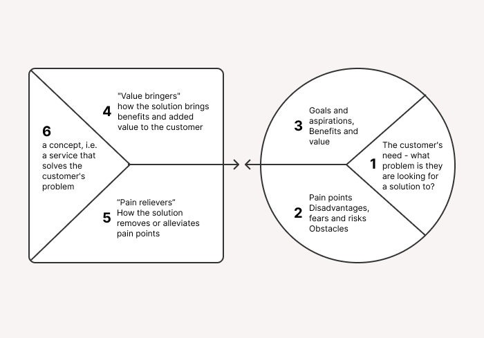
Based on the insights from the consumer study, the team clarified the value propositions to assess the perceived value generated by the service and what pain points are associated with its use. Besides our four primary user segments, we clarified the value proposition for corporate clients.
Based on the value proposition, we formed a brand promise. The brand promise targeted towards customer profiles describes the unique value that the service provides to each profile. The brand promise is:
Kaksplus is the most versatile parenting media in Finland, offering information, support, and great stories for the unique stage of life. Kaksplus accompanies its readers on the path of parenthood and makes family life even better.
Lastly, to ensure we agree on the future target state, we mapped out the goals for the visual identity and goals for the renewal overall. These included for instance what goals are associated with the new visual identity, how are the user segments taken into account in the design, and how do our goals connect to the brand promise.
Towards tangible service
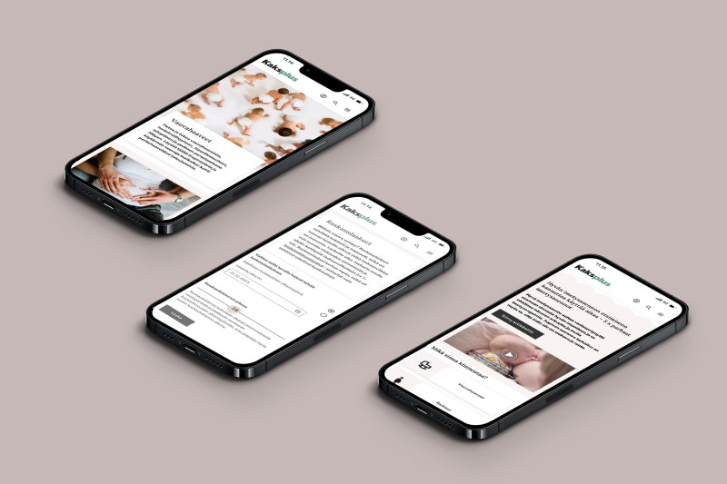
Visual identity
Otavamedia wanted to keep the Kaksplus brand independent. The new visual look did not have to refer to Otavamedia’s main brand. The goals of the visual identity were defined in a workshop with the project team and were described with the following words:
- Premium
- Modern
- Positive
- A step towards gender neutrality
Qvik presented three alternatives for the new visual identity to Kaksplus’ team. One of them was chosen for the continuation.
Modern look was created with contrasts
- Contrast of sizes, visible in the use of fonts
- Contrasts in the color values, heavier colors brought next to light ones
- Contrast of forms, using photos next to vector graphics
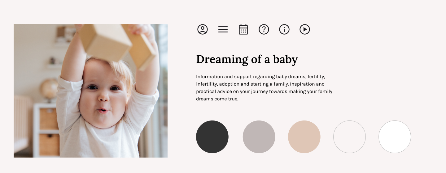
We took a conscious risk by keeping light pink in the new color palette. We thought carefully about the right tone, because with the redesign we wanted to get rid of old-fashioned parenting references.
The image style of photos is soft, because Kaksplus is a family-oriented brand. A shallow depth of field was used in the images to achieve this effect. The main object of the pictures is clearly visible while other parts of the picture are blurred.
We also took a stand on the composition. The judicious use of empty space helps the user to visualize the different parts of the page more easily and keeps the overall look light. The airy composition creates an image of a premium service.
In conclusion, Qvik and Otavamedia were able to create a cohesive brand that appeals to the target audience from every angle. The new visual identity aligns perfectly with the core values of Kaksplus’ new concept.
Target groups as the starting point for the site’s structure
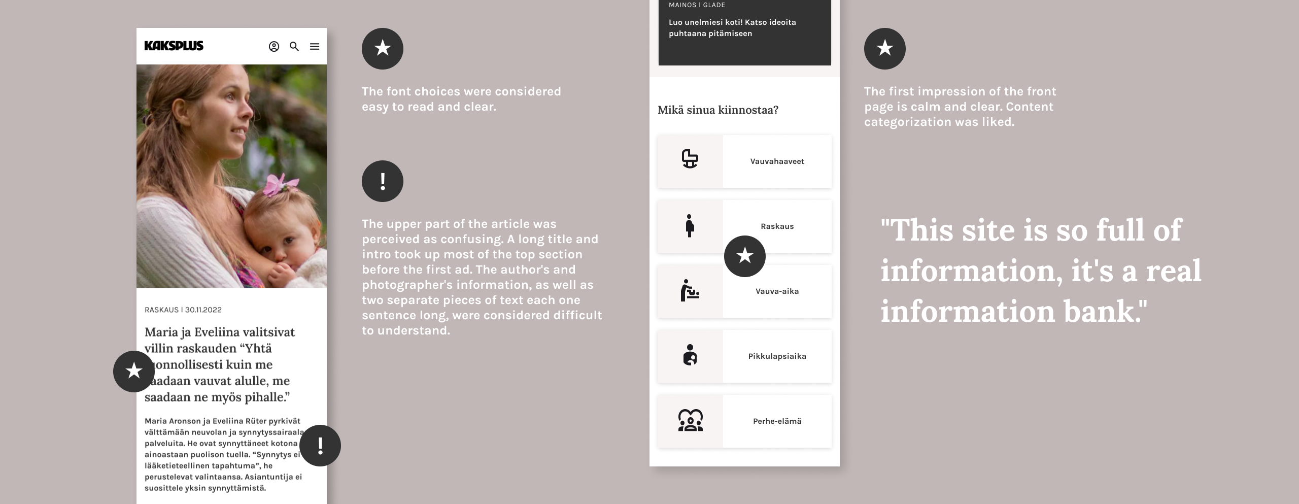
Qvik and Otavamedia wanted to follow a holistic design process and build the new service firmly on insights. Furthermore, we wanted to take advantage of collaborative design practices. Since one of the specific challenges with the old site was its confusing navigation, the team decided to renew the Kaksplus site’s information architecture completely. The content structure was co-designed with customers to improve user experience and to allow easy discovery of new content.
We organised the parts of the site by target groups. After this change, the site became easier to understand and information was easier to find. Kaksplussa’s credibility as a reliable and high-quality source of information is strengthened when the site is clear and easy to use. Users are also more likely to return to the site and use it longer when the service is easy to use.

Identifying target groups helps Otavamedia immediately in targeting and selling advertisements. The identified target groups will also appear in the long-term goals, when Kaksplussa’s website will have its own section for signed in users.
During the project, the cooperation with Qvik’s and the Otavamedia’s team was close. We held e.g. weekly working meetings with Otavamedia’s editors, a graphic designer and Qvik’s designers, where we worked on the concept together on a practical level.
User testing with prototype
The new website concept and visual identity were tested with users. Based on the observations, we made the necessary changes to the designs. We also compiled recommendations for Otavamedia for further development of the site.
Foundation for design system
Finally, the team performed some foundational work for a new design system. This ensured that the client would be able to systematically execute the new visual identity in the future, too. Atomic Design principles were chosen as a suitable foundation for the new design system. Additionally, Qvik mentored Otavamedia’s in-house designers to independently develop the system further.
Implemented with good taste
Although the team created numerous design assets as output, both Qvik and Otavamedia’s primary interests were in the actual impact of the changes. Kaksplus is actively monitoring the outcomes of the renewed site and gathering feedback from customers through a feedback form available on the site. Based on the traffic to the site, some changes have already been made. Due to high reader demand for specific calculators such as ovulation and pregnancy calculators, Kaksplus created a dedicated content block for those on the front page alongside articles.
The technical implementation of the website is made by Hion. It’s great to see the site has developed smoothly since the concept plan handover. This shows that the design team succeeded in communicating the principles and goals of the design forward.
Link to the renewed Kaksplus site: https://kaksplus.fi/
The team
Kaksplus
Annina Pennonen
Editor in Chief
Anna Huuhtanen
Product Manager
Maria Mäkituomas
Content Creator
Anniina Rintala
Content Creator
Hanna Sirén
Senior Specialist
SEO, Analytics
Vesa Tuukkanen
Art Director
Riku Österlund
Project Manager/
Head of Design and Technology
Jaana Nyström,
Project Manager/
Head of Business IT
Qvik
Katariina Helin
Business Designer
Miia Karjalainen
Senior Product Designer
Anu Vuokko
Product Designer
Marjo Kujala
Design Lead
Juha Falck
Sales Executive
Jerry Lindholm
Account Manager
Hion
Ville Viklund
Senior Developer
Hermanni Piirainen
Senior Developer