Customer
Riksinsamlingen för Världens Barn
Scope
UI-design, UX-design, web development, content structure, accessibility
For children’s rights around the world
For children's rights around the world
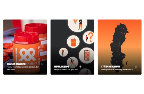
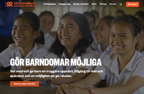
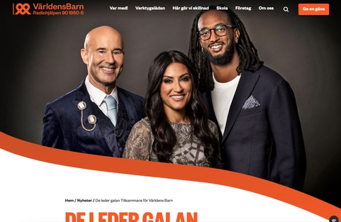
Världens Barn is Sweden's biggest campaign for children's rights around the world. Their primary goal is to inspire and motivate people to participate in fundraising that ultimately helps create a better future for children. The activities throughout the year culminate in a large gala broadcasted live on television. We designed and developed the new campaign site that had a clear purpose – it would be inspiring and engaging!
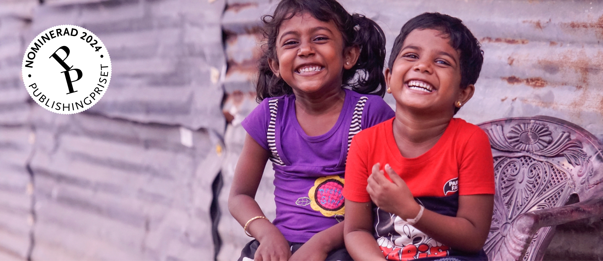
This project won gold in the Publishingpriset 2024 competition in the category "Marketing Websites for Associations and Organizations."




Goals of the website
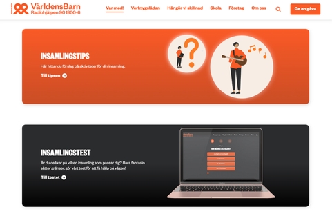
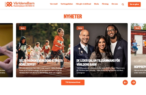
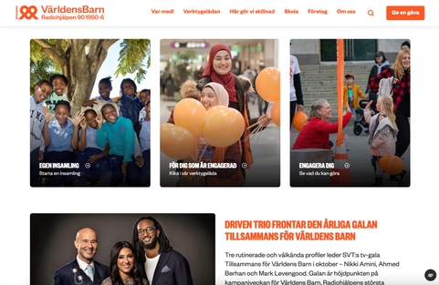
Världens Barn has a wealth of important content to share with its visitors. Since its target audience includes schools, companies, associations, and individuals, the volume of information is substantial. It was essential to present this information in an inspiring and enjoyable way, ensuring that visitors can easily find what they're looking for.
Engagement through interactivity
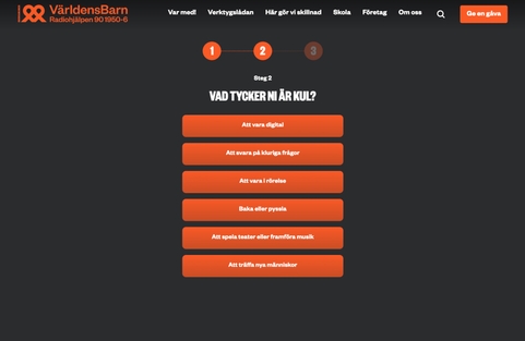
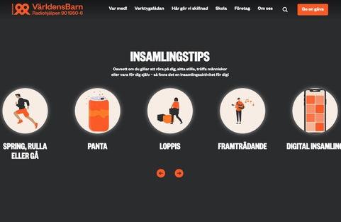
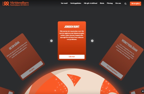
We wanted to make absorbing information an exciting process. Therefore, the website is full of gamified interactive elements, inspired by how games engage users. The goal is to make visitors have fun and become curious – encouraging them to stay longer and engage with the content.

"Tobias and Sigrid from Världens Barn gave me so much creative freedom to experiment with animations and features. I felt truly empowered to be creative and let ideas flow."
Josefin, suunnittelijaCondensing information
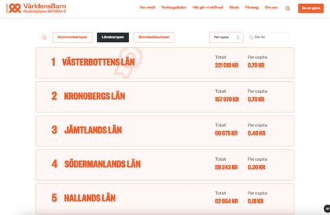
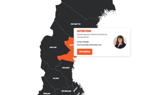
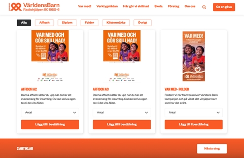
Världens Barn contains a lot of text-heavy content, such as long lists for finding regional coordinators, municipality codes, and contact details. In the design, we focused on visualizing information, condensing long lists, and only showing relevant information to the reader.
Instead of making visitors scroll through long lists, we turned lists into interactive sections where you get relevant information based on the details you enter. The same method is used repeatedly, so users learn to receive customized information based on their needs.
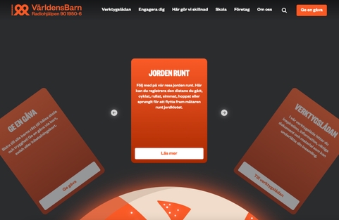
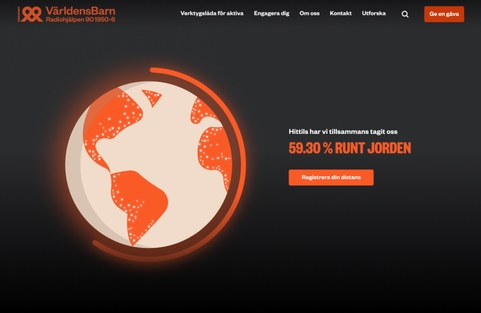
Jorden Runt is a fundraising campaign in which users log the distance they’ve traveled and donate a corresponding amount of money. Previously, there wasn’t a way to visualize the results, so our designer created an animated globe with a progress bar to encourage users to participate.
Instead of simply listing what different donation sums can achieve, we made a slider where the user is presented with different projects depending on the sum they choose. The sliders make the content more engaging and prevent users from merely scrolling through it.
When users enter their municipality, we can display the relevant information for their area without requiring them to scroll through a long list. This method of condensing information is widely used throughout the site.
Development
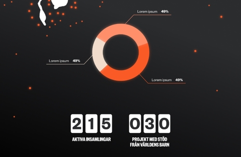
In addition to allowing visitors to follow and participate in Världens Barn's important work, visualization of statistics was needed for partners and employees. Part of the development work involved enabling the reception, processing, and categorization of data, covering everything from Swish donations to schoolchildren's participation. This was designed to be as automatic as possible. The website was built using Gatsby.JS and WordPress as a headless CMS.
