
Terveystalo.com is now clean, simple and smooth on any device
Terveystalo is going through a full digital service shake-up
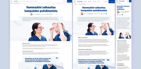
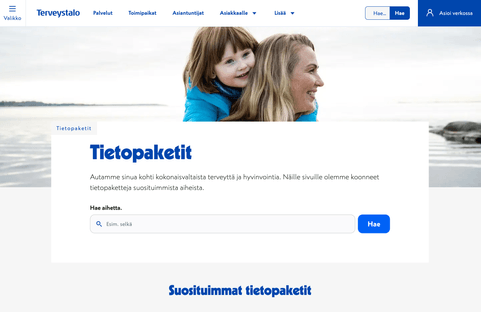
The flagship of its new digital offering is the new Terveystalo.com website, which also brings Terveystalo’s design system into use, laying out the blueprint for all aspects of the company’s digital presence.
Terveystalo is Finland’s largest private health care provider, so its customers justifiably expect only the best. The quality and user experience of digital services are essential to building trust.
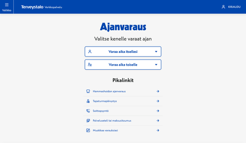
Terveystalo has given its customers plenty to be happy about lately: the health giant has overhauled its booking system, improved its e-doctor services, spruced up its brand and launched a more accessible website that serves customers better. What’s more, Terveystalo has tied all of this together with a comprehensive design system.
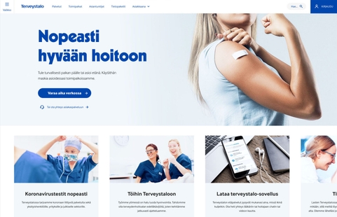
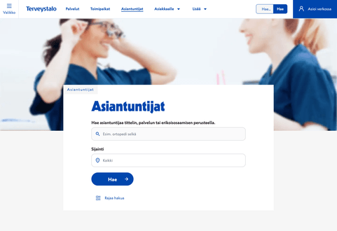




Qvik’s Senior Product Designer Jukka Forsten had a strong hand in designing the new website and building the design system.
“Jukka takes a positive, active role in the projects”, says Sami Hyttinen, the product owner of Terveystalo.com development.
“If the project gets tied into a knot, Jukka will quickly come up with a handful of solid suggestions on where to start unraveling it. That’s very much how I like to see people bring their professional skills and vision into play.”
A new site design based on easy-to-use blocks
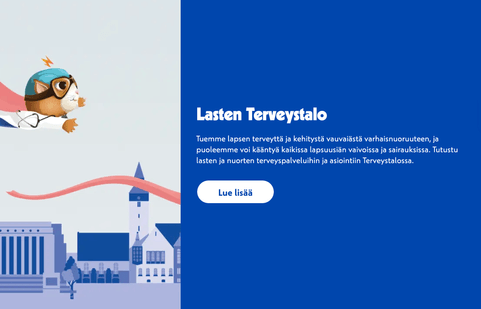
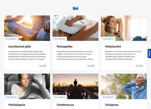
The new website is modular by design, with each page built out of blocks. This design makes updating content easy whenever the need arises.
“In comparison, traditional website design typically starts with creating a template for every page you need”, Forsten says. “But our approach was different: we created a number of different content blocks to make it easier for the creators to build entirely new pages for every conceivable need.”
The web project is constantly churning out new components for Terveystalo’s common design library. If a component could be useful in more projects than just the website, such as Terveystalo’s appointment booking system, it will also be written out in code. The blocks also come with the correct size and break point versions built in.
Content blocks can also be found from Figma’s asset library. Breakpoint versions use Figma’s Variants functionality.
“When the need for a new page crops up, we can start the project by looking at the blocks we already have in use”, Forsten says. “If none of them fit, we can then create completely new blocks and make them immediately available to everyone.”
Each block is an independent unit that scales according to its own rule set. In other words, there is no need to define page-wide scaling. The blocks make things like landing pages, and other pages you need at short notice, easy to implement.
A lot of work was also done under the hood to bring Terveystalo.com up to today’s technical standards. For example, we deployed the latest update for Optimizely’s (formerly known as Episerver) CMS platform.
A design system harmonizes all digital services and improves internal efficiency
It is vital for the digital customer experience that all digital services look the same and follow the same logic. As a bonus, a coherent look and feel also makes it easier to tell fake sites from the real thing.
“A design system has a huge impact on service uniformity”, Hyttinen says. “A well-running design system also eliminates a lot of unnecessary work, since different teams don’t have to spend time on thinking about the same thing any more.”
The design system was developed in pace with the website update so that everyone automatically got access to all components.
“What’s really great about this is that we can now do continuous development”, says Hyttinen. “We don’t have to get everything ready at the same time and can proceed gradually.”
The beta version of Terveystalo.com was launched in an early stage
As the site got launched and visitor numbers started growing, the development team got more and more data on which choices work and what could still be improved about the new site.
“That improves the efficiency of development, and we are able to meet our customers’ needs even more precisely whenever they need reliable information or help with health issues”, Forsten says.
In addition to Terveystalo.com and the design system, Qvik is also involved in the renewal of Terveystalo’s occupational health care services.


