The modern and easy way to get your train tickets
VR ticket vending machine is the modern and accessibility standards fulfilling ticket booking service for the national railway service in Finland. Thanks to the devoted multi-vendor team, hardware quickly found its place in the tough Finnish environment and in the hearts of hard-to-please customers.
In 2017, when the road towards a new ticket booking experience started, VR was struggling with aging physical machines as well as increasing complaints from customers. The journey officially took off in late 2017 with Qvik focusing on data-driven design and user testing. The first pilot was launched for test use already in March 2018.
Breaking the Silos
The key to the effortless user experience is striking a balance between the main use cases, the context of a busy train station, and designing the service as accessible as possible.
Breaking down silos was essential. Bringing people together to workshop and ideate helped the designers to find the problematic root causes and craft a viable solution that delights both end users and the people behind the service.
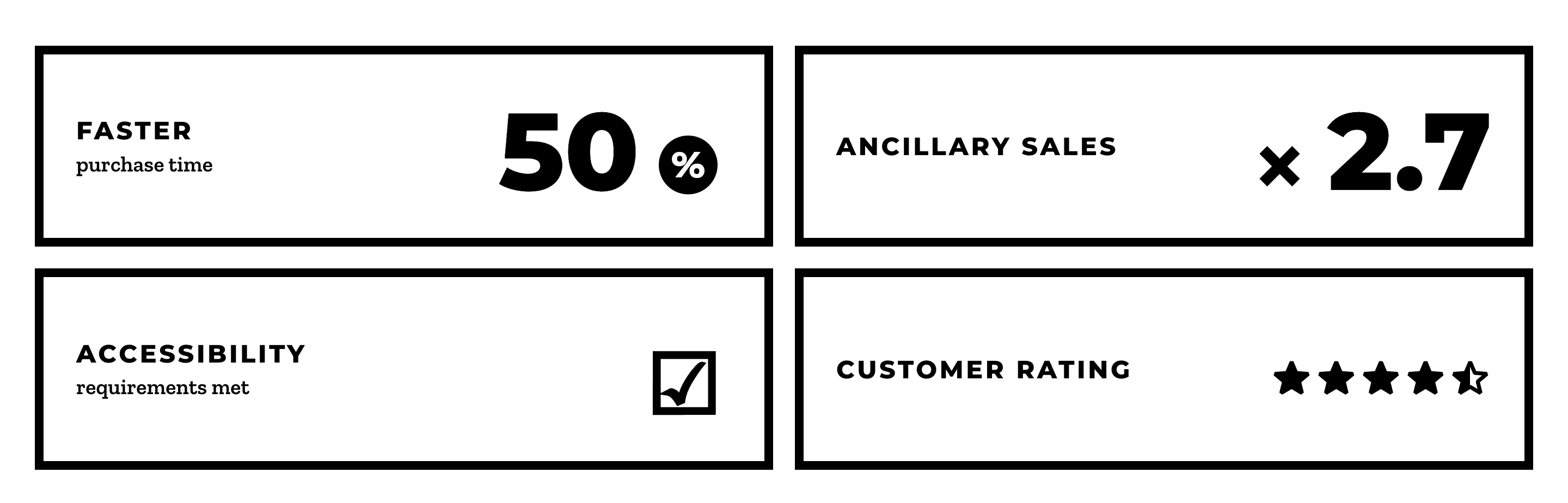
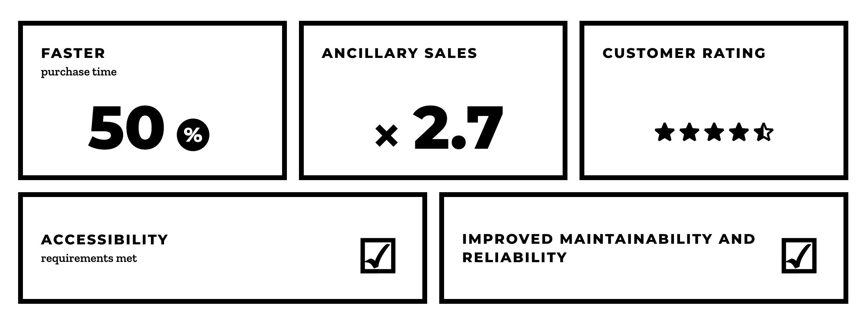
Our goals were simple: The machines should be more pleasant than the old ones. The average transaction time should be faster and it should do a better job at selling extra services. The modern touch screen should be used to make the machines accessible for every user.
VR’s brand renewal made it possible to take accessibility into account right from the beginning. Fine tuning UI elements, interactions, typography, motion design and colours went hand in hand with the new brand that was starting to take shape.
The machines would focus on the essential. The context for a ticket vending machine is very different from mobile and web booking services and this is reflected in data. For example, over 95% of tickets were for a same-day departure and 99.5% of the tickets sold were one-way tickets.
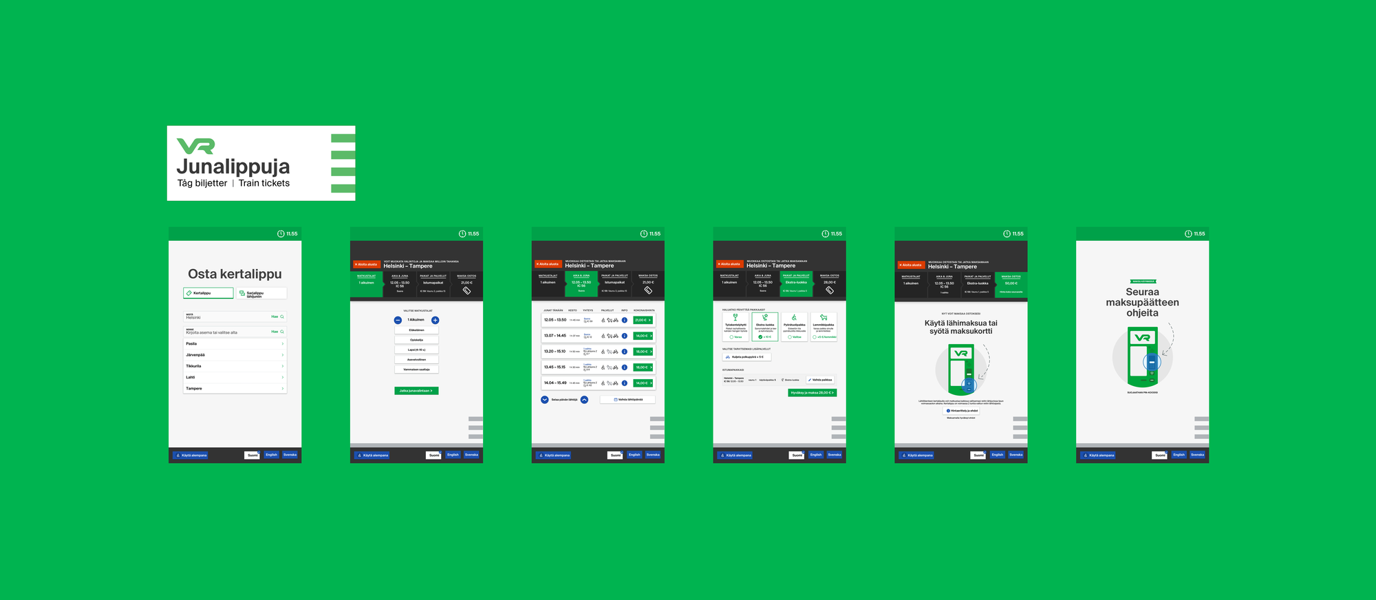
We started building the purchase flow from the customer’s perspective. The new user interface enables most users to purchase their ticket to the next train in just three taps.
Making It Easy
We wanted to make the service as accessible as possible, knowing the machines would be serving around the nation. Designing and building a robust software infrastructure that supports the UX design goals and gets the most out of the chosen hardware was just as important.
Data-driven service design
We wanted to find a true win-win situation: customers should have an easier way to book what they want and sales should increase. To achieve this, we conducted extensive sales data analysis. We needed to figure out the best destination stations to be shown on the front page, the best products to include and the most relevant extra services to recommend.
We studied the previous generation of machines and the aim was to avoid repeating their mistakes. This was possible by using contextual inquiry and interviews, usability testing and usability inspection as methods. Human sales agents were interviewed and observed to understand how passengers actually communicated about their ticket needs and what was the natural flow of buying a ticket.
Summary of the research phase
☑ Contextual inquiry☑ Customer interviews☑ Expert interviews (sales agents, station information staff)☑ Stakeholder interviews (conductors, revenue managers etc.)☑ Usability inspection for the old machines☑ Usability testing for the old machines☑ Sales data analysis☑ Competitor benchmarking
Accessibility all the way
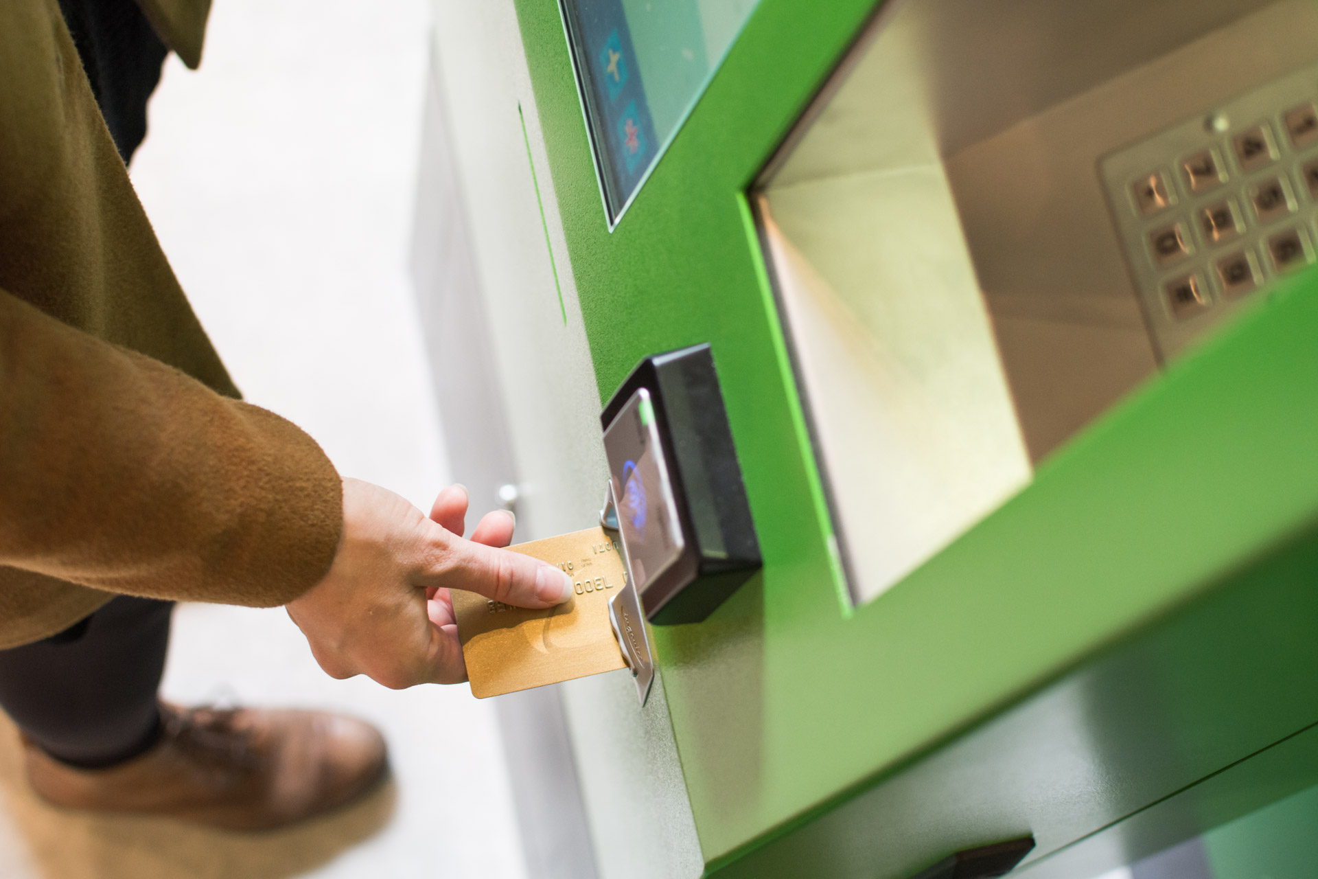
It was critically important that anyone can use the machines to buy a ticket. Hence, accessibility was taken seriously in the process. The actual hardware was designed in a way that it complies with various requirements from height to audio feedback. Accessibility of the user interface was specifically validated by professionals.
Smarter default values
In user interface design, we had two different approached to choose from. One was heavily based on smart default values, based on the data that most users are going to buy a ticket to the next train out of a handful of destinations.
This approach had been seen successful in some earlier booking engine projects and was also inspired by the sales agent interviews. The other approach was a more traditional wizard where you are always taken through all the steps in the process.
Both options were prototyped and tested with users. The end result combines the best of both worlds. The wizard-like UI lets you move step by step easily and browse all the extra services that are available for the selected train – using a sophisticated prioritisation logic.
In the background the steps are filled with smart default values, however, which lets you jump directly to the payment if you are happy with the default seat. This way you can buy a ticket to a typical destination in just two taps.
Smooth payments and handier tickets
Payment is traditionally another time sink. The communication was tailored so that the machine always recommends to use near field payment by default if the sum is below the 50 € limit. To save one further tap from the process, the payment terminal is activated automatically at the last step.
The tickets were completely redesigned. The old machine had the problem that people failed to get a receipt when they needed it.
The new machine prints enough information to the ticket itself that no extra receipts are needed. The new ticket design makes it easier to find the relevant information at a glance – and harder to cheat when validating your commuter train ticket.
Beta Release In Less Than Six Months
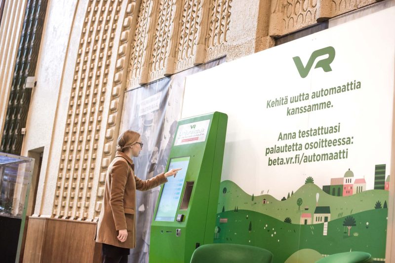
The first version of the ticket vending machine software used an old backend system and the old visual identity and was launched for test pilot use already in March 2018. This phased release made it possible to iterate and improve the complicated hardware integration.
For example, the touch sensitivity of the touch screens was improved significantly based on this early feedback. It was the collaboration of software and hardware tweaks, coupled with some audio feedback.
One set of devices was taken to Rovaniemi to test if the machine would stay operational in the extreme weather conditions of the north (see the video above).
The beta launch was successful with great customer feedback and an average rating of well over 4 out of 5. It was clear , however, that the machine would not be launched before the new backend system and visual identity were ready to be used.
One of the major themes that was improved after the public beta launch was accessibility. The device itself had been crafted accessible from the beginning and the UI was designed to utilise the large touch screen to flexibly adjust the height to support many sizes of users. However, once the new visual identity got ready, it was the time to make sure the final UI met all the accessibility requirements.
Results
The project met its goals: the customer feedback has been positive, average transaction times have decreased and ancillary sales have grown significantly. Not to forget greatly improved accessibility and maintainability.
Awards
GO2020 – Best Service Design Winner
“Perusteellisessa ja hyvin dokumentoidussa palvelumuotoiluprosessissa otettu selkeästi huomioon eri käyttäjäryhmät, käyttöpaikat ja -tilanteet. Palvelu yhdistää digitaaliset ja fyysiset aspektit saumattomaksi kokonaisuudeksi, jonka ansiosta käyttäjät voivat suoriutua ostoprosessista itsenäisesti, jolloin asiakaspalveluresursseja voidaan kohdentaa muualle.”
Team: VR, Qvik, Nordkapp, Fjord, Futurice, Accenture
Blue Arrow Award
The Best Digital Service of the Year
“VR Ticket Vending Machine is a combination of many small things that work well together. This is what makes the service very fluent, very effective and very nice to use.”
The entries are judged by the following criteria: Business results, User experience, Innovation, International breakthrough and Societal Influence.
For more information