Three things we learned at UX Camp Europe
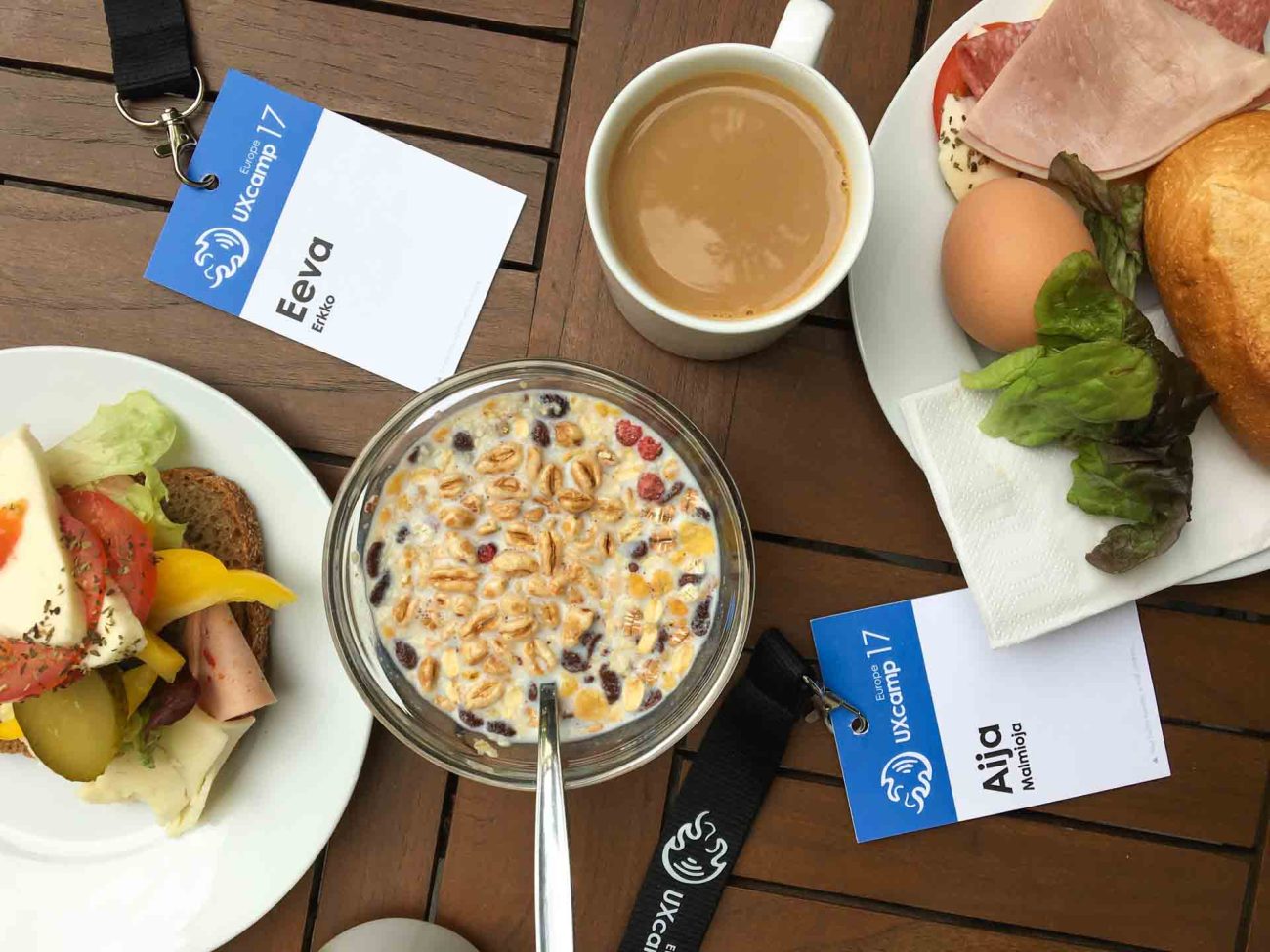
We, Aija Malmioja and Eeva Erkko, spent a weekend in Berlin and attended the UX Camp Europe. From all the sessions we participated in, we picked the three most insightful learnings.
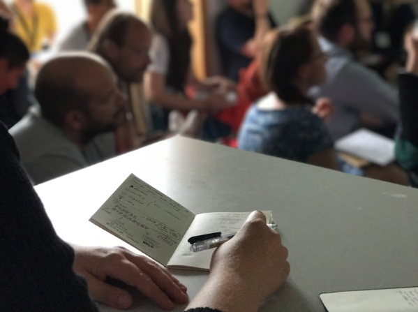
The UX Camp Europe gathered together a vast amount, more than 500 UX professionals from around the world. The conference didn’t feel as huge though, as people were divided into smaller groups when attending the sessions. The sessions were varied: some were traditional lectures or demos, others were hands-on workshops, and some were just plain discussions. The sessions were held by the attendees of the event, which created a relaxed and communicative atmosphere.
For us first-timers, attending the pre-party on the Friday evening turned out to be a winning move. Around pizza and beer, it was easy to get to know new people, and to start a blazing discussion about the shared topic. It gave a good conception of who the people are, and what is the atmosphere of the conference. On the conference days, the people felt more like acquaintances already, and it was easier to attend full-hearted in the discussions.
Sessions and New Learnings
Both of the conference days were filled with more and more inspiring topics around UX design. For us, the most interesting sessions were the ones that left us with concrete learnings – new tools and methods to implement to our work. Here’s the three topics that inspired us the most.
1. Empathy Mapping for understanding the user’s mind – Marguerite Halley
Marguerite Halley held a workshop about using the Empathy Mapping method. The method aims to construct an empathetic overview of the users in a certain context. It specifies what the users do, think, say and feel in different phases of a linear customer journey. It helps to recognize which phase has the most problems most valuable to solve, and to start working on ideas how to solve them.
The Empathy Mapping method is fast to execute, participatory, and easy to understand. The method is worth using not only with users but also with specialists in order to capture and organize their existing knowledge.
2. Sketching anything and taking visual notes – Eva-Lotta Lamm
Eva-Lotta Lamm is a not only an entertaining speaker, but is also able to teach in a very short time how to move from traditional french lines towards more readable notes. As we write in linear lines of text, the only reference between the lines is temporal: what the person said after what. Instead, we should write in smaller chunks, highlight what’s important, draw connections between the thoughts, and illustrate the content with images. This approach could be especially useful for taking notes during user research, when the user cannot express himself in a structured and linear manner.
In the second part of the double session, Lamm explained that we base our sketching on three sources: what we see, know and imagine. During the interactive session, she described her process how to sketch anything:
1) Recognize the simple shapes of the object (rectangles, triangles, circles…)
2) Draw the biggest part first and continue into smaller details
3) Repeat the drawing multiple times, and simplify the shape
4) User your knowledge to explain the context (e.g. rain drops on an umbrella)
With this approach, everyone in the room was able to draw a simple bicycle frame, different animals, and a human in any posture. Being able to sketch anything quickly is useful for explaining ideas on paper.
3. Growing as a designer and compiling your UX portfolio – Ian Fenn
Reflecting on your design process and learnings from a project eventually makes you a better designer. That was one of the key takeaways from Ian Fenn’s session on creating a UX portfolio. It only requires to write down a few lines about your project, and to reflect, what you have done, what was the process and what you learned.
Compiling a good UX portfolio is not easy. In most cases UX portfolios are done in a similar manner to other design portfolios: visual and appealing collection of deliverables. As told by Fenn, a UX portfolio should be built with a user centric approach, and explain the design process.
* Know the readers of your portfolio. Serve different readers in different manners – give a detailed description to educated readers, and highlights with images and lists for non-professionals.
* Focus on telling about yourself, your skills, and your personal design process. Show what kind of impact your work has had. Show that you are willing to learn.
* Select the cases that represent what you want to be working on in the future. Choose a few cases to showcase the breadth of your skills, and choose one for more in-depth demonstration.
* Focus on a tidy and clear visual presentation. Choose the artifacts you want to be evaluated. Use white background to enable printing.
* Keynote is a handy tool to maintain the portfolio. You can modify the content per purpose, and hide slides you don’t want to include.
In conclusion, we strongly recommend attending the event next year! Every year comes with new attendees, so fresh topics for the sessions, and a communicative atmosphere are guaranteed.
The idea for this trip was set a year earlier, when Eeva and Aija won Qvik’s internal design challenge. For Qvik’s developers there was also an internal coding challenge, and as a prize the winners, Tuomas Lahti and Ville Valta, got to go to FOSDEM’17, Belgium.


