Three experts share their tricks for new Figma features
Figma is the leading UX design tool, and many designers are very passionate about it. In this article, Jukka Forsten, Vitali Gusatinsky and Hugo Raymond show their best tips and tricks on how to make the most of Figma and its new features.
Qvik’s own Figma wizard, Jukka Forsten, talks about his experience of creating a new and improved design library for our customer Terveystalo, Finland’s biggest private health care provider.
Figma introduced new component properties and design tokens last year, so updating the design library became necessary to get the most out of the tool. It meant getting rid of huge variant sets, improving the library structure, and support for multi-brand structures using design tokens.
“The old library followed an atomic design structure, and not many changes were made to the atomic component levels, apart from adding the new design tokens”, says Qvik’s senior designer Jukka Forsten.
“These tokens now contain colors, text styles, shadows and spacings. The improved file structure also has its own pages for every atomic level and a documentation frame of what you can do with the component.”
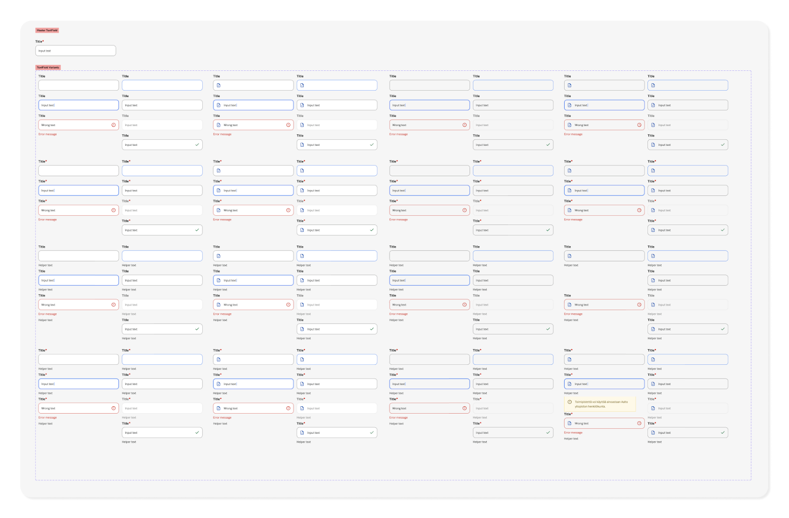
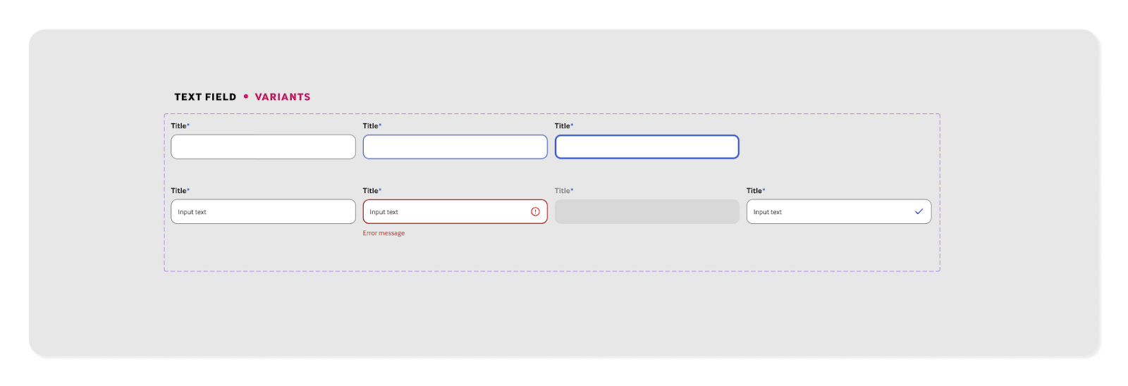
After refactoring a big bunch of component variants into properties and updating the structure of the Figma file, the new library looks compact and clean. The number of input field component variants decreased from over a hundred to just seven. Impressive!


Although the main reason for the update was multi-brand support, it also made the maintenance of this new library much easier. Updating existing components and adding new ones is now a lot faster.
“The hardest part of developing the design system was changing the naming logic of design tokens. Naming is hard”, Forsten says.
Migrating to the new library can take time, but luckily it can be done step by step, as both libraries are still in use. So far, only a couple of teams have started using the new library, but as the work continues, all teams will be able to harness the power of this new design library.
Grasping the full potential of FigJam
Figma introduced their own whiteboard tool, FigJam, less than two years ago. It has improved in leaps and bounds and become the second-most popular digital whiteboard tool (UX Tools, Design tools survey, 2022), just slightly behind Miro. But what makes FigJam so awesome?
Vitali Gusatinsky, Design Lead at Fraktio, shares his power user tips and amazes us with some FigJam magic.
FigJam’s interactivity tools make teamwork smooth and easy: temporary reactions help direct people’s attention in the file, and you can request people to follow your screen with the spotlight mode.
You can use the pen tool to draw directly onto the board with an iPad. In addition you can vote, invite guest editors and use audio sessions. So no need to huddle.
Drawing simple user flows is super quick. With a few clicks, you can add stickies, draw flows, and organize and create a structure easily.
“This is what makes FigJam different from tools like Miro. I can work quickly and get my ideas quickly out into the real world”, Vitali says.
“There is also support for semantics: just type two hashtags + a space to immediately give a subheading style to an item.”
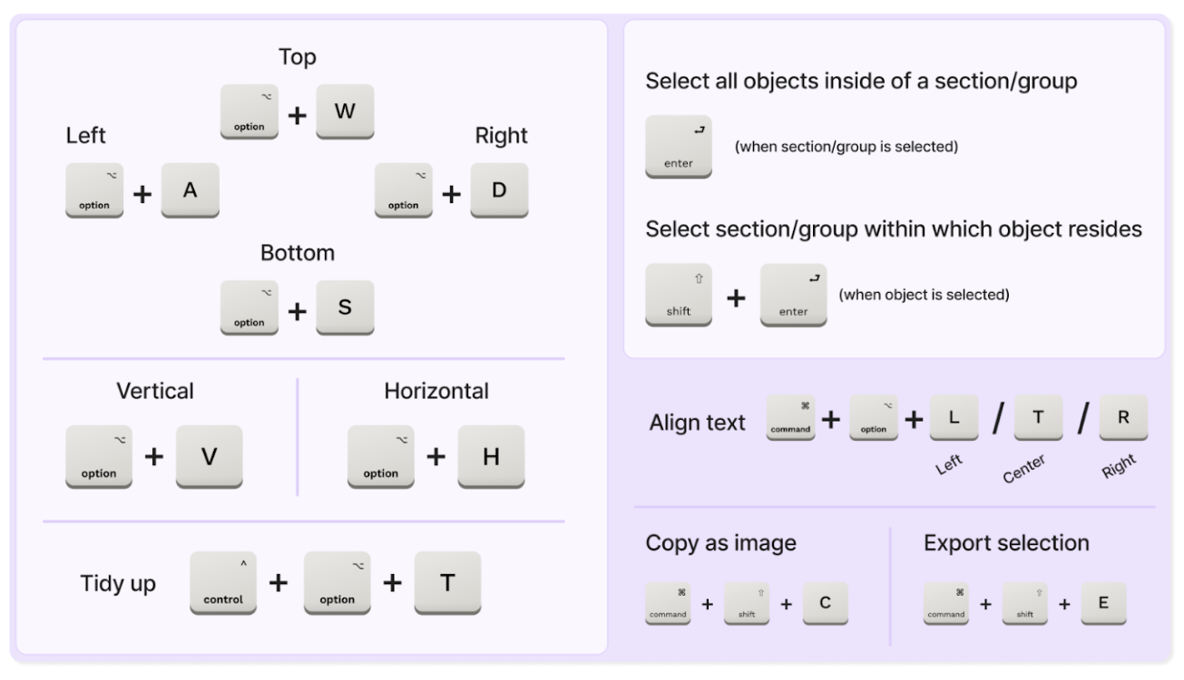
Vitali’s tip for efficient use of the tool is to learn the shortcuts. For example, you can tidy up a bunch of rectangles with ctrl + option + T to organize them into a grid with smart selectors.

Groups and sections are great for organizing content. You can use basic grouping (command + G) if you want multiple objects to behave as one. But scaling a group can still be messy, especially when using text.
Sections are the new hotness in FigJam
FigJam’s sections are easy to scale, move around and nest inside one another. Sections can bring a lot of structure to a large amount of content while retaining legibility.
“These can seem like small, trivial things, but it all adds up when working on something.” Vitali says.
“I can very quickly develop an idea into something that I can then iterate on further, because I don’t want to spend all my time working on my first draft.”
FigJam and Figma also work well together, and you can use Figma assets from the shared libraries and bring in layouts from Figma. This allows you to brainstorm easily, as you can add ideas directly into the layouts instead of using sticky notes, bring the layout back to Figma, and iterate it.
Figma offers lots of widgets like timeline and calendar, and multiple templates with great instructions on how to use them to facilitate workshops properly.
Figma advocates make users’ lives easier
Figma’ Designer advocate Hugo Raymond gives insight into what Figma advocates do and how they contribute to the community. An advocate is a passionate Figma user, experienced designer, and someone engaged with the community.
“The current Figma advocate team is a 17-people mix of different roles globally. Besides sales and marketing, they collect user feedback, represent user needs and support product teams”, Raymond says.
“We are trusted to drive value through meaningful interactions that help make people feel heard and get feedback on their experiences”
Advocates contextualize feature releases into designers’ workflows and have the opportunity to develop content that the community needs. For instance, Figma’s new advocate, Lauren Andres, publishes a tip based on her most recent discoveries every single week. Lauren has highlighted things like a documentation plugin created by the community, EightShapes Specs. This plugin makes it super easy to summarize the styles you are using, like border radius, line height, letter spacing and font size.
Another advocate, Luis Ouriach, likes to give a breakdown of his best-practice guides in an online digest. He wrote a long article about structuring your teams, projects and files. In it, he introduces some different ways of setting up and managing the structure of your files and projects.
The final resource tip from Hugo points us to the videos created by Chad Bergman, focusing on how to build a design system. The videos are recorded conversations between him and Jacob Miller, the product manager for design systems at Figma.
Those 7 hours of content synthesize Jacob’s knowledge about design systems and user needs with Chad’s 20-year experience of the design industry and design system structures. From the videos, you can learn everything from crafting the components and polishing design system versions to providing the documentation inside Figma.
And remember, Figma’s annual Config conference is coming up in June 2023 in San Francisco. While they are currently accepting talk proposals, most of us should be eagerly waiting for news about tokens as well as the next steps in the possible Adobe-Figma merger. Hugo promised nothing, but we have a strong feeling that it will be an event to look forward to.
This article is based on An Evening with Figma at Qvik – an event held at Qvik’s office in early March for a tightly packed audience of nearly 100. If you wish to hear more about upcoming events, follow Qvik’s events on https://www.meetup.com/qvik-events/.
The evening’s presentations were:
Jukka Forsten: https://tinyurl.com/62uvm8u8
Hugo Raymonds: https://www.figma.com/community/file/1215974979546434907
Vitali Gusatinsky: https://tinyurl.com/fraktio-figjam


