Building a SwiftUI Design System – Part 2: Colors, Typography, Iconography, Animation
Let Joel show you how these commonly used components can be made reusable and conclude this part of the series with a brief discussion of syncing design with code.

In the first part of this series, I introduced ways to reuse SwiftUI views in your design system. I will next show you how other commonly used components can be made reusable and conclude this part of the series with a brief discussion of syncing design with code.
I believe most developers do recognize the benefits of separating colors and fonts into constants, not only to avoid mistakes but to speed up development as well. In my experience, software development prioritization still usually favors feature building and bug fixing, leading to poorly maintainable and inconsistent code. New features and redesign updates are significantly slower to implement if the code is not properly structured with reusable components.
In one project, I was asked whether it would be easy to change the app’s primary color to a slightly different shade. With the application being a massive pile of poorly maintained code with no globally used color components, I had to say no. Of course, it was way harder to use color components in .xib or .storyboard files at the time, but that excuse is no longer valid when you build your apps in SwiftUI.
There is no limit to structuring your visual properties into components. You can separate padding values, shadows, grid layout parameters and even user interaction gestures into a catalog of easily adjustable components. For now, I will only focus on colors, typography, iconography and animation. Of these, colors and typography are most commonly made into reusable components.
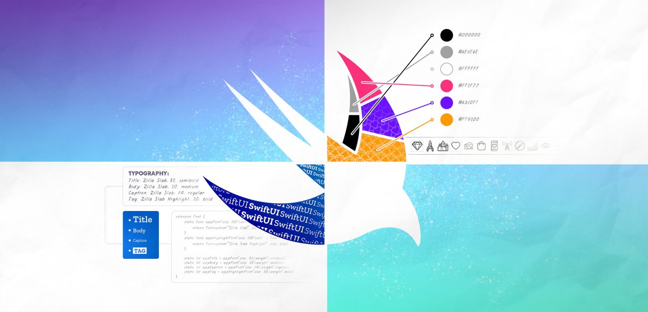
Colors
It’s important to have a consistent catalog of all colors used. This should be a key part in the whole design process and extend all the way to development and testing. If you neglect the system in development, the testers might just find 50 wrong shades of the same color.
Xcode provides many default system colors that are easy to use for quick layouts. Color assets were introduced in Xcode 9 and, like default colors, they are accessible from everywhere within the project. They are created in a specific .xcassets file in the same way as image assets and support different color values for dark mode straight from the catalog.
This is a huge feature, especially for setting colors for elements in the interface builder. It becomes much less error-prone when you don’t have to copy and paste hex values around. Interface builder is of course not as useful anymore with SwiftUI, but color assets are still a consistent way to store colors in one place.
In code, you can refer to a color asset with its name:
let backgroundColor = Color("backgroundColor")This works fine, but for more than one color it would be better to wrap all of them inside a Color extension. This way you can reference the color anywhere with Color.backgroundColor.
 If you have a more complex application and bigger catalog of colors, you might want to add some hierarchy. This can be achieved by implementing color groups with enums or structs, both having their own advantages. You can keep the main colors in the highest level and group other colors by their purpose, like in this example:
extension Color {
    static let appBlue = Color("appBlue")

    enum Button {
        static let label = Color("buttonLabel")
        static let border = Color("buttonBorder")
    }
}

struct ContentView: View {
    let buttonFont = Font.custom("Zilla Slab", size: 18).weight(.bold)
    var body: some View {
        Button("Tap Me", action: {})
            .font(buttonFont)
            .padding(8)
            .foregroundColor(Color.Button.label)
            .background(Color.appBlue)
            .cornerRadius(10)
            .overlay(
                RoundedRectangle(cornerRadius: 10)
                    .stroke(Color.Button.border, lineWidth: 2)
            }
    }
}
Typography
The typography system is code-wise quite similar to the color system, in that it’s constructed with an extension that defines all used fonts in a single location. Projects shouldn’t include any more different font styles than necessary.
A font can have many different properties, such as font name, size, style and weight. But they are quite easy to get mixed up, and that is why fonts should always be made into components, even when using the default iOS font, San Francisco.
The default font is really easy to use as you don’t have to specify the font itself, just the style you want, like title, headline, body, caption, footnote, etc. The font itself looks good and supports Dynamic Type that enables users to adjust the font size for better readability. Dynamic Type only works automatically for custom fonts in iOS 14 or above, otherwise the size has to be scaled manually using UIFontMetrics based on the current sizeCategory.
 iOS also comes with many pre-installed system fonts that are quick to use. But adding your own custom font isn’t hard either, if you follow these simple steps:
- Import font files to your Xcode project.
- Check that the files have your project set as the target membership.
- Add the fonts to Info.plist with the key “Fonts provided by application”.
- Verify that the font files are included in Copy Bundle Resources.
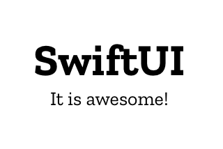
You can then create your typography system, like in this example:
extension Font {
    static func appFont(size: CGFloat) -> Font {
        return Font.custom("Zilla Slab", size: size)
    }

    static let appTitle = appFont(size: 32).weight(.semibold)
    static let appBody = appFont(size: 20).weight(.medium)
    static let appCaption = appFont(size: 14).weight(.regular)
}

struct ContentView: View {
    var body: some View {
        VStack {
            Text("SwiftUI")
                .font(.appTitle)
            Text("It is awesome!")
                .font(.appCaption)
        }
    }
}
Iconography
Using images and icons has always been straightforward in Xcode. Image assets are easy to add to the .xcassets file for use in code and within the interface builder. Using images is very simple in SwiftUI too, as you only need to refer to the image’s name within an Image object. You should add the .resizable() modifier to resize your image and fit it inside the available space, and for maintaining its aspect ratio, you have to add the .aspectRatio modifier using either .fill or .fit. Here’s an example:
Image("image-name")
    .resizable()
    .aspectRatio(contentMode: .fit)
This way of referring to the image by its actual name is error-prone though, and it’s better to move images into a separate extension.
Apple introduced SF Symbols in the 2019 WWDC. It’s a collection of freely usable and configurable symbols for a myriad of different purposes. They are integrated into the San Francisco system font and thus support different variants, weights and sizes. They are really easy to use, and can often replace traditional icon images. You can treat them as images or as text, like this:
Image(systemName: "hand.thumbsup")
    .font(.system(size: 24, weight: .bold))
    .foregroundColor(.blue)
In the example, the thumbs-up symbol is referenced by its system name. This is fine for a simple app, but for an all-encompassing icon system it would be better to separate all image names into an Image extension similarly to colors and typography.
Also when combining multiple images in a single view component or animating images with Lottie, for example, you want to put the logic elsewhere to keep your view code as clean as possible.
Animation
Including animation in the design system is also important for the sake of consistency and flexibility. It is often ignored, though, as proper animation management may not be considered a priority in projects with a tight schedule.
A high-level design system should separate animations into two sections: Motion principles and Implementation. Motion principles typically explain the intention behind the animations and motion design decisions. It doesn’t address the implementation, but rather describes the feel and style of animations and states the brand values related to them.
The Implementation section is a set of guidelines for the implementation of animations. It should include defaults for the different purposes of animation, like object movement, color transitions, button effects, etc. This set should also be mirrored within the Xcode project as custom reusable implementations of animations and transitions.
The building blocks of an animation are its duration and timing curve. Duration is easy to understand and, in a design system, it’s defined simply as a set of values from fast to slow, usually spanning from 0.1 to 0.7 seconds, with any number of increments in between.
The timing curve, on the other hand, is a more complex subject. SwiftUI fortunately provides easy ways for using the most common .easeIn, .easeOut and .easeInOut curves in addition to creating custom spring animations and timing curves.
struct AnimDuration {
    static let fast: Double = 0.1
    static let regular: Double = 0.3
    static let slow: Double = 0.5
}

extension Animation {
    static let easeInOutRegular = Self.easeInOut(duration: AnimDuration.regular)
    static let customCurve = Self.timingCurve(0, 0.8, 0.2, 1,
                                            duration: AnimDuration.slow)
    static let offsetSpring = Self.interpolatingSpring(
                                       	 mass: 0.05,
                                        	 stiffness: 4.5,
                                        	 damping: 0.8,
                                        	 initialVelocity: 5)
}

struct ContentView: View {
    @State private var moved = false
    let buttonFont = Font.custom("Zilla Slab", size: 18).weight(.bold)
    var body: some View {
        Button("Tap me", action: {})
            .font(buttonFont)
            .offset(x: moved ? 15 : -15)
            .animation(Animation.offsetSpring.repeatForever(autoreverses: true))
            .onAppear {
                moved = true
            }
    }
}

In this example, we have separated animation durations into a struct and a few different animations into an extension. They are then easily reusable throughout the application and can be adjusted as needed. You can naturally make transitions reusable as well by following the same principles. Please check out Basics of SwiftUI Animation for more information about animating.
How to sync design and code?
It seems that there are new tools emerging for designers all the time. And there are now more tools than ever for supporting developer handover, from generating ready-to-use code to sharing a style guide and components in a separate cloud-based design system library.
In a perfect world, such handovers would be seamless and automatic all the way from design tools to every individual platform, with a minimum of extra development required. While some services may get close, they usually have limitations, at least on some platform-specific features. Code generation can be an ideal way to transfer design elements and styles on some platforms but less convenient on others.
While colors, typography and various constants and values should be quite straightforward to sync between SwiftUI and a design tool, sharing view components or other complex structures can be rather more difficult. There are ways to attempt it, however, like using this Figma plugin built for generating SwiftUI code out of different kinds of views. I’m not really convinced that it’s quite there yet for large-scale projects, but it looks promising.
Developers usually prefer their own code over anyone else’s, which is also true for code generated by these design tools. If the code doesn’t look like your own code, you want to change it so that it does. This of course means extra work for development, which leads to the question: “Is it really worth the time?”.
Switching to automatic handover methods always requires some work, and it shouldn’t be the only option available. The most important part of any kind of design handover is to ensure high-quality communication between designers and developers. This collaboration makes sure that all parties are on the same page concerning all the changes.
Whatever handover method you use, communication helps you avoid confusion and problems that can lead to unnecessary or redundant work, or even a bad UX in the end product.
Conclusion
Design systems are becoming more and more popular and, while they look like an obvious choice for any project, do require maintenance, integration, and design tools. This might not be sensible for small projects, or even bigger ones targeting just one platform, where a simpler style guide might be more suitable.
No matter how you build your design system, you should always maximize the reusability of components in your project’s code. In the first part of this series, we learned many ways to reuse view elements in your SwiftUI application. This second part focused on certain other reusable components that are equally as important to separate from your actual view code.
For further reading on building SwiftUI design systems, check out this article by Vince MingPu Shao. I also recommend this great blog post by our senior product designer Jani Laatunen for more tips on design handovers.
Illustration: Joel Pöllänen