New vr.fi site finally out! Accessibility and clear content benefit everyone.
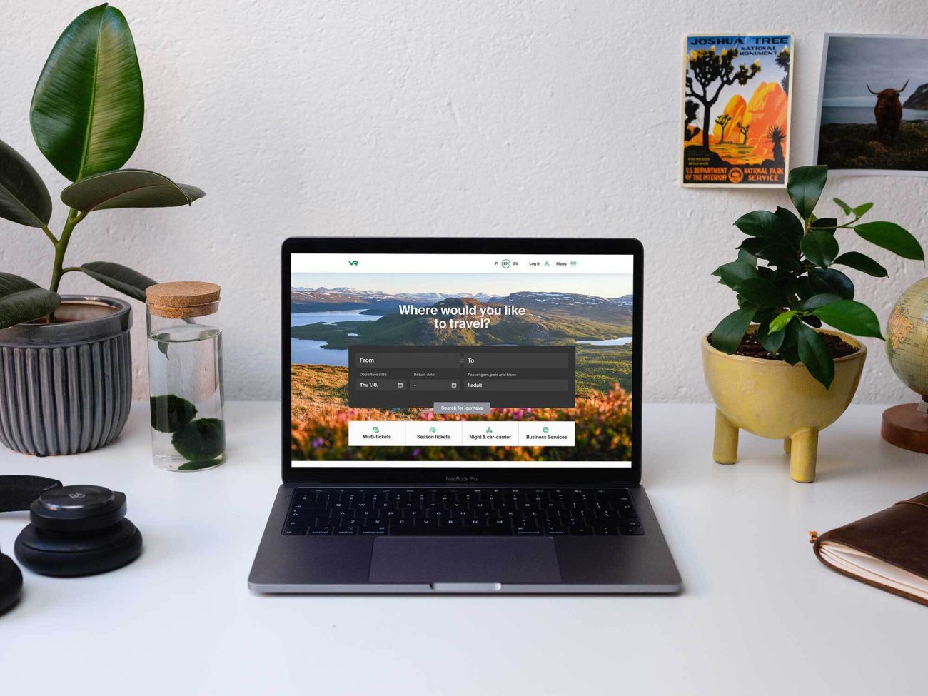
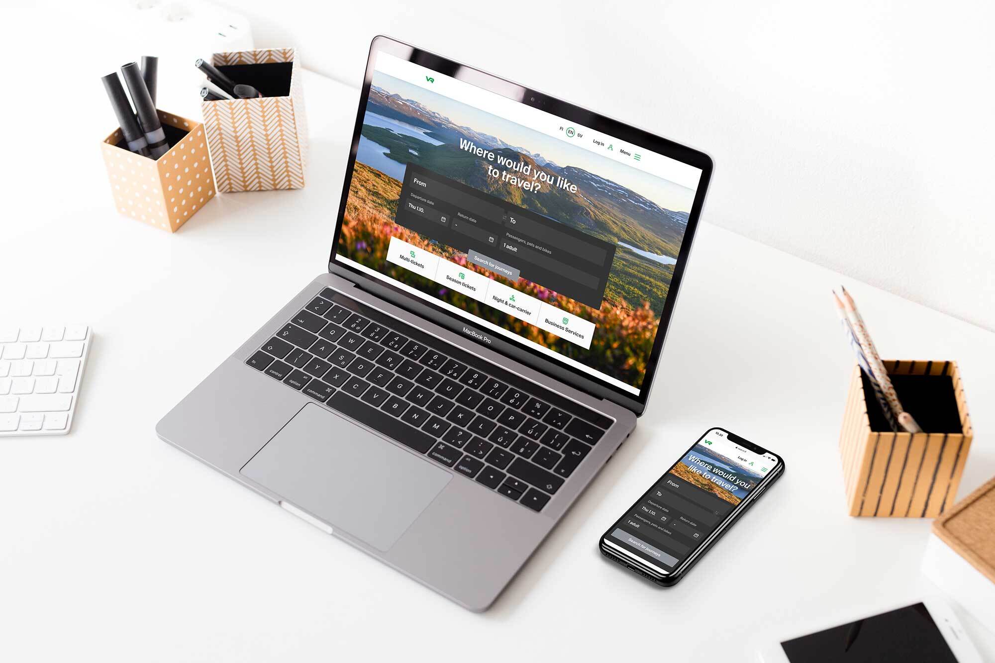
Finland’s national railway operator VR has today officially launched its new website and is preparing to take the old “monster” down for good. The website revamp is a huge project for VR, one which has also advanced their corporate culture.

Finland’s national railway operator VR has today officially launched its new website and is preparing to take the old “monster” down for good. The website revamp is a huge project for VR, one which has also advanced their corporate culture.
In the real world, VR has been accessible for a long time. Their trains and stations are planned to cater for special needs, and disability associations have been involved in their planning from the start. Now VR’s digital services have also been brought into line with the company’s values of equality and responsibility.
“The first service in which we incorporated accessibility thinking from the design phase on was the renewal of our new ticket vending machines”, says VR’s Head of Digital Services & Marketing, Vanessa Lehtinen.
“Our new website now works with a screen reader and can be used by people with impaired vision. Rewriting the texts and improving their layout played a large role in the update.”
VR sees the new Accessibility Directive as a welcome improvement, as it accelerates the implementation of these updates. Accessibility is taken into consideration in all of VR’s new digital services, even though VR is not a government authority and is thus not obligated to follow the Directive yet.
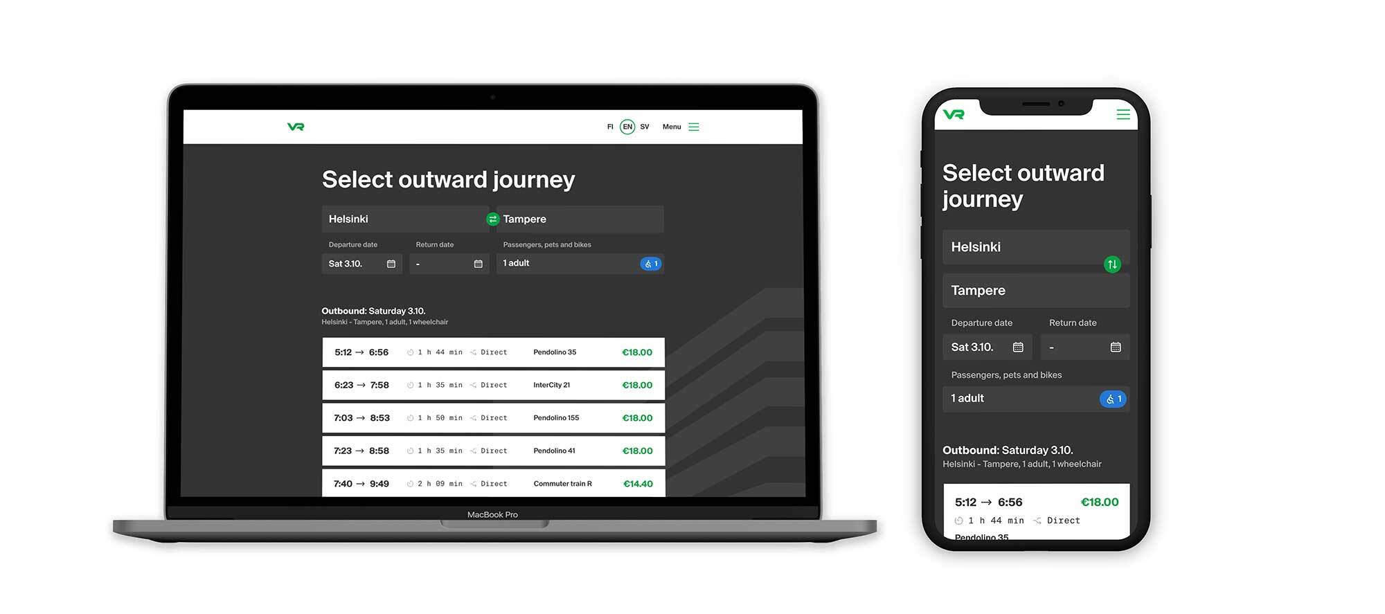
“We did have to think about how far accessibility could currently be implemented at the level of individual features, though”, Lehtinen says. “For example, buying a ticket from the class you want is accessible at the moment, but picking a specific seat from the wagon map is not possible with a screen reader.”
Accessible content improves usability for everyone
The website has a nice special feature related to accessibility: When you implement screen reader support, the website becomes more visible in search engines at the same time. In other words, screen reader optimization makes the information easier to find for all users.
Sufficiently large buttons, clear contrasts and a simple user interface also make the service easier to use even if you don’t have special needs.
“Using consistent and semantic language in both the code and UI helps the blind, vision-impaired and digitally native equally”, says Qvik’s designer Jesse Ukkonen, whose job in the design team was to focus on vr.fi’s accessibility and user experience.
“Accessibility is ultimately pretty easy to achieve if you take it into account in the design process from the start, instead of trying to tack it onto the finished service at the end. This went especially well with the new vr.fi since VR was honing its new visual identity simultaneously with the website design and we could integrate accessibility support into all elements from the ground up”, says Ukkonen.
 The practices learned from designing the ticket vending machines were used in the accessibility design of the website, which was also audited by accessibility experts. Qvik had a big role in designing the ticket vending machine and has also been involved with planning the renewal of vr.fi from the start. Qvik is also on the new site’s front-end and back-end developer teams.
Old habits die hard – as do old websites
Over the years, the old vr.fi had become a confusing and technologically rickety site using obsolete solutions like Flash. As with VR’s other digital services, the website revamp required a change of attitude from the whole organization.
“You can’t order a website like a locomotive: ‘one of these please’. Rather, you need deeper competence and understanding of development and design in your own organization too”, Lehtinen says.
“For us, the website revamp changed our in-house attitude to digital services. We learned how to manage the work and teams ourselves and clarified the roles of the services being developed. There was also a lot of trial and error involved.”
Building VR’s website and online store was a development-intensive project. This is not just a purchase funnel and website, but a sales system offering a new kind of service for which every ticket product has to be created individually. The tickets have connections to, for example the conductors’ devices and customer service, and every single connection needs to work.
“The front-end teams developing VR’s digital products cooperate to keep the integration with VR’s back-end systems as effortless as possible and to minimize the amount of technical debt”, says Ilkka Nyholm, our fellow Qvikie on the vr.fi front-end team.
“The goal is to make all functions built for the back-end system directly compatible with all digital services instead of, for example, having to create separate cancellation cover for mobile and web in the back-end.”
We are not wholly rid of the old website yet, as some ticket products still have to be purchased through the old purchase funnel. The new website is improved one step at a time in accordance with the principles of agile development, with connections to the old online store pared away as we go.
The new vr.fi website is the outcome of a well-functioning multivendor team. We want to give kudos to VR’s in-house experts and to our talented friends at Futurice, Luoto, Nordkapp and Netlight.
Related to this story