Building a SwiftUI Design System – Part 1: Reusable view components
The SwiftUI framework was announced by Apple in WWDC 2019, leaving everyone excited for a new declarative way to build your apps. Much to the delight of developers and, especially, designers everywhere, it became evident that design systems became much easier to implement and manage in iOS.

The SwiftUI framework was announced by Apple in WWDC 2019, leaving everyone excited for a new declarative way to build your apps. Much to the delight of developers and, especially, designers everywhere, it became evident that design systems became much easier to implement and manage in iOS.
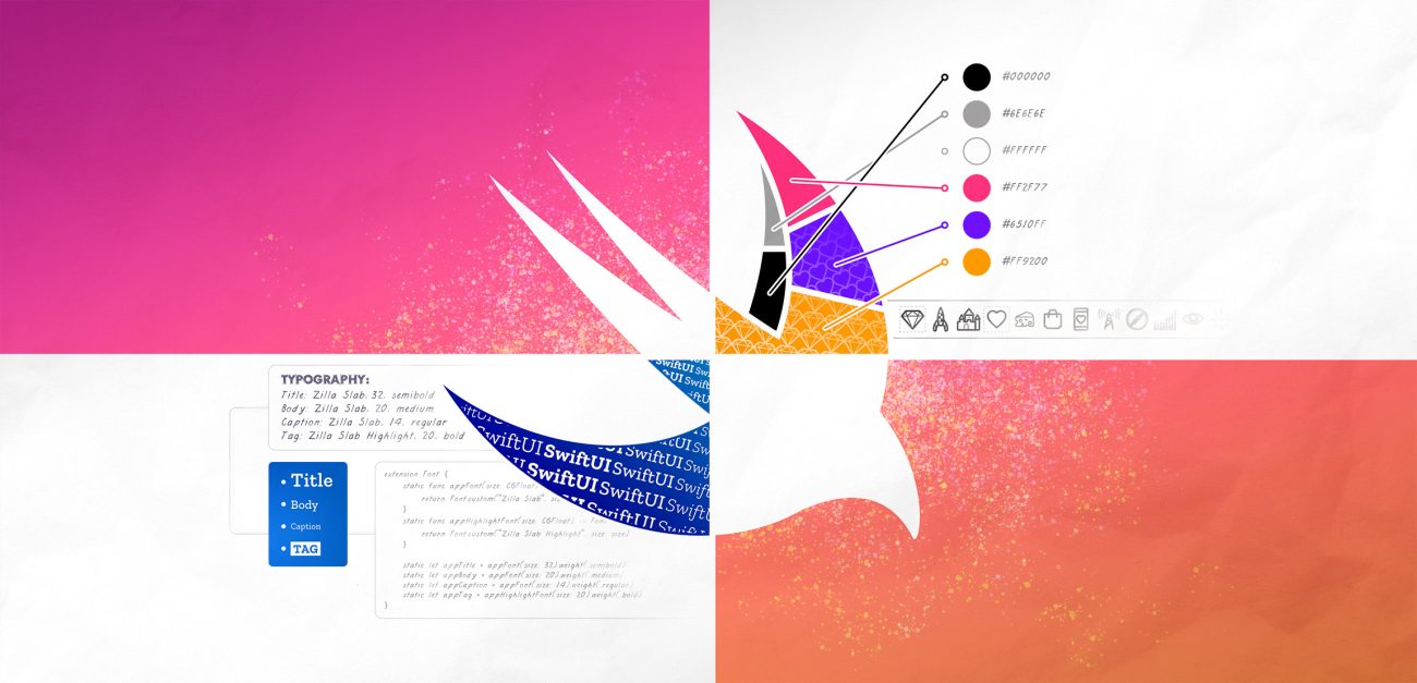
A design system is a combination of a style guide, asset and component catalog and a pattern library. Design systems also describe the standards for assembling these components into any number of applications.
In this article, I will focus on ways of taking design systems into account when developing a SwiftUI application. I think it’s useful for developers to understand the whole process of building a design system and the reasons behind it, as it does benefit development if you actually understand the guide you’re following. Designers should not overlook SwiftUI either, since it can even be used as a prototyping tool.
How to build your component catalog
You want to have a system of components that you can reuse for everything in your application. The components should also be easily adjustable and should not include any business logic. For example, if a designer wanted to change a padding value in every instance of a button component, you should be able to make the change with a single fix.
The component system as a whole should follow a hierarchical structure that makes it easy to find whatever you’re looking for. For keeping your code consistent with the designs, it’s also important to standardize naming conventions and communicate with tokens.
While building a design system is entirely possible with UIKit, SwiftUI makes it a lot easier, at least when implementing view components. With SwiftUI’s declarative way of building views, it doesn’t take much to make the view components reusable. This is a big improvement from the traditional way of managing Interface Builder files. What’s more, SwiftUI improves code readability too.
Local or global reusability
There are a few ways to implement reusable views. Your choice depends on the view type and the customizations applied to the view at hand.
Before going deeper into code, I should note that you have to take the view type into account when returning a view from any function or variable. Most of the time, you want to use some View which means any kind of type conforming to the View protocol. It’s what you call an ”opaque return type” for situations where we don’t want to specify the type.
For simple local reusability, you can create a function or a computed variable that returns the view with all of its modifiers applied. This is also a good option if the view uses private variables set in the parent view.
@State private var isMorning = true

private var greetingText: some View {
    Text(isMorning ? "Good morning!" : "Good afternoon!")
        .font(.appTitle)
}
In this simple example, we have a computed variable generating a greeting text view based on a state object.
If you want to reuse a view everywhere in your application, you need to implement a more refined solution. SwiftUI fortunately makes splitting a view struct into multiple files really easy. This is important not only for reusability, but also for maintaining good code structure and organization.
View extensions and custom styling
Another potential solution would be writing a global extension to a view type and implementing a function or a computed variable to return the modified, and now reusable, view. These can be defined as instance-specific or static, like in this example:
extension Text {
    static func greetingText(isMorning: Bool) -> Text {
        return Text(isMorning ? "Good morning!" : "Good afternoon!")
            .font(.appTitle)
    }
}
SwiftUI provides custom styling for views that include some sort of logic such as buttons, toggles, text fields, etc. By setting a style for the view, you are able to modify the appearance while maintaining the logic. Another benefit is actually being able to change how the logic affects the view’s appearance.
There are several predefined styles available for each supported view type. You can also create your own, although not every style can be customized, unfortunately.
In this example, the buttons’ appearance is changed with a custom ButtonStyle implementation. The touch-down effect is also changed to scale and fade with an animation:
struct ContentView: View {
    var body: some View {
        Button("Tap me", action: {})
            .buttonStyle(AppButtonStyle())
    }
}

struct AppButtonStyle: ButtonStyle {

    let buttonFont = Font.custom("Zilla Slab", size: 20).weight(.bold)

    func makeBody(configuration: Self.Configuration) -> some View {
        configuration
            .label
            .font(buttonFont)
            .multilineTextAlignment(.center)
            .lineLimit(1)
            .padding(.horizontal, 10)
            .foregroundColor(.white)
            .offset(y: -1)
            .frame(height: 30)
            .background(Color.black)
            .clipShape(RoundedRectangle(cornerRadius: 10))
            .scaleEffect(configuration.isPressed ? 0.9 : 1)
            .opacity(configuration.isPressed ? 0.6 : 1)
            .animation(.spring())
    }
}
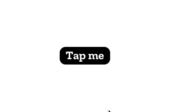 View styling can also be set higher in the view hierarchy as it cascades down to all subviews that support it, which is nice for views with many styleable subviews, like forms. All the supported types and predefined view styles can be found on this Apple Developer Documentation page.
How about ViewModifier and ViewBuilder?
 It is really quick to add all kinds of modifiers to a view In SwiftUI, like background colors or font styles. But if you want to apply the same set of modifiers to different views, you might consider making your own custom viewModifier. For that, you need a struct conforming to ViewModifier protocol that then encapsulates all changes you want to make. It can even include state management of its own!
struct ContentView: View {
    var body: some View {
        Text("SwiftUI is awesome!").appLabel()
    }
}

extension Text {
    func appLabel() -> some View {
        self.modifier(AppLabel())
    }
}

struct AppLabel: ViewModifier {

    let labelFont = Font.custom("Zilla Slab", size: 14).weight(.regular)

    func body(content: Content) -> some View {
        content
            .padding()
            .foregroundColor(.red)
            .font(labelFont)
    }
}
In the example above, the AppLabel modifier is created and then applied with .modifier(AppLabel()). And it’s applied in a separate extension function to make it even easier to use with our Text object.
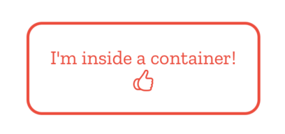 If you wanted to surround your content views with some other predefined views and/or modifiers instead, you could use @ViewBuilder, a function builder you use to create container views of your own. You can add any kind of UI elements into it and they will be shown as defined in the container struct, like in this simple example:
struct ContentView: View {
    var body: some View {
        BaseViewContainer {
            Text("I'm inside a container!")
            Image(systemName: "hand.thumbsup")
        }
    }
}

struct BaseViewContainer <Content : View> : View {
    var content : Content

    init(@ViewBuilder content: () -> Content) {
        self.content = content()
    }

    let labelFont = Font.custom("Zilla Slab", size: 14).weight(.regular)
    var body: some View {
        content
            .padding()
            .foregroundColor(.red)
            .font(labelFont)
            .overlay(
                RoundedRectangle(cornerRadius: 10)
                    .stroke(Color.red, lineWidth: 2)
            )
    }
}
Conclusion
SwiftUI’s declarative syntax allows all UIs to be described in code with ease. Although I have always been a huge fan of Auto Layout and using a graphical interface for creating views, I must say that Apple has done a tremendous job with SwiftUI. With Xcode’s new live preview feature, even reused view components are shown as they should be, which was sometimes a struggle with Interface Builder.
A design system improves communication with the design team and benefits the whole codebase, keeping it more structured and easier to maintain. If you’re a designer interested in building your own design system, you should check out this article by our senior product designer Aija Malmioja. In it, she explains how you can streamline a product’s design language with a proper style guide. Another senior product designer of ours, Jukka Forsten, has also identified common issues with design systems and ways to fix them.
In the second part of this article, I will show you some ways to separate colors, typography, iconography and even animations into reusable components.
Illustration: Joel Pöllänen